Text to Image
Outdoor Brand Kit Presentation Board — AI Image Prompt
Generates a square agency-style brand system board with logo variations, icons, mockups, apparel imagery, ads, app screens, and social tiles for an outdoor brand. - AIPinMaker
Prompt
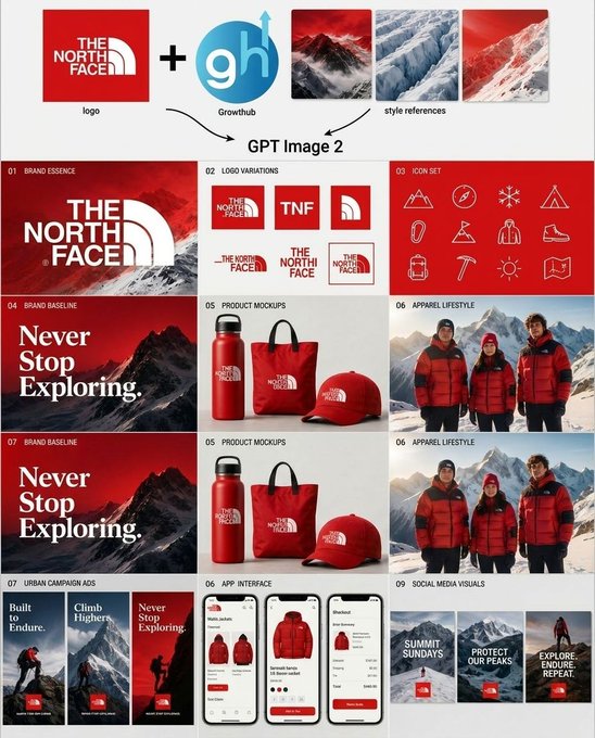
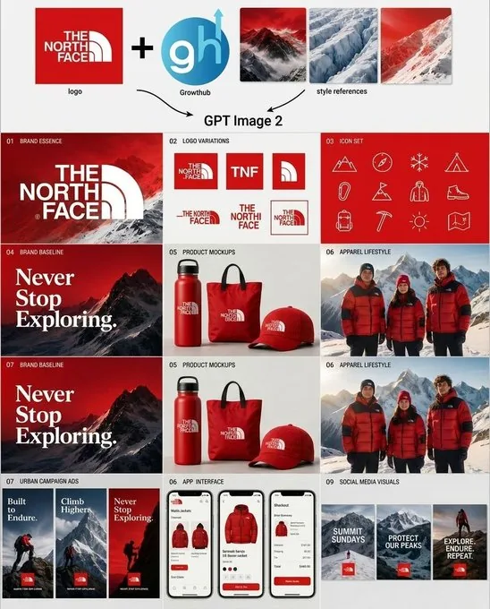
Goal: Create a clean square brand-kit presentation board showing an AI-generated logo system and marketing variations for {argument name="brand name" default="The North Face"}, combining an uploaded logo, an AI tool logo, and mountain style references into a complete visual identity system.

Canvas: Square 1:1 layout on a light gray/off-white background, designed like a polished agency case-study sheet. Use crisp grid lines, generous margins, and a modern editorial branding style.

Top input row: Show exactly 5 input elements across the top: 1 red square brand logo tile for {argument name="brand name" default="The North Face"}; 1 large black plus sign; 1 circular blue logo marked “gh” with a small upward arrow and the label “Growthub”; and 3 vertical mountain style-reference thumbnails in red, blue-white glacier, and red snowy mountain palettes. Add small captions under the logo and style references. Beneath this row, draw two curved black arrows pointing down toward the centered text “GPT Image 2”.

Main layout: Below the header, create a 3-column by 4-row grid of exactly 12 brand-kit panels, each with a tiny numbered label in the upper-left corner and a bold section title. The overall palette is red, white, black, ice blue, and mountain gray, with premium outdoor expedition energy.

Panel count and content:
1. “01 Brand Essence”: large red poster-style panel with a snowy mountain background and oversized white {argument name="brand name" default="The North Face"} logo lockup.
2. “02 Logo Variations”: white panel showing exactly 6 logo variations: full red-square logo, red square with “TNF”, red square with arch symbol only, horizontal wordmark with arch, stacked wordmark, and small boxed lockup.
3. “03 Icon Set”: red panel with exactly 12 thin white line icons arranged in a 4-by-3 grid: mountain, compass, snowflake, tent, carabiner, flag, parka jacket, hiking boot, backpack, ice axe, sun, and folded map.
4. “04 Brand Baseline”: dark red mountain poster with large serif white slogan text “Never Stop Exploring.”
5. “05 Product Mockups”: white product mockup panel with exactly 3 red branded items: water bottle, tote bag, and baseball cap.
6. “06 Apparel Lifestyle”: photorealistic outdoor apparel scene with exactly 3 people wearing red and black expedition jackets in snowy mountains.
7. “07 Brand Baseline”: repeat the dark red mountain slogan poster, again reading “Never Stop Exploring.”
8. “05 Product Mockups”: repeat the same white panel with exactly 3 red branded products: bottle, tote, and cap.
9. “06 Apparel Lifestyle”: repeat the same snowy mountain lifestyle panel with exactly 3 red-jacketed people.
10. “07 Urban Campaign Ads”: show exactly 3 tall vertical ad posters with mountain climbers and red logo blocks, titled “Built to Endure.”, “Climb Higher.”, and “Never Stop Exploring.”
11. “08 App Interface”: show exactly 3 smartphone screens for an outdoor shopping app, featuring red jackets, product cards, checkout UI, red buttons, and clean white mobile interface design.
12. “09 Social Media Visuals”: show exactly 3 square social media tiles with snowy mountain backgrounds, red logo blocks, and white text: “SUMMIT SUNDAYS”, “PROTECT OUR PEAKS”, and “EXPLORE. ENDURE. REPEAT.”

Visual style: Mix photorealistic mountain photography with crisp vector logo work, minimal product mockups, thin white iconography, and luxury outdoor-brand art direction. Use red gradient overlays, snow textures, high contrast typography, and neat case-study spacing. Keep the design readable at a glance, with no extra panels, no watermarks, and no unrelated text.37:Te74,Goal: Create a clean square brand-kit presentation board showing an AI-generated logo syPrompt breakdown
- Subject
- Square brand-kit presentation board for The North Face showing exactly 12 numbered panels plus top input row with red logo tile, Growthub mark, and three mountain style thumbnails
- Style
- Mix of photorealistic mountain photography, crisp vector logo variations, thin white line icons in 4x3 grid, and minimal product mockups with red gradient overlays
- Composition
- Light gray 1:1 canvas with top input row of five elements, two curved arrows pointing to centered GPT Image 2 text, and strict 3-column by 4-row grid of panels with numbered labels
- Mood
- Premium outdoor expedition energy using red, white, black, ice blue, and mountain gray with high-contrast typography and snow textures
Remix ideas
- Swap the three mountain thumbnails for glacier, forest, and desert references while keeping the red North Face tile
- Replace the 09 Social Media Visuals tiles with new copy reading Summit Sundays, Protect Our Peaks, and Explore Endure Repeat in different layouts
- Change panel 10 Urban Campaign Ads posters to feature the arch symbol only instead of full logo blocks
Reference images
How to use this AI Image prompt template
 1
1Copy the prompt — grab this template’s prompt and negative prompt.  2
2Pick a model — choose a recommended AI model for the best match.  3
3Generate — open the studio with one click and create your result.
Related templates

Pet Brand Identity System Board
{"type":"brand identity system board","brand":{"name":"{argument name=\"brand name\" default=\"狗东西\"}","english_mark":"{argument name=\"logo letters\" default=\"GDX\"}","industry":"{argument name=\"industry\" default=\"宠物行业\"}","date":"{argument name=\"date\" default=\"2024.05\"}","tagline":"爱它・懂它・陪伴它"},"style":{"overall":"minimalist premium corporate presentation, clean Swiss-inspired layout, large white margins, light gray divider lines, muted neutral background","palette":"deep forest green and warm off-white with small accent swatches","mood":"modern, trustworthy, pet-friendly, refined"},"canvas":{"aspect_ratio":"3:4 vertical","background":"soft warm white"},"header":{"left_title_cn":"品牌视觉识别系统","left_title_en":"BRAND IDENTITY SYSTEM","right_tagline":"爱它・懂它・陪伴它","center_logo":"large custom GDX wordmark with a white dog silhouette integrated into the middle of the logo, bold geometric curves and diagonal strokes, dark green","center_subtitle":"狗东西"},"layout":{"sections":[{"title":"基础信息","position":"upper left","count":3,"labels":["品牌名称","行业属性","设计时间"]},{"title":"设计网格","position":"mid upper left","count":1,"labels":["logo construction grid with ratio 1.618:1"]},{"title":"概念草图","position":"mid upper center","count":4,"labels":["dog head and letters sketch","outline refinement","intermediate combined mark","final simplified mark"]},{"title":"灵感来源","position":"mid upper right","count":6,"labels":["minimal white architectural arch","golden retriever profile photo","curved arch block composition","green leaf close-up","dark green material square","light wood texture square"]},{"title":"创意理念","position":"middle left","count":4,"labels":["设计哲学与符号意义","品牌定位服务","色彩心理学与策略","可扩展性与适应性"]},{"title":"品牌应用","position":"middle center to right","count":7,"labels":["名片 正反面","信纸信封","APP图标","网站首页 / 网站图标","产品包装 / 购物袋","店面门头 / 标识牌","mobile app icon variants"]},{"title":"色彩规范","position":"lower middle left","count":5,"labels":["主色","辅助色","暖灰色","浅绿色","强调色"]},{"title":"字体规范","position":"lower middle center","count":2,"labels":["思源黑体 CN","思源柔黑体 CN"]},{"title":"最小使用尺寸","position":"lower middle right","count":2,"labels":["horizontal logo minimum size","stacked logo minimum size"]},{"title":"安全留白区域","position":"bottom left","count":1,"labels":["clear space diagram around logo"]},{"title":"错误使用示例","position":"bottom center to right","count":5,"labels":["do not distort","do not change colors","do not add effects","do not stretch vertically","do not place on busy photo background"]}],"grid":"strict multi-column editorial board with thin dividing rules and consistent spacing"},"logo_design":{"form":"GDX lettermark","integration":"negative-space dog silhouette embedded between G and X, reading as the letter D while showing a standing dog profile facing right","color":"dark green","subtitle":"Chinese brand name centered below with thin horizontal lines on both sides"},"color_swatches":[{"name":"墨绿色","hex":"#1E3D34"},{"name":"米白色","hex":"#F5F3EF"},{"name":"暖灰色","hex":"#E5E2DB"},{"name":"浅绿色","hex":"#A8C5B1"},{"name":"暖橙色","hex":"#E0A86E"}],"applications":{"mockups":7,"details":"business card set, stationery set, smartphone app icon screen, website hero with dog photo, dark green and kraft shopping bags, storefront signage, grouped square app icon variations"},"typography":{"families":["思源黑体 CN","思源柔黑体 CN"],"weights":["Bold","Medium","Regular"]},"rendering":"high-resolution graphic design presentation board, flat front-facing view, crisp vector logo, realistic mockup inserts, subtle shadows only inside product mockups, no perspective distortion"}

Professional Logo VI Design Manual
Create a creative image of Professional Logo Vi Design Manual. Style: photorealistic. Composition: balanced and well-framed. Lighting: natural with cinematic mood. Category: photography. Reference: professional-logo-vi-design-manual-18072.

AI Cosplay Expo Logo Guide Sheet
Goal: Create a clean black-and-white logo guide and usage sheet for AI COSPLAY EXPO 2026 (event name), presented as a professional brand identity document. Canvas: Portrait A4-style page, white background, thin light-gray divider lines, generous margins, crisp monochrome vector look. Use bold futuristic techno sans-serif typography, all caps, high contrast black ink. Header: Top-left title reads “AI COSPLAY EXPO 2026” with small subtitle “INTERNATIONAL EVENT” underneath. Top-right small label reads “LOGO GUIDE & USAGE SHEET”. A thin horizontal rule separates the header from the main content. Core logo design: The symbol is a black silhouette of a cute anime-style twin-tail cosplay girl standing inside four broken corner brackets, with a small diamond sparkle below. Combine it with bold text “AI COSPLAY EXPO” and large stacked numerals “2026”, plus the small tagline “- INTERNATIONAL EVENT -” and credit line “produced by AI lady collection (producer name)”. Layout: Divide the page into exactly 7 numbered brand-guide sections using small black square number badges and thin gray rules. Sections: 1. “PRIMARY LOGO – HORIZONTAL”: large horizontal lockup. Symbol on the left, text on the right: “AI COSPLAY EXPO” above huge “2026”, tagline “- INTERNATIONAL EVENT -”, and credit “produced by AI lady collection”. 2. “STACKED LOGO”: vertical centered lockup. Symbol on top, “AI COSPLAY EXPO” stacked in three lines, large “2026”, tagline, and producer credit below. 3. “SYMBOL MARK”: standalone large silhouette symbol only. 4. “MONOCHROME VARIATIONS”: show exactly 4 logo variations: black horizontal logo, gray/outline horizontal logo, black stacked logo, gray/outline stacked logo. 5. “INVERTED (WHITE ON BLACK)”: black rectangle containing exactly 2 white reversed logos: one horizontal logo at top and one stacked logo below. 6. “CLEAR SPACE / MINIMUM SIZE”: left side shows the horizontal logo inside a dotted clear-space box with “A” spacing markers on the top, left, right, and bottom; right side shows exactly 2 minimum-size examples: “MINIMUM SIZE (PRINT)” with width label “25mm / 0.98 in”, and “MINIMUM SIZE (DIGITAL)” with width label “32px”. 7. “USAGE EXAMPLES”: show exactly 4 simple outline icons with labels: globe icon labeled “INTERNATIONAL APPAREL”, ticket icon labeled “EVENTS & TICKETING”, open book icon labeled “MAGAZINE & EDITORIAL”, and medal badge icon labeled “STAFF & EXHIBITOR”. Footer: Bottom strip divided into three columns. Left column title “ORGANIZER TEXT EXAMPLES” with two Japanese-style text lines: “主催: AI lady collection” and “公式 SNS: AI lady collection”. Center column contains a small stacked version of the logo. Right column title “CREDIT LINE” with the line “produced by AI lady collection”. Visual style: Minimal Swiss grid meets Japanese event-brand manual, precise alignment, thin gray separators, no color except black, white, and light gray. Make all text legible, sharp, and print-ready. Avoid extra sections, extra icons, watermarks, gradients, shadows, or decorative backgrounds.38:Tcae,Goal: Create a clean black-and-white logo guide and usage sheet for AI COSPLAY EXPO 2026 (event name), presented

Shynloc Brand Identity Sheet
{"type":"clean corporate visual identity presentation sheet","format":"single page brand identity guideline, page 01, portrait orientation","brand":{"name":"{argument name=\"brand name\" default=\"Shynloc\"}","system title":"{argument name=\"system title\" default=\"SHYNLOC VISUAL IDENTITY SYSTEM\"}","tagline":"{argument name=\"tagline\" default=\"AI-DRIVEN FOLDED N\"}","logo concept":"a futuristic wordmark where the central letter N is transformed into a folded origami-like angular symbol that also reads as AI, using black italic script lettering for the surrounding word and bright orange gradient folded geometry for the N"},"style":{"background":"pure white with generous negative space","layout":"minimal Swiss grid, thin light gray divider lines, uppercase micro typography, premium brand-book aesthetic","typography":"bold sans-serif section headers, small widely spaced uppercase captions, clean body copy","colors":"black, white, gray, vivid orange gradient"},"layout":{"header":{"position":"top edge","left text":"SHYNLOC VISUAL IDENTITY SYSTEM","right text":"PAGE 01","divider":"thin horizontal gray rule across the page"},"hero section":{"position":"upper half center","title block":"BRAND IDENTITY with subtitle Logo Concept and a vertical orange accent bar","right label":"AI-DRIVEN FOLDED N with a small orange slash","primary logo":"large centered Shynloc wordmark; black glossy italic custom lettering, orange folded N in the middle, labeled PRIMARY LOGO underneath"},"sections":[{"title":"SYMBOL MARK","position":"middle-left","count":1,"items":["standalone orange folded N symbol with sharp triangular facets, subtle shadow below"]},{"title":"CONCEPT DIAGRAM","position":"middle-right","count":3,"labels":["N, Letter N Identity","AI, Artificial Intelligence","Folded N, AI-Driven"],"content":"gray N plus gray AI equals orange folded N icon"},{"title":"CONCEPT","position":"below concept diagram","count":1,"body text":"The logo centers on a bold folded N that intelligently integrates the essence of AI. The lower diagonal fold forms an A, while the vertical stroke completes the I, creating a forward-looking mark that communicates innovation, intelligence, and precision. Origami-inspired geometry reflects adaptability, engineering, and future-ready thinking."},{"title":"COLOR PALETTE","position":"bottom-left","count":2,"swatches":["Onyx Black #0A0A0A","Shynloc Orange #FF7A00 – #FFB400"]},{"title":"CONSTRUCTION","position":"bottom-right","count":1,"content":"small grayscale wordmark with the orange N overlaid by dotted construction grid, angular guide lines, and two 45° annotations"}],"footer":{"position":"bottom boxed strip","count":4,"items":["small black square logo tile containing the orange folded N","SHYNLOC VISUAL IDENTITY SYSTEM","VERSION 1.0 / MAY 2024","DESIGNED FOR THE FUTURE. DRIVEN BY INTELLIGENCE. with orange slash"]}},"rendering":"crisp vector graphic design, high-resolution brand guideline mockup, perfectly aligned grid, thin rules, precise spacing, professional agency presentation, no photo texture, no people","customization":{"primary color":"{argument name=\"primary color\" default=\"vivid orange gradient #FF7A00 to #FFB400\"}","secondary color":"{argument name=\"secondary color\" default=\"onyx black #0A0A0A\"}"}}37:

Outdoor Brand Kit Concept Board
Goal: Create a polished branding concept board showing how GPT Image 2 generates a complete outdoor apparel brand kit for The North Face (brand name), combining an existing logo, an agency mark, and style references into a grid of deliverables. Canvas: Square 4:3-ish presentation board on a light gray background, clean modern pitch-deck style, thin white gutters between panels, high-resolution mockup aesthetic. Top workflow strip: Show 5 discrete elements arranged left to right: 1) a red square logo tile with the white text/logo “THE NORTH FACE” labeled “logo”; 2) a large black plus sign; 3) a circular blue “gh” Growthhub mark with an upward arrow labeled “Growthhub”; 4) three rectangular mountain style-reference thumbnails in red, icy blue, and red snowy tones; 5) two curved black arrows pointing down toward centered text reading “GPT Image 2”. Main layout: Below the workflow strip, create a 3-column grid of brand-kit tiles with numbered captions in small uppercase black text. Use a dominant palette of deep red (primary color), white, black, snow gray, and mountain photography. The brand feels premium, rugged, alpine, adventurous, and eCommerce-ready. Sections and exact visible counts: - 01 Brand Essence: 1 wide red mountain banner with large white “THE NORTH FACE” logo over dramatic snowy mountains. - 02 Logo Variations: exactly 6 logo variation tiles: 1 red square full logo, 1 red square “TNF” monogram, 1 red square cropped half-dome icon, 1 horizontal red wordmark/half-dome lockup, 1 stacked red wordmark, and 1 outlined red square lockup. - 03 Icon Set: exactly 12 thin white line icons on a red panel: mountain, compass, snowflake, tent, carabiner, trail flag on mountain, hiker jacket/person, hiking boot, backpack, ice axe, sun, and folded map. - 04 Brand Baseline: 1 red-and-black mountain poster with large white serif text “Never Stop Exploring.” - 05 Product Mockups: exactly 3 red merchandise items on a light background: 1 insulated bottle, 1 tote bag, and 1 baseball cap, each with a small white brand logo. - 06 Apparel Lifestyle: 1 alpine lifestyle photo panel showing exactly 3 people wearing red puffer jackets in front of snowy mountains. - 07 Brand Baseline: repeat the mountain poster concept once more, again with the white serif phrase “Never Stop Exploring.” - 05 Product Mockups: repeat the 3 product mockups once more: bottle, tote, cap. - 06 Apparel Lifestyle: repeat the 3-person red jacket mountain lifestyle panel once more. - 07 Urban Campaign Ads: exactly 3 vertical ad cards with mountain/hiker imagery and red logo tags, with headlines “Built to Endure.”, “Climb Higher.”, and “Never Stop Exploring.” - 06 App Interface: exactly 3 smartphone screens showing a mobile shopping app for red jackets: product grid, product detail page, and checkout/order summary. - 09 Social Media Visuals: exactly 3 vertical social cards with snowy mountain imagery and red logo tags, with headlines “SUMMIT SUNDAYS”, “PROTECT OUR PEAKS”, and “EXPLORE. ENDURE. REPEAT.” Typography: Use bold sans-serif for labels and UI text, the authentic-looking white brand logo styling, and an elegant bold serif for the “Never Stop Exploring.” campaign line. Keep all text crisp and readable. Image style: Realistic product mockups and lifestyle photography mixed with vector logo-system elements; cinematic alpine lighting, snowy mountain backgrounds, premium brand presentation, clean agency case-study layout. Constraints: Preserve the exact section numbering shown, including the repeated 05, 06, and 07 labels. Use exactly the counts listed above. Do not add extra panels, extra icons, extra products, watermarks, or decorative text.37:Tece,Goal: Create a polished branding concept board showing h

Business Presentation Icon Set
Goal: Create a clean vector icon set for business presentation illustrations, suitable for slide decks and documents. Canvas: Wide 16:9 white background, evenly spaced grid layout with 40 discrete icons arranged in 5 rows and 8 columns. Use generous margins and consistent icon sizing. Visual style: Flat modern corporate vector style with rounded shapes, minimal shading, crisp edges, and a friendly SaaS/business look. Use a limited palette of bright blue (primary blue), fresh green (accent green), vivid orange (accent orange), dark navy outlines, light gray UI details, and occasional yellow. No text labels, no watermark, no realistic texture. Icon contents: Include exactly 40 icons in this order, left to right by row: Row 1: 1) three people meeting at a table with speech bubbles, 2) bar chart with upward growth arrow, 3) line graph with three colored points and rising arrow, 4) three vertical upward arrows in blue green orange, 5) presentation screen with pie chart and pointer, 6) laptop with dashboard cards, 7) tablet with colored dashboard blocks. Row 2: 8) kanban board with three columns and colored task cards, 9) glowing light bulb idea icon, 10) target with arrow hitting bullseye, 11) handshake with blue and green sleeves, 12) monthly calendar grid with one orange date, 13) document page with blue folded corner and lines, 14) checklist document with green check marks. Row 3: 15) cloud upload icon with upward arrow, 16) dark blue gear settings icon, 17) magnifying glass search icon, 18) blue envelope email icon, 19) video conference monitor with four participants, 20) gold trophy award icon, 21) four-piece puzzle in blue green orange. Row 4: 22) green circle check mark, 23) pie chart in blue green orange, 24) organization chart with connected colored nodes, 25) thumbs-up approval icon, 26) team/group icon with three people, 27) bar chart with rising green arrow, 28) green shield with white check mark. Row 5: 29) money bag with dollar sign and stacked coins, 30) calculator with orange key, 31) analog clock, 32) yellow file folder, 33) overlapping chat bubbles with ellipsis, 34) dark blue briefcase with yellow clasp, 35) blue globe wireframe. Layout constraints: Maintain a balanced grid and consistent visual weight; leave open white space between icons; keep all icons centered in their cells; avoid adding captions or extra elements. The final image should feel like a reusable business icon library (asset type) for presentation materials (use case).
Explore more prompts
Browse more AI image and video prompts by category.
FAQ
- Which slogan repeats across two dark red panels in the grid?
- Never Stop Exploring. appears in large serif white text on both Brand Baseline panels 04 and 07.
- How many smartphone screens appear in the App Interface panel?
- Exactly three smartphone screens show red jackets, product cards, checkout UI, and clean white mobile interface with red buttons.