Text to Image
Brand Kit Design Prompt — AI Image Prompt
A prompt for creating a comprehensive brand kit with guidelines using reference images for style consistency in GPT Image 2. - AIPinMaker
Prompt
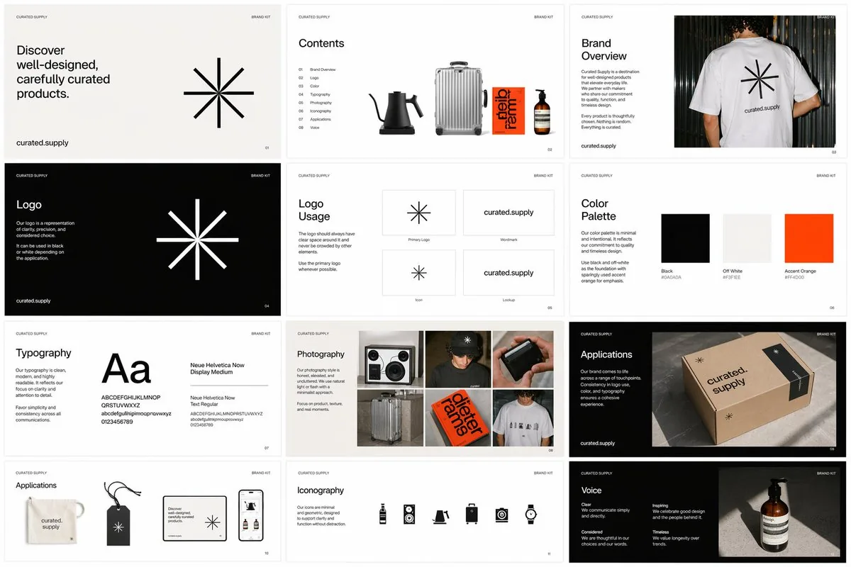
Create a creative image of Brand Kit Design Prompt. Style: photorealistic. Composition: balanced and well-framed. Lighting: natural with cinematic mood. Category: photography. Reference: brand-kit-design-prompt-15522.
Prompt breakdown
- Subject
- Brand Kit Design Prompt with logos, color palettes, typography samples
- Style
- photorealistic
- Lighting
- natural with cinematic mood
- Composition
- balanced and well-framed
- Mood
- cinematic
Remix ideas
- Swap the workspace surface for dark marble to emphasize metallic foil logo prints
- Add a subtle vignette in post to heighten the cinematic mood while keeping natural light direction
- Include a single branded coffee cup or notebook to ground the kit in everyday use
Reference images
How to use this AI Image prompt template
 1
1Copy the prompt — grab this template’s prompt and negative prompt.  2
2Pick a model — choose a recommended AI model for the best match.  3
3Generate — open the studio with one click and create your result.
Related templates

Japanese Video Production Poster
Create a clean, premium Japanese corporate poster for a Arks (company name) video production company, in a minimalist editorial layout on an off-white background with lots of negative space. Portrait orientation, A4-like poster proportions. At the very top left, place an oversized bold black sans-serif logotype reading Arks (company name), spanning nearly the full width of the page. In the upper right, add a small stacked brand mark in thin uppercase letters: "VIDEO" on one line, "PRODUCTION" on the next, "COMPANY" on the third, with a small burnt-orange geometric accent nearby. Below the logo, add a vertical burnt-orange bar on the left and a large elegant Japanese headline in black Mincho-style serif: 4つの領域で、映像を磨く。 (headline text). Directly underneath, add a smaller service line in Japanese with slash separators: "SNS運用 / ショートドラマ / MV制作 / AI映像". The main body is a 2 by 2 grid of exactly 4 service panels with thin light-gray divider lines. Each panel has a large black editorial number and a Japanese label. Panel 1 label: "SNS運用" with the number "01"; image shows a close-up hand holding a smartphone displaying social media analytics, on a desk with charts, a calendar sheet, a pen, and a coffee mug, in warm natural office lighting; caption below in Japanese: "企画・分析・運用を一つの流れで。" Panel 2 label: "ショートドラマ" with the number "02"; image shows exactly 2 Japanese high-school-age students in white shirts standing outdoors on a rooftop or balcony, one female and one male, side-profile composition, muted overcast daylight, cinematic shallow depth of field; caption below: "共感が残る、短編の物語設計。" Panel 3 label: "MV制作" with the number "03"; image shows a moody musician playing electric guitar in a dim studio, backlit by soft haze, with a camera monitor in the foreground showing the same performer; caption below: "アーティストの世界観を、映像で可視化。" Panel 4 label: "AI映像" with the number "04"; image shows a dark professional AI video-generation or image-editing software interface on a monitor, with a cinematic scene of a lone figure standing on rocks under dramatic clouds, plus thumbnail timeline images and side control panels; caption below: "技術を表現へ変える、次世代の映像制作。" At the bottom left, place a small three-line English slogan in uppercase: CREATE.\nCONNECT.\nLEAVE A MARK. (tagline text) with a small burnt-orange line accent above it. At the bottom right, place the website arks-vp.com (website) in small serif text with a short black horizontal line beside it. Use a refined mix of bold modern sans-serif for the large logo and numbers, and elegant Japanese serif for headlines and labels. Color palette: black, charcoal, warm off-white, light gray rules, and restrained burnt-orange accents. The overall feel should be realistic, polished, contemporary, Japanese editorial advertising design, with accurate Japanese typography and natural image tones.38:Tc78,Create a clean, premium Japanese corporate poster for a Arks (company name) video production company, in a minimalist editorial layout on an off-white background with lots of neg

MIXUE Dimo Collaboration Brand Board
{"type":"cute pastel co-branded marketing visual proposal board","theme":"{argument name=\"campaign theme\" default=\"MIXUE × Rock Kingdom Dimo collaboration\"}","canvas":"wide 4:3 presentation board with rounded white panels, soft pink border, pastel blue and pink gradients, glossy commercial design, clean grid layout, high-resolution brand proposal style","brand_identity":{"primary_logos":"top-left and bottom-right show Mixue mascot logo plus 洛克王国 crown logo","overall_mood":"sweet, playful, adventurous,萌, youthful dessert-drink campaign"},"main_key_visual":{"position":"large upper-left panel","headline":"{argument name=\"headline text\" default=\"甜蜜冒险 萌力出发\"}","subheadline":"蜜雪冰城 × 洛克王国 迪莫联名活动","english_caption":"MIXUE × ROCK KINGDOM DIMO COLLAB","character":"{argument name=\"mascot character\" default=\"Dimo, a cute blue-and-white fox-like Rock Kingdom mascot\"}","pose":"large winking chibi mascot leaning beside an oversized pink MIXUE drink cup filled with cream, pearls and fruit, holding a tiny cone, smiling with open mouth","props_count":4,"props":["oversized MIXUE collaboration drink cup","tiny ice cream cone","speech bubble reading Hi!","floating yellow stars and sparkles"],"style":"rounded kawaii mascot illustration, thick clean outlines, glossy highlights, soft shadows"},"layout":{"sections_count":10,"sections":[{"title":"聯名主推","english_title":"collaboration items","position":"middle-left","count":5,"items":["collaboration drink cup design 1","collaboration drink cup design 2","collaboration drink cup design 3","Dimo acrylic keychain","colorful sticker or card pack"]},{"title":"聯名套餐","english_title":"collab combo","position":"middle-center-right","count":4,"items":["two branded drink cups","Dimo acrylic keychain","pink promotional badge reading 套餐内限定周边","small pink bonus charm or standee"]},{"title":"COLOR PALETTE","position":"upper-right","count":6,"swatches":["hot pink","warm yellow","royal blue","lavender","pale blush pink","iridescent rainbow gradient"]},{"title":"TYPOGRAPHY","position":"right upper-middle","count":2,"items":["large Chinese campaign headline in pink and blue","Aa Latin sample with 思源黑体 CN, Bold / Medium / Regular, numerals and punctuation"]},{"title":"KEY VISUAL ELEMENTS","position":"right middle","count":5,"icons":["pink crown","yellow star","blue paw print","blue Dimo head silhouette","pink heart"]},{"title":"PATTERN & TEXTURE","position":"right lower-middle","count":5,"patterns":["pink halftone dots","blue sky with tiny stars","pink grid","pink mascot icon pattern","wide blue cloud texture strip"]},{"title":"活動應用 APPLICATIONS","position":"lower-middle-left","count":3,"items":["storefront billboard mockup","vertical digital poster lightbox mockup","branded takeaway paper bag mockup"]},{"title":"product display row","position":"lower-middle-right","count":4,"items":["three finished drink cups with toppings","printed promotional cards or folders","blue Dimo acrylic standee","rectangular dessert package or tray with mascot"]},{"title":"聯名主視覺延展 KEY VISUAL EXTENSION","position":"bottom row","count":3,"banners":["pink banner with headline 甜蜜冒险 萌力出发 and Dimo next to a MIXUE drink","blue and pink banner with headline 甜蜜冒险 萌力出发 and Dimo jumping while holding a cone","blue banner with headline 和迪莫一起 甜蜜冒险吧! and Dimo holding a cone"]},{"title":"品牌理念 BRAND VISION","position":"bottom-left footer","count":1,"text":"你爱我 我爱你 蜜雪冰城甜蜜蜜 / I LOVE YOU, YOU LOVE ME, MIXUE ICE CREAM & TEA"}]},"color_and_lighting":{"palette":"{argument name=\"color palette\" default=\"cotton-candy pink, sky blue, cream white, lemon yellow, lavender, glossy highlights\"}","lighting":"bright studio lighting, soft shadows, cheerful commercial polish"},"composition":"information-dense brand guideline board with clear gutters, rounded cards, small bilingual labels, product mockups and visual system elements arranged neatly; preserve visible Chinese titles and brand marks as readable design text","rendering":"2D vector and semi-3D kawaii product mockup hybrid, crisp typography, polished advertising pitch deck aesthetic, no photorealistic people","negative_prompt":"dark colors, gritty texture, realistic humans, cluttered illegible layout, distorted logos, misspelled major headline, harsh shadows"}

Professional Brand Identity Guidelines Poster
باستخدام الشعار المرفوع، أنشئ ملصق احترافي عالي الجودة لنظام هوية علامة تجارية متكامل. الهدف: كل شيء لازم يكون مبني على الشعار: الألوان، الأسلوب، الشخصية، والنغمة. ❌ ممنوع أي عناصر عامة أو عشوائية. 🧱 الهيكل: ملصق عمودي بنسبة 4:5، نظام Grid واضح ومتعدد الطبقات، التصميم يكون كثيف بالمحتوى لكن نظيف ومنظم. 🔝 القسم العلوي: اسم العلامة التجارية بخط واضح ونظيف، جملة قصيرة تعبّر عن البراند (حد أقصى 6 كلمات)، وصف الهوية بثلاث كلمات (مثال: حديث / جريء / بسيط). 🎨 نظام الألوان (احترافي): اعرض ألوان أساسية (3–5)، ألوان ثانوية (3–5)، وألوان Accent. لكل لون: بلوكات لونية واضحة، كود HEX، واستخدامه (خلفية / أساسي / تمييز). أضف تدرجات لونية وأمثلة دمج الألوان. 🔤 الخطوط (Typography): حدد خط العناوين، خط العناوين الفرعية، وخط النصوص. اعرض أمثلة نصوص حقيقية وHierarchy واضح بين الأحجام. 🖼️ الهوية البصرية: حدد أسلوب الصور (سينمائي / بسيط / تحريري…)، اتجاه الإضاءة، ونوع الخامات والملمس. اعرض 3 إلى 5 أمثلة بصرية (ستايل الصور). 📦 تطبيقات العلامة (مهم جدًا): اعرض نماذج واقعية مثل: تغليف منتج، واجهة موقع (Hero Section)، شاشة تطبيق موبايل، 3 منشورات سوشيال ميديا، بطاقة عمل، إعلان أو Billboard. ⚠️ لازم كلها تكون بنفس روح الهوية. 🧩 نظام التصميم: اعرض مكونات UI، كروت (Cards)، ونظام المسافات. أمثلة: أزرار، Layouts، وSections. 🔘 الأيقونات: من 6 إلى 10 أيقونات، نفس الأسلوب (Line أو Filled)، متناسقة مع الهوية. 🎭 الأنماط والعناصر: Patterns للخلفيات، أشكال زخرفية، وعناصر مستوحاة من الشعار. ✨ التفاصيل الدقيقة: ظلال، خامات، انعكاسات، وعمق طبقات. 🎯 الأسلوب العام: مزيج بين Editorial Design + Tech Style، نظيف جدًا لكن غني بالتفاصيل، وHierarchy قوي وواضح. 📊 الكثافة: من 30 إلى 50 عنصر بصري، مزيج بين عناصر كبيرة وصغيرة، تصميم مزدحم بشكل ذكي ومنظم. 🚫 قواعد مهمة: ما في فراغات بدون سبب، ما في عناصر حشو، كل شيء له هدف، وكل العناصر مترابطة بصريًا. 💎 النتيجة النهائية: لازم يكون كأنه مشروع قوي على Behance أو دليل هوية من وكالة تصميم. شيء يخلي العميل يقول: "كم السعر؟" 😏 مش: بسيط، تقليدي، أو قالب جاهز.3a:T962,Using the uploaded logo, create a high-quality professional poster for an integrated brand identity system. Goal: Everything must be based on the logo: Colors, Style, Personality, and Tone. ❌ No generic or random elements allowed. 🧱 Structure: Vertical poster with a 4:5 ratio, a clear and multi-layered Grid system; the design should be content-dense but clean and organized. 🔝 Top Section: Brand name in a clear and clean font, a short slogan expressing the brand (max 6 words), and an identity description in three words (e.g., modern / bold / simple). 🎨 Color System (Professional): Display primary colors (3–5), secondary colors (3–5), and accent colors. For each color, provide clear color blocks, HEX codes, and usage (Background / Primary / Accent). Add color gradients and color blending examples. 🔤 Typography: Specify heading font, subheading font, and body text font. Show real text examples and a clear hierarchy between sizes. 🖼️ Visual Identity: Specify image style (cinematic / minimalist / editorial…), lighting direction, and type of materials and textures. Display 3 to 5 visual examples (image style). 📦 Brand Applications (Very Important): Show realistic mockups such as product packaging, website interface (Hero Section), mobile app screen, 3 social media posts, business card, and an advertisement or billboard. ⚠️ All must share the

Japanese Course Promotion Slide
Goal: Create a Japanese webinar/lesson announcement slide in a cute, simple “Marcy-style” presentation design for Claude Code slide creation course (course topic). Canvas: 16:9 horizontal slide, 1200×675 px, warm cream-peach background with soft abstract circular blobs in pale peach and off-white. Add a thin coral-red rectangular border inset about 20 px from the edge. Layout: Center-left text-heavy composition with a simple mascot illustration on the right. At the top center, place a wide coral-red folded ribbon banner with angled darker red folded ends. Below it, stack the main headline and subheadline. Place three circular badges in a row under the subheadline. Along the bottom, add one large rounded coral-red call-to-action bar spanning almost the full width. Text content: Use Japanese text exactly as follows. Top ribbon text: 失敗しない始め方がわかる! (top ribbon text). Small centered heading below ribbon: 初心者のための (audience line). Large main title in coral-red with white outline/drop shadow: Claude Code スライド作成講座 (main title). Teal rounded label below title: AI資料づくりを効率化する方法を解説します! (supporting line). Three badge labels, exactly 3 badges from left to right: 「参加無料」, 「実演つき」, 「初心者OK」. Bottom CTA text: 「詳しくはこちら!」 in large bold white letters. Add a white circular play button at the right end of the CTA bar with a small coral-red triangle inside. Subject details: On the right side, draw one minimalist female presenter mascot with a round face, closed eyes, simple smile, short dark-brown bob hair, peach outline, and a white body. Her right arm is raised diagonally holding a small circular pointer. In front of her torso, place one pale blue rounded rectangle laptop/tablet with teal outline. Decorative elements: Add exactly 4 thin coral plus signs: one near the upper-left edge, one near the upper-right area, one near the lower-left area above the CTA, and one near the lower-right area. Scatter many tiny coral and white dots across the background like confetti, keeping them subtle and not text-like. Visual style: Flat vector illustration, soft pastel colors, clean Japanese slide design, friendly educational seminar aesthetic. Coral red, teal, cream, gold, and dark brown palette. Use bold rounded sans-serif Japanese typography. Keep all text crisp and centered/aligned like a polished promotional slide. Constraints: Include exactly 3 circular badges, exactly 1 mascot, exactly 1 CTA bar, exactly 1 play icon, and exactly 4 plus-sign decorations. Do not add logos, watermarks, extra characters, extra badges, QR codes, or additional text.39:Tb21,Goal: Create a Japanese webinar/lesson announcement slide in a cute, simple “Marcy-style” presentation design for {argument name="course topic" def

Hāng to Lā (Good to Bad) Rating Infographic Prompt - Nano Banana Pro AI Prompt for Infographic / Edu Visual
【核心任务指令】 你是一个拥有实时网络搜索能力和顶尖数据可视化设计能力的AI专家。请执行以下两个步骤: 调研阶段:立刻针对用户指定的【2025 中国新能源汽车 (调研目标领域)】进行全面的网络调研。搜集关于该领域内不同子产品、型号或作品的大众口碑、市场热度、专业评测及用户反馈数据。 可视化阶段:基于你的调研结果,设计一张专业的信息图表(Infographic)。你需要将调研到的具体项目,精准地分类填入下面定义的五个“从夯到拉”的视觉等级模块中。 【用户指定目标领域/产品】 [在此处填写你需要调研的内容,例如:2024年热门智能手机、市面上的无糖茶饮料品牌、近十年的漫威电影、程序员常用的代码编辑器 (目标领域)] 【图像设计要求】 整体风格: 一张结构清晰、现代感强的模块化信息图表,采用“Bento Grid”(便当盒网格)布局。背景干净简洁,聚焦于内容呈现。视觉上必须体现出从高到低的强烈层级落差感。 等级结构与视觉定义(严格执行以下五级): 第1级(最高层):夯 (Hāng) 调研填充标准:根据调研,该领域内目前公认的“版本之子”、具有统治级热度、无可争议的顶流产品/作品。 视觉表现:占据画面最上方或最大的版面模块。色调为极具爆发力的爆裂红与辉煌金,带有光晕或能量外溢的视觉特效。字体最大、最粗。模块内需展示调研到的代表性产品的名称或高质量图像,并配以极简的赞美短语(如“全网吹爆”、“神作”)。 第2级:顶级 调研填充标准:硬核实力派,虽然热度可能不及“夯”,但口碑极佳,是行家首选的优质项目。 视觉表现:位于第二层。色调为坚实、高级的燃烧橙与金属银。模块设计显得扎实、富有质感。展示代表性实力派产品。 第3级:人上人 调研填充标准:优越之选,品味在线,买了/看了绝对不亏的中坚力量,代表了一定的鉴赏力。 视觉表现:位于中层。色调为明亮、干净的柠檬黄与冷灰。设计风格现代、清爽。展示代表性优质中产产品。 第4级:NPC 调研填充标准:毫无记忆点的大众脸产品,凑数的工业流水线产物,无功无过,容易被遗忘,必须要写上具体的产品或品牌或者人名不要含糊其辞。 视觉表现:位于中下层。色调为平淡乏味的面包色/米色或纸板棕。模块设计显得普通、重复、缺乏个性。展示那些非常平庸的产品。 第5级(最底层):拉完了 调研填充标准:调研中发现的公认“避雷针”、“智商税”、灾难级失败产品或甚至不如没有的存在,必须要写上具体的产品或品牌或者人名不要含糊其辞。 视觉表现:挤在画面最底部或角落,视觉空间被压缩。色调为绝望黑、惨白,并带有明显的数字故障(Glitch)、破碎或腐烂的视觉效果。展示那些著名的“翻车”产品,并配以警示性短语(如“快逃”、“大冤种”)。40:Tf97,[Core Task Instruction] You are an AI expert with real-time web search capabilities and top-tier data visualization design skills. Please perform the following two steps: Research Phase: Immediately conduct comprehensive online research on the user-specified [2025 Chinese New Energy Vehicles (research target field)]. Collect public reputation, market popularity, professional reviews, and user feedback data on different sub-products, models, or works within this field. Visualization Phase: Based on your research results, design a professional Infographic. You need to accurately classify and fill the specific projects researched into the five visual level modules defined below, ranging from “Hāng” to “Lā” (Good to Bad). [User Specified Target Field/Product] [Fill in the content you need to research here, e.g., Popular smartphones in 2024, Sugar-free tea beverage brands on the market, Marvel movies of the last decade, Code editors commonly used by programmers (target field)] [Image Design Requirements] Overall Style: A modular infographic with clear structure and a strong modern feel, using a “Bento Grid” layout. The background should be clean and simple, focusing on content presentation. Visually, it must show a strong hierarchical drop-off from high to low. Level Structure and Visual Definition (Strictly enforce the following five levels): Level 1 (Highest Level): 夯 (Hāng - Top Tier) Research Filling Standard: According to research, the generally recognized “Version King” in the field, with dominant popularity and undisputed top-tier products/works. Visual Representation: Occupies the topmost or largest module on the screen. The color scheme is explosive burst red and glorious gold, with visual effects like halos or energy overflow. The font is the largest and boldest. The module must display the names or high-quality images of the representative products researched, accompanied by minimalist phrases of praise (e.g., “Blown up across the internet,” “Masterpiece”). Level 2: Top T

UI redesign and optimization commands
Create a creative image of Ui Redesign And Optimization Commands. Style: photorealistic. Composition: balanced and well-framed. Lighting: natural with cinematic mood. Category: photography. Reference: ui-redesign-and-optimization-commands-107.
Explore more prompts
Browse more AI image and video prompts by category.
FAQ
- How does the reference code brand-kit-design-prompt-15522 affect the final image?
- It anchors the generation to consistent brand-kit visuals so repeated renders maintain the same asset layout and color accuracy.
- Can this photorealistic brand kit image replace traditional flat mockups?
- Yes, the natural lighting and tangible textures give clients a clearer sense of print quality and material choices before production begins.