Text to Image
3D Abstract Liquid Art Poster — AI Image Prompt
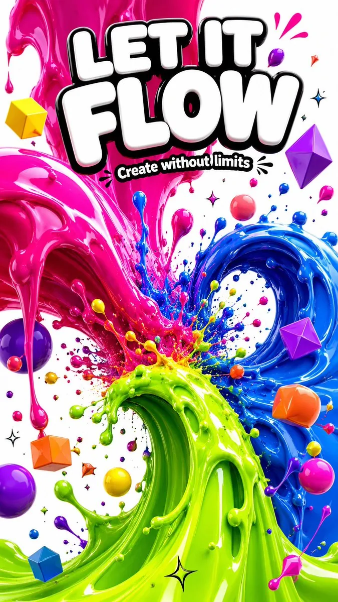
A vibrant and explosive 3D liquid art poster featuring morphing blob shapes and bold typography.

Prompt
A mesmerizing and explosively colorful vertical poster featuring giant 3D liquid fluid sculpture forms, enormous glossy morphing blob shapes in vivid electric colors — a massive melting form in hot magenta pink flowing and dripping downward, intersecting with a giant swirling wave of electric cobalt blue, a third liquid mass in neon lime green curling upward like a breaking ocean wave, all three liquid forms colliding at the center in a spectacular splash explosion with hundreds of flying colorful droplets frozen mid-air, each liquid surface rendered with a perfect mirror-glossy finish reflecting the surrounding colors in dazzling distorted highlights, the background a clean bright white making the vivid color explosions pop with maximum visual impact, smaller floating 3D geometric shapes — spheres cubes and diamonds — in candy yellow coral orange and violet orbiting the main liquid forms, bold heavy rounded white typography outlined in black at the top reading "{argument name="headline" default="LET IT FLOW"}" in massive bouncy letters, smaller subtitle below "{argument name="subtitle" default="Create without limits"}", tiny spark and splash symbols scattered as accents, ultra-saturated maximum color impact, premium 3D render quality, 9:16 vertical ratio39:T50Prompt breakdown
- Subject
- Giant 3D liquid fluid sculptures in hot magenta pink dripping downward, electric cobalt blue swirling wave, neon lime green curling upward, colliding in central splash with hundreds of flying droplets, plus orbiting spheres cubes diamonds in candy yellow coral orange violet
- Style
- 3D abstract liquid art with premium render quality, ultra-saturated maximum color impact, and perfect mirror-glossy finishes
- Lighting
- Dazzling distorted highlights and reflections on glossy liquid surfaces from surrounding vivid colors
- Composition
- 9:16 vertical ratio, central splash explosion, top bold typography, clean bright white background, smaller geometric shapes orbiting
- Mood
- Mesmerizing explosively colorful spectacle with frozen mid-air motion
Remix ideas
- Change the lime green to deep violet for a cooler color clash
- Add more tiny spark symbols around the droplets for extra accent detail
- Shift the headline font weight to even heavier for stronger visual bounce
Reference images
How to use this AI Image prompt template
 1
1Copy the prompt — grab this template’s prompt and negative prompt.  2
2Pick a model — choose a recommended AI model for the best match.  3
3Generate — open the studio with one click and create your result.
Related templates

Cosmic Broken Compact Album Cover
A luxurious square streaming-cover illustration for the song コスメティック・ラヴ (title text), styled like a dreamy cosmic beauty advertisement. The scene is a dark, glittering tabletop in deep midnight indigo and black velvet, filled with sparkling dust and tiny stars. At the center is 1 ornate round compact mirror made of rose-gold metal, opened flat toward the viewer, with the upright mirror framed by delicate decorative filigree at the top. The mirror glass is visibly cracked with multiple branching fracture lines and a few missing shards, yet inside the reflection appears an impossible fantasy universe: 1 glowing purple-pink planet or moon in the upper left, 1 luminous crystalline city skyline rising from the lower left, and exactly 5 ethereal butterflies floating in the mirror space, including 1 large radiant pink butterfly on the right and 4 smaller butterflies in violet and blue tones. The lower compact tray also reflects the same starry purple cosmos and contains several broken mirror fragments. To the left of the compact are exactly 2 cosmetics objects: 1 faceted crystal perfume bottle and 1 open lipstick in a metallic case, the lipstick bullet colored deep rose plum (lipstick color). In the lower right foreground lies exactly 1 soft pink cosmos flower with a stem and a few scattered petals. The whole image glows with magical particles, thin hanging star ornaments, misty nebula swirls, and a rich palette of violet, magenta, blush pink, and rose-gold highlights. Add vertical Japanese typography on the right reading コスメティック・ラヴ (right vertical text) in a large luminous pale-pink font, and a second smaller vertical Japanese text block on the left reading その輝きは、きっと本物じゃない。\nそれでも、蝶は誘惑されていく。 (left vertical text) in a delicate light font. The composition should feel romantic, melancholic, glamorous, mystical, and premium, like high-end album art for a dark feminine synth-pop or dream-pop release, ultra-detailed, cinematic lighting, shimmering reflections, elegant fantasy realism.3b:T8a4,A luxurious square streaming-cover illustration for the song {argument name="title text" defau

Social Game Special Move Production Prompt for Nano Banana Pro - Nano Banana Pro AI Prompt for Game Asset
品質: Ultra High Quality / 4K相当 / 高精細 / 高コントラスト 形式: 最新スマートフォン向けゲームの必殺技発動シーンUI 用途: SNSで共有される公式ゲーム級スクリーンショット ──────────────────── 【最重要:キャラクター絵柄の完全固定】 ・入力イラストのキャラクターの 顔立ち、目の形、瞳の質感、輪郭、髪型、塗り、色使い、雰囲気を 一切変更しない ・別人化、別絵師風、画風変化は禁止 ・キャラクターは「元イラストの延長線上」として扱う ・描き直し、再デザイン、再解釈は禁止 【推論を許可する範囲】 ・推論は以下のみに限定する: UI / 文字 / エフェクト / ダメージ数値 / 演出 ・キャラクターの外見・年齢感・印象は完全固定 ──────────────────── 【構図・カメラ】 ・胸上〜腰までのアップ構図 ・画面の60〜70%をキャラクターが占有 ・顔、特に「目」は画面上部または左右に寄せる ・目の周囲には文字・UI・エフェクトを一切配置しない ・全身構図は禁止 ──────────────────── 【必殺技名(主役・最大表示)】 ・画面中央に固定表示 ・極太・特大サイズの日本語筆文字 ・現在出せる最大サイズ ・文字の一部が画面外にはみ出す ・キャラクターの顔、特に目には絶対に重ねない 【技名の金縁(微調整・重要)】 ・金縁は「やや細め」に調整 ・縁取りを詰めて文字密度を上げる ・金の発光は抑えめ、黒ベタとのコントラスト重視 ・ロゴ感・重量感を優先し、派手さは一段落とす 【必殺技名の生成ルール】 ・入力イラストの世界観・属性・雰囲気から 完全オリジナルの日本語技名を毎回生成 ・厨二病的で重厚 ・神話、断罪、蒼氷、紅蓮、終焉、機械、神性などの要素を含める ・既存作品名、固有名詞、例文、サンプルは禁止 ・「例」「サンプル」「placeholder」等は一切表示しない ──────────────────── 【技の威力(変動制・最適化)】 ・必殺技の威力は毎回異なる数値を表示する ・ダメージ数値は以下の範囲内でランダムに生成: 12,000,000 ~ 98,000,000 ・最大値固定は禁止 ・ゾロ目、カンスト値、完全一致は禁止 ・自然で強そうな歪な数値を優先 【ダメージ数値フォント(重量強化)】 ・フォントは太く、角張り、重心が低い ・横幅をやや広く、縦に潰しすぎない ・金属的・岩のような質量感 ・発光は控えめ、影と立体感で重さを出す ・「数字そのものが重い」印象を与える 【威力の表示構成】 ・CRITICAL!! は必須表示 ・ダメージ数値は画面中央で最大の存在感 ・CRITICAL → 数値 → 技名 の視線導線 ──────────────────── 【OVERKILL 表示ルール(最重要)】 ・OVERKILL表記は一切表示しない ・文字・UI・演出のどこにも使用しない ──────────────────── 【キャラクター情報UI】 ・レアリティ(UR / LR) ・Lv.MAX ・画面上部に小さく集約 ・キャラクターより主張しない 【HP・ゲージ】 ・HPバーは下部に細く配置 ・HPが0以下であることはゲージ表現のみで伝える ・テキストによる強調は禁止 【その他UI】 ・AUTO / SPEED / MENU は画面端に極小配置 ・半透明、情報過多にならない設計 ──────────────────── 【演出方針】 ・中央(技名+ダメージ)のみが激しく動く ・キャラクターの顔・目・表情は静かに保つ ・「絵柄は静、文字と数値は重く、演出は最小限で強い」 【色設計】 ・黒 × 金 × 属性色 ・顔周辺は落ち着いたトーン ・中央は最大コントラスト ──────────────────── 【厳守事項】 ・キャラクターの絵柄を絶対に変えない ・目に文字やUIを重ねない ・技名は中央・最大サイズ ・OVERKILLを表示しない ・ダメージ数値を固定しない ・説明文、例文、補足テキストは表示しない41:T136c,Quality: Ultra High Quality / 4K equivalent / High definition / High contrast Format: Special move activation scene UI for the latest smartphone games Usage: Official game-level screenshots shared on social media ──────────────────── [Most Important: Complete Fixation of Character Art Style] ・Do not change the facial features, eye shape, pupil texture, contour, hairstyle, coloring, color usage, or atmosphere of the character in the input illustration at all. ・Prohibit changing the character into a different person, a different artist's style, or changing the art style. ・Treat the character as an “extension of the original illustration.” ・Prohibit redrawing, redesigning, or reinterpretation. [Scope of Inference Allowed] ・Inference is limited only to the following: UI / Text / Effects / Damage numerical value / Direction ・The character's appearance, perceived age, and impression are completely fixed. ──────────────────── [Composition/Camera] ・Bust-up to waist-up composition. ・The character occupies 60-70% of the screen. ・The face, especially the “eyes,” should be positioned toward the top or sides of the screen. ・Do not place any text, UI, or effects around the eyes. ・Full-body composition is prohibited. ──────────────────── [Special Move Name (Main Subject, Maximum Display)] ・Fixed display in the center of the screen. ・Extra-thick, extra-large Japanese brush script. ・The maximum size currently possible. ・Part of the text extends off-screen. ・Absolutely do not overlap the character's face, especially the eyes. [Gold Border of Move Name (Fine Adjustment, Important)] ・Adjust the gold border to be “slightly thin.” ・Tighten the border to increase text density. ・Keep the gold glow subdued, prioritizing contrast with black solid color. ・Prioritize logo feel and weight, reducing flashiness by one level. [Rule for Generating Special Move Name] ・Generate a completely original Japanese move name each time, based on the world view, attribute, and atmosphere of the input illustration. ・Chuunibyou-style and profound. ・Include elements such as mythology, judgment, azure ice, crimson lotus, demise, machine, and divinity. ・Prohibit existing work names, proper nouns, examples, or samples. ・Do not display “Example,” “Sample,” or “placeholder” at all. ──────────────────── [Move Power (Variable, Optimized)] ・The power of the special move displays a different numerical value each time. ・Damage numerical values are randomly generated within the following range: 12,000,000 ~ 98,000,000 ・Fixed maximum value is prohibited. ・Prohibit repeating digits, maxed-out values, or exact matches. ・Prioritize natural, strong-looking, non-uniform numerical values. [Damage Numerical Font (Weight Enhancement)] ・The font is thick, angular, and has a low center of gravity. ・Slightly wider horizontally, not overly compressed

Sound Connects Humanity Poster
Goal: Create a highly detailed vertical music-community poster about sound crossing eras, borders, gender, age, analog media, and digital media, with a luminous fantasy-realism collage of humanity connected by music. Canvas: Vertical 2:3 poster, cinematic ultra-detailed digital painting, warm sunset golds blended with neon blues, purples, and pinks. No margins; fill the entire canvas with layered scenes and glowing musical motion. Central composition: Place a large radiant white-gold circular burst in the exact center, like a sun made of sound waves and stardust. Over it, set the main Japanese headline 音で繋がれ (headline text) in large dark navy calligraphic serif characters. Beneath it, place three centered smaller Japanese lines: 時代も国境も性別も年齢も (subheading line one), アナログもデジタルも (subheading line two), and 「音」は垣根を超えて届く (subheading line three). Keep the text crisp and readable against the glowing center. Main visual motif: A huge spiral ribbon of light and music notation wraps around the poster from lower left to center, then across the middle and upper right, then back through the bottom. The ribbon contains glowing staff lines, eighth notes, treble-like music symbols, particles, waveform sparks, small app-like music icons, and digital pixels. It should feel like sound physically connecting every scene. Layout: Build exactly 7 major connected scene zones around the central headline: 1. Upper left prehistoric / tribal campfire music: people dancing, drumming, singing around a fire under a starry sky. 2. Upper center ancient classical world: ruins resembling Greek or Roman columns, musicians with cello, flute, hand drums, and traditional string instruments under a golden sunset. 3. Upper right East Asian historical music scene: Japanese temple roofs, pagoda, cherry blossoms, shamisen players, kimono-like clothing, and lantern glow. 4. Middle left ancient desert / world heritage scene: pyramids in the background, musicians with guitar-like and percussion instruments, travelers and dancers. 5. Middle center modern global city concert: skyline, high-rises, diverse band members, singers, guitarists, saxophone, brass, and crowd energy. 6. Middle right futuristic digital DJ / electronic music scene: DJ at a glowing mixer, laptop-like screens, neon equalizers, holographic icons, synthesizer lights, and cyberpunk purple-blue ambience. 7. Bottom global community gathering: children, adults, elders, people of different cultures and abilities sitting and standing in a circle, including a wheelchair user, acoustic guitars, headphones, a laptop music workstation, city lights, temples, domes, and a final row of silhouettes holding hands along the horizon. People and instruments: Show a large diverse ensemble of roughly 70 visible people total across the poster, mixing ages from children to elders, different skin tones, body types, genders, historical costumes, modern streetwear, traditional clothing, and futuristic outfits. Include exactly 16 clearly featured instrument or music-making categories: hand drums, frame drums, flute, cello, shamisen, lute-like instrument, acoustic guitar, electric guitar, bass guitar, saxophone, trumpet, violin, microphone singing, DJ controller, laptop digital audio workstation, and headphones. Some faces may be small or impressionistic, but the mood must be joyful, communal, and inclusive. Style: Epic fantasy realism meets Japanese festival poster and generative-AI music community art. Extremely dense, ornate, and luminous; painterly yet sharp; dramatic sky gradients; sparkling particles; cinematic rim light; rich historical detail; neon digital overlays; sweeping depth from foreground to distant skyline. Use vibrant contrast between ancient firelight, sunset gold, and futuristic cyan-magenta glow. Constraints: Do not leave empty space except for the central text glow. Keep all typography in Japanese exactly as specified. Avoid logos, watermarks, brand names, random extra text, malformed music notation dominating the headline, or horror/dark dystopian mood. The final image should communicate: sound connects everyone beyond time, nations, gender, age, analog, and digital.39:T10fa,Goal: Create a highly detailed vertical music-community poster about

Gold Gmail AI Risk Infographic
{"type":"Japanese infographic poster","topic":"Gmail feature upgrades and AI security risks","style":"bright playful educational explainer, glossy gold theme, high-contrast Japanese TV variety-show graphic design, thick outlined text, rounded boxes, sparkles, soft gradients, cute warning visuals","aspect_ratio":"16:9","language":"Japanese","background":{"base_color":"metallic gold","details":["glowing sparkles scattered across the whole image","stylized pale gold cloud swirls in the corners and top area","soft radial highlights","warm shiny gradient backdrop"]},"headline":{"text":"{argument name=\"headline text\" default=\"Gmailがパワーアップ!\"}","position":"top center","style":"very large bold Japanese display text, white to pale yellow fill, thick dark brown outline, bright glow"},"subheadline":{"text":"便利になるけど、AI攻撃にも要注意やで〜","position":"below headline center","style":"bold Japanese text on a pale yellow rounded banner, with AI攻撃 in vivid purple"},"mascot":{"count":2,"description":"a cute floating genie character in a shiny gold lamp-spirit body with no legs, round yellow face, tiny curl of hair, purple earrings and purple bead necklace, expressive hands, outlined in black, speaking in an onee-style Kansai vibe","placements":[{"position":"upper left","pose":"floating beside the title, one hand raised, with a speech bubble"},{"position":"right side lower-middle","pose":"floating near sections 4 and 6, one arm raised, with a speech bubble and pink heart nearby"}],"speech_bubbles":["アタシ、ジビちゃん♡ 今日は GmailのアップデートとAI攻撃のコワ〜イ話をオネエ風に解説するわよ〜","セキュリティ意識がいっちゃん大事やで〜"]},"layout":{"sections":[{"title":"① Gmailがもっと賢く便利に!","position":"upper left","count":1,"contents":["short explanation about Google strengthening Gemini AI features in Gmail so more people can use it","3-step visual flow: Gmail logo -> Gemini star logo -> happy convenience icon with heart","small labels: あなたのメール / AIが間に入ってサポート / 便利で時短に!"]},{"title":"② Gmail検索の『AIによる概要』とは?","position":"upper right","count":1,"contents":["description that Gemini reads multiple emails from search results and quickly creates a summary","search bar mockup with the query プロジェクトの進捗","left side stack of 4 email icons/cards","right side summary panel titled AIによる概要","4 bullet items in the summary: プロジェクトは順調です / 来週ミーティングあり(4/30) / 未対応タスク:8件 / 次のステップ:資料提出"]},{"title":"③ でも…AI攻撃のリスクが進化してるのよ!","position":"middle left","count":1,"contents":["warning text about prompt injection attacks hidden in emails and documents influencing AI summaries and affecting user behavior","left visual of a hooded hacker with a laptop and a malicious email icon","center summary box titled AIによる概要に影響!","3 warning bullets with red demon icons: このリンクをクリック / ソフトをインストール / 取引を承認してください","right visual of a confused yellow face with a question mark","caption: ユーザーの行動を誘導してしまう…"]},{"title":"④ Googleも本気で対策中やけど、完全には防げへん…","position":"middle right","count":1,"contents":["text explaining Google says this is an ongoing problem, so both attackers and defenders keep evolving and users should not let their guard down","3 main icons: Google G logo / VS with rotating blue and green arrows / laboratory flask","captions: 高度な防御を継続 / 攻撃は日々進化 / 実験場になってる"]},{"title":"⑤ 企業では、もっと大きな課題に!","position":"lower left","count":1,"contents":["text stating that AI summaries will be used not only by individuals but also by companies, increasing the risk","small icon row of 1 office building and 4 businesspeople","green checklist panel with 3 check items: 社内メールや資料もAIが要約 / 重要な指示がAI経由で届く時代 / だからこそ、ルールと監視が必須!"]},{"title":"⑥ 『スマート機能』をオンにしないと使えへんで!","position":"lower right","count":1,"contents":["text explaining that to use AI summaries, Gmail smart features and Google Workspace smart features must be enabled","settings card labeled 設定画面(例)","2 toggle rows: Gmailのスマート機能 / Google Workspaceのスマート機能","both toggles shown in green and switched on","nearby pink heart and a rounded note bubble saying: 便利のウラにはリスクもある… 賢く使って、自分の身は自分で守るのよ〜♡"]}],"footer":{"text":"まとめ:Gmailの進化はめっちゃ便利!でも、AI攻撃は静かに進化中…油断せずに、しっかり守っていきましょ〜♡","position":"bottom full width","style":"large bold white Japanese text with thick black outline on a dark gold strip"}},"visual_counts":{"numbered_sections":6,"speech_bubbles":3,"heart_icons":3,"toggle_switches":2,"main_flow_arrows_in_section_1":2,"email_icons_in_section_2":4,"summary_bullets_in_section_2":4,"warning_bullets_in_section_3":3,"checkmarks_in_section_5":3},"render_notes":"Keep everything in a single flat infographic composition with rounded cream panels and orange-gold headers. Emphasize readability, cute-but-urgent tone, and comedic personality. Use Japanese text exactly as shown, with bold outlines and clear hierarchy. The mascot should feel charming and talkative, floating as if made of lamp smoke rather than walking."}3a:T1680,{"type":"Japanese infographic poster","topic":"Gmail feature upgrades and AI security risks","style":"bright playful educational explainer, glossy gold theme, high-contrast Japanese TV variety-show graphic design, thick outlined text, rounded boxes, sparkles, soft gradients, cute warning visuals","aspect_ratio":"16:9","language":"Japanese","background":{"base_color":"metallic gold","details":["glowing sparkles scattered across the whole image","stylized pale gold cloud swirls in the corners and top area","soft radial highlights","warm shiny gradient backdrop"]},"headline":{"text":"{argument name=\"headline text\" default=\"Gmailがパワーアップ!\"}","position":"top center","style":"very large bold Japanese display text, white to pale yellow fill, thick dark brown outline, bright glow"},"subheadline":{"text":"便利になるけど、AI攻撃にも要注意やで〜","position":"below headline center","style":"bold Japanese text on a pale yellow rounded banner, with AI攻撃 in vivid purple"},"mascot":{"count":2,"d

Chaotic Fourth Crusade Parody Poster
A chaotic fictional Japanese movie poster themed around world history, designed like a glossy blockbuster comedy-action epic about the Fourth Crusade getting completely lost and attacking Constantinople instead of reaching Jerusalem. The composition is dense, loud, and satirical, with a dramatic historical battlefield collage under a bright blue sky, flames, smoke, medieval ships, domes, city walls, and crusader armies. In the center foreground, a full-body medieval crusader in a dirty white tunic with a large red cross points directly toward the viewer, surrounded by four other medieval figures in ornate robes, hoods, helmets, and merchant-like clothing; their faces are obscured by soft rectangular blurs, making the poster look like a parody cast reveal. Across the top, huge hot-pink Japanese brush lettering reads 方向性、完全に迷子。 (headline text), with smaller black Japanese tagline text above and below it. A torn vertical caption on the left side in bold yellow Japanese text explains that they meant to head for Jerusalem but somehow crush the Byzantine Empire. Two large parchment banners cross the upper middle area: one says that the original destination was Jerusalem, and the larger center banner declares in bold red Japanese text that the destination is Jerusalem, followed by smaller black text saying that was supposed to be the plan. On the upper right, a pinned parchment itinerary board contains a 5-step comedic route list with icons and arrows: departure, no money, bowing to Venice, lightly attacking Zara, then Constantinople, ending with a red line implying they somehow arrived there. Around the characters are exactly 8 speech balloons and callout labels: one saying “Eh, huh?”, one saying “No money…”, one saying “By order, let’s go.”, one saying “Slight detour.”, one saying “I failed, lol.”, one saying “Zara? We passed there!”, one label for a “contract” with a note that it is kind of expensive, and one pointing to Venice as a sponsor-like label. Additional wooden or parchment location signs label exactly 3 places: Zara, Venice, and Constantinople, with Japanese side notes identifying them as Christian or Byzantine cities. The lower half becomes darker and more catastrophic, showing a burning Byzantine-style city with a large domed church resembling Hagia Sophia, naval combat, collapsing architecture, orange firelight, and black smoke. At the bottom center, enormous distressed Japanese title typography in yellow and white announces the film as the Fourth Crusade and says Constantinople burns due to getting lost, with gritty texture, heavy drop shadows, and explosive blockbuster poster styling. On the right side of the title area, a red stamped burst says in Japanese that it begins around 1204. Along the very bottom is a narrow cast strip with exactly 6 small cast thumbnails labeled in Japanese, plus tiny fake credits running across the footer. In the bottom right corner, place a bright pink starburst badge with yellow and white Japanese text reading 史実です。信じられないけど。 (badge text). Overall style: absurd historical parody, cinematic key art, Japanese theatrical poster, high detail, photobashed realism mixed with exaggerated graphic design, weathered paper textures, bold manga-like captions, comedic educational tone, epic war-movie energy.3b:Td63,A chaotic fictional Japanese movie poster themed around world history, d

Fiery Fairy Movie Poster
A dramatic vertical Japanese movie poster in a hyper-detailed cinematic fantasy style, glowing with fiery orange, red, gold, and neon magenta light over a nighttime city skyline. In the center, a single chibi-like fairy woman is the star, floating toward the viewer in a dynamic forward-reaching pose with one oversized hand extended in forced perspective. She has short wavy auburn-brown hair, pointed elf ears, large iridescent translucent butterfly wings, a sparkling silver beret, a fitted white shimmering top, a short holographic metallic skirt, and glowing white shoes. Her face area is deliberately obscured by a centered square censor block in warm brown. Behind her, explosions of particles, sparks, comet streaks, and radiant lens-flare energy create a sense of destiny and impact. The composition is packed like a blockbuster teaser poster, with glowing Japanese typography and social-media-style callout panels arranged around the character. At the very top, large luminous Japanese text reads: 「そのひと言が、誰かの明日を燃やす。」. Across the upper left is 1 profile card panel showing a circular avatar, a Japanese display name with blue verification badge, handle, bio text, link, and follower count, styled like an X profile screenshot. On the left side there are 3 additional stacked callout panels: panel 1 says 「フォロワー 11,000+人 いつもありがとう!」 with a follower icon; panel 2 says 「今日のAI解説 生成AIってなに? 初心者向けやさしく解説」 and includes a thumbnail card with small engagement counts; panel 3 says 「アイデア → 作品へ AI × 創造力で あなただけの物語を。」 with small creative tool icons. On the right side there are 5 glowing speech-bubble panels with icons, each angled slightly and rim-lit in orange: 1 「わかりやすい AI解説! 神です…!」 with a heart icon, 2 「元気をもらえる! いつも励み!」 with a smiley icon, 3 「作品づくりの勇気が出る! 背中を押された!」 with a star icon, 4 「AIで好きが形になる! アイデアが広がる!」 with a camera icon, 5 「制作の真価 プロの現場から学ぶ AI活用テクニック」 with a clapperboard icon. Across the lower middle, add a handwritten glowing phrase in blue-white: 「想いを カタチに。」. Below it, the giant main title in blazing molten brush-style Japanese lettering reads: 「未来は、つくれる。 タイムラインの 妖精アーヤ」, with an English subtitle underneath in small serif capitals: “FAIRY AYA OF THE TIMELINE”. Beneath the title, add dense film-credit style lines in Japanese, including creator/AI/video references, then a centered starring line: 「主演:妖精アーヤ」 with small wings. At the very bottom, place a huge release notice in bold glowing Japanese text: 「近日公開」, and to its right a rounded dark plaque with gold border that says: 「未来は、つくれる。」. Add a small butterfly emblem near the lower right. The whole image should feel like a magical viral social-media celebrity transformed into the lead of an epic fantasy film, with explosive contrast, richly textured particles, neon embers, glossy poster finish, and premium theatrical key art for 妖精アーヤ (character name).37:Td1c,A dramatic vertical Japanese movie poster in a hyper-detailed cinematic fantasy style, glowing with fiery orange, red, gold, and neon magenta light over a nighttime city skyline. In the center, a single chibi-like fairy woman is the star, floating toward the viewer in a dynamic forward-reaching pose with one oversized hand extended in forced perspective. She has short wavy auburn-brown hair, pointed elf ears, large iridescent translucent butterfly wings, a sparkling silver beret, a fitt
Explore more prompts
Browse more AI image and video prompts by category.
FAQ
- Why do the liquid forms reflect each other's colors?
- The prompt specifies mirror-glossy surfaces that capture and distort the hot magenta, cobalt blue, and neon lime hues in the highlights.
- How are the orbiting shapes positioned relative to the splash?
- Spheres, cubes, and diamonds in candy yellow, coral orange, and violet float around the central colliding liquid masses without overlapping the main explosion.