Text to Image
AI Brand Guide Generation UI — AI Image Prompt
Creates a clean AI workspace screenshot showing a markdown brand file being turned into a six-slide Dacoit-style brand guide contact sheet. - AIPinMaker
Prompt
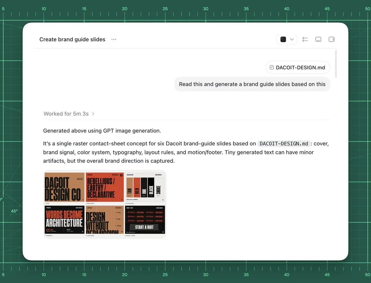
Goal: Create a polished screenshot-style UI mockup showing an AI chat or agent workspace successfully generating brand guide slides from a markdown file.

Canvas: 4:3 landscape composition, approximately 1024×768. Background is a dark green cutting-mat grid with ruler markings around the top and left edges, thin mint grid lines, measurement numbers from 5 to 50, small tick marks, and a few faint diagonal guide lines. Center a large rounded white app window with a soft shadow, leaving the green grid visible as a border.

App window layout: The white panel has rounded corners and a minimal toolbar. At top left, show the title text “Create brand guide slides” followed by a three-dot menu. At top right, include exactly 4 small toolbar icons: a dark square icon with a dropdown chevron, a list/settings icon, a small rectangle icon, and a split-panel icon. A thin horizontal divider runs under the toolbar. Near the upper right of the chat area, show a rounded attachment chip labeled “DACOIT-DESIGN.md”, then below it a light gray user message bubble reading “Read this and generate a brand guide slides based on this”. Add a subtle vertical scrollbar on the far right inside the window.

Main response content: In the left-middle area, show a muted status line “Worked for {argument name="processing time" default="5m 3s"} ›”. Below a divider, show the response text: “Generated above using GPT image generation.” Then a paragraph: “It’s a single raster contact-sheet concept for six Dacoit brand-guide slides based on `DACOIT-DESIGN.md`: cover, brand signal, color system, typography, layout rules, and motion/footer. Tiny generated text can have minor artifacts, but the overall brand direction is captured.” Use clean modern sans-serif UI typography, black and gray text, generous spacing.

Embedded generated image thumbnail: Under the paragraph, place one rounded-corner thumbnail preview of a six-slide brand-guide contact sheet. It must contain exactly 6 mini slide panels in a 3×2 grid. The style of the mini slides is gritty editorial branding with tan, burnt orange, black, cream, and red. Count and depict the six visible slide topics: 1) cover slide with huge text “DACOIT DESIGN CO”, 2) brand signal slide with “REBELLIOUS / EARTHY / DECLARATIVE”, 3) color system slide with vertical swatches labeled roughly TAN, RED, INK, BLACK, SMOKE, 4) typography slide with large words “WORDS BECOME ARCHITECTURE”, 5) layout rules slide with “DESIGN WITHOUT APOLOGY”, 6) motion/footer slide with dark background and “START A RIOT”. The tiny text may be imperfect but the large labels should be recognizable.

Visual style: High-fidelity product screenshot, crisp white interface, subtle shadows, realistic browser/app chrome, minimal monochrome icons, sharp readable text, clean spacing. The background should feel like a design workspace or drafting mat.

Customizable source/brand details: Use {argument name="project title" default="Create brand guide slides"} as the window title if changed. Use {argument name="file name" default="DACOIT-DESIGN.md"} for the attachment chip and paragraph reference. Use {argument name="brand name" default="Dacoit"} for the brand guide subject. Use {argument name="user request" default="Read this and generate a brand guide slides based on this"} as the message bubble text.

Constraints: Do not add people, hands, browser address bars, extra popups, watermarks, or unrelated UI. Keep exactly one app window, one attachment chip, one user message bubble, one status line, one response paragraph block, and one embedded thumbnail containing exactly six mini slides.37:Te4e,Goal: Create a polished screenshot-style UPrompt breakdown
- Subject
- Polished screenshot of AI workspace generating six-slide brand guide from DACOIT-DESIGN.md attachment for Dacoit
- Style
- High-fidelity product screenshot with crisp white rounded app window, minimal monochrome toolbar icons, and clean sans-serif UI text
- Composition
- 4:3 landscape with centered white panel on dark green cutting-mat grid featuring ruler markings, mint lines, numbers 5-50, and faint diagonals
- Mood
- Professional design workspace atmosphere with subtle shadows and realistic app chrome
Remix ideas
- Change the attachment chip label from DACOIT-DESIGN.md to a custom markdown filename
- Swap the six 3x2 thumbnail slides to emphasize different topics like logo variations instead of motion/footer
- Alter the background grid color or add more diagonal guide lines for a varied drafting mat feel
Reference images
How to use this AI Image prompt template
 1
1Copy the prompt — grab this template’s prompt and negative prompt.  2
2Pick a model — choose a recommended AI model for the best match.  3
3Generate — open the studio with one click and create your result.
Related templates

Professional Physical Product Design Board
{ "prompt": { "title": "High-End Physical Product Design Board", "trigger": "Upload a simple sketch or outline of a product. Use it to build a full, professional product design poster—the kind that wins over investors and gets featured on top design websites.", "prime_directive": { "rule": "Every shape, material, screen, and accessory must come directly from the lines and style of the uploaded sketch.", "enforcement": "Do not use standard templates. Look closely at the shape. Build a complete physical and digital world from its basic design." }, "format": { "orientation": "Horizontal", "aspect_ratio": "16:9", "layout": "Clean technical grid", "composition": "Neat, spacious, and purposeful—balancing big, beautiful images with clear technical details" }, "sections": { "01_product_header": { "label": "The Main Shot", "elements": [ "Product name (product name) in strong, clean text", "Short product goal—5 words max, sharp and clear", "Three main feeling words (e.g., Smooth / Tough / Smart (style keywords))" ] }, "02_materials_system": { "label": "Colors, Materials, and Finishes", "palettes": { "primary_body": "Main materials (e.g., dark metal, smooth plastic (primary materials))", "secondary_parts": "Materials for buttons, ports, or edges", "touch_areas": "Materials you feel (e.g., soft rubber, textured fabric)" }, "per_material_display": [ "Close-up picture of the material", "Material name", "Finish type (matte, shiny, or rough)" ] }, "03_exploded_view": { "label": "Inside the Product", "components": [ "Outer shell floating above the inside parts", "Visible battery, main circuit board, or switches", "Connecting wires and cooling parts" ], "requirement": "Must look like it can actually be built in real life, with clear guide lines." }, "04_digital_screen": { "label": "The App or Screen", "define": [ "The main device screen or a mobile app that controls it", "The screen design must match the physical product's shape" ], "visual_tiles": { "count": "2–3 key screens", "style": "Dark mode with high contrast and simple buttons" } }, "05_unboxing_experience": { "label": "The Packaging", "rule": "The box must look premium, sturdy, and environmentally friendly.", "mockups": [ { "type": "Outer Box", "detail": "Clean logo pressed into thick, high-quality cardboard" }, { "type": "Inside Tray", "detail": "Perfectly cut spaces to hold the product and wires safely" } ] }, "06_real_world_use": { "label": "Human Interaction", "scenarios": [ "Product sitting naturally on a desk or outdoors", "A person's hand pressing the main button or holding the handle", "Realistic lighting and shadows that match the background" ], "requirement": "Must look like a real photograph to show the actual size of the item." }, "07_text_and_specs": { "label": "Technical Details", "tiers": { "model_number": "Clear, typewriter-style text for small numbers" } } } }

Fitness SaaS Landing Page UI
Design a modern, high-end fitness app (app type) landing page and product UI for a brand called PulseFit (brand name). Create a clean web design mockup that looks like a real SaaS fitness platform and mobile companion app. The design should feel premium, motivating, and easy to use, with a polished UI/UX style similar to top-tier health and wellness apps. Include: - A hero section with bold headline, short subheadline, strong call-to-action button, and app preview - Dashboard UI showing daily activity, calories burned, workout streak, heart rate, step count, and progress rings - Workout program cards for strength, cardio, mobility, and recovery - Nutrition tracking section with macro breakdown and water intake - Progress charts and analytics widgets - Trainer/community section with profile cards and testimonials - Pricing section and download/app store callout - Mobile app screens shown alongside the web design for a cohesive product ecosystem Style direction: - Sleek, minimal, modern interface - Premium fitness brand aesthetic - Smooth spacing, strong hierarchy, rounded cards, soft shadows - Dark mode UI with energetic accent colors like electric blue, neon green, or vibrant orange - Crisp typography, realistic charts, polished buttons, beautiful onboarding feel - Highly detailed, dribbble-worthy, startup-quality product design - Realistic UX case study presentation, not a cartoon or illustration Composition: - Full website homepage mockup - Multiple UI sections visible in one polished presentation - Slight perspective or straight-on product showcase - Clean background with subtle gradients and professional lighting - Ultra-detailed, sharp text rendering, visually balanced layout Output: A stunning, realistic UI/UX design concept for a fitness app website and dashboard that looks ready for development. Make it look like a real Figma product design presentation for a premium startup.

Neumorphic Smart Dashboard UI
A clean neumorphic mobile dashboard UI mockup shown straight-on, centered on a soft light gray background, inside a white rounded smartphone frame with subtle embossed shadows and glossy soft highlights. The interface uses a minimalist white-on-white design with teal green and warm orange accent colors. At the very top of the phone, include a small circular menu button on the left, a centered speaker slit and front camera dot, and status icons on the right showing Wi‑Fi, signal, 100%, and battery. The main layout contains 12 distinct UI modules: 1 large time card at upper left showing “AM”, “10:24”, and “Friday, May 24” with three tiny pagination dots beneath; 1 weather card at upper right showing a soft 3D partly cloudy sun icon, “24°”, “Partly Cloudy”, and “New York”; 4 small circular action buttons in one row under the time card, showing a grid icon, heart, bell, and gear, with the grid button filled in dark teal; 1 slim horizontal slider card to the right of those buttons with a droplet icon, “40%”, and a teal progress bar; 1 large circular volume control occupying the left middle area, with a thick beveled silver knob, a surrounding tick-mark ring split into teal on the left and orange on the right, a short orange indicator line near the upper right, tiny speaker icons on both sides, and a pill label reading “VOLUME”; 1 music player card on the right middle with square album art in dark teal waves, the title “Ocean Drive”, subtitle “Miami Nights”, a thin orange playback progress line with times “1:45” and “3:48”, and three circular transport controls for previous, play, and next, with the play button filled teal; 3 small rounded buttons in a row beneath the music player, showing an equalizer icon filled teal, a broadcast icon, and sliders icon; 1 compass card at lower left with small circular buttons in the top corners, heading text “320° NW” above, and a detailed analog compass with N, E, S, W letters and a teal-and-orange needle pointing northwest; 1 equalizer card at lower right with four vertical sliders, scale markings “+12”, “0”, “-12”, and bottom frequency labels “60”, “250”, “1K”, “4K”, “16K”, using orange slider stems and white knobs; and 5 bottom dock controls: an orange circular power button, a small Bluetooth button, a central pill waveform panel, a crescent moon button, and a sun brightness button. Use soft ambient shadows, gentle inner embossing, rounded corners, precise spacing, and a premium futuristic smart-home or control-center aesthetic inspired by high-end dribbble neumorphism, ultra-detailed, crisp vector UI, realistic depth, polished product presentation.3c:Ta9d,A clean neumorphic mobile dashboard UI mockup shown straight-on, centered on a s

Pastel Running App UI with Sloth Mascot
{"type":"mobile fitness app UI mockup","style":"clean modern pastel app design, soft beige and warm white surfaces, muted sage green accents, rounded cards and buttons, subtle shadows, thin minimalist line icons, friendly playful branding with a sloth mascot, dribbble-style presentation on a dark brown dotted background","theme":"running tracker app","layout":{"device_count":3,"arrangement":"three tall smartphone screens side by side, evenly spaced, front view","background":"very dark brown with a faint evenly spaced dot grid","screens":[{"position":"left","screen_type":"home dashboard","header":{"greeting":"Good morning, Runner! 👋","left_icon":"none","right_icon":"notification bell"},"hero_card":{"headline":"Ready for a great day?","subcard_text_line_1":"Every step forward is a win.","subcard_text_line_2":"Let's make it count. 🌱","illustration":"cute sloth wearing a cream headband and mint-green workout outfit, standing and waving inside the card on the right"},"sections":[{"title":"This Week","position":"upper middle","count":3,"labels":["Runs","Distance","Time"],"values":["3","12.6 km","1h 45m"],"presentation":"single rounded stats card with three equal columns and pale green circular icons"},{"title":"NEXT GOAL","position":"middle lower","count":1,"labels":["20 km this month"],"values":["63%"],"presentation":"rounded progress card with green progress bar and small waving sloth illustration on the right"},{"title":"Recent Activity","position":"lower","count":1,"labels":["Recent Activity"],"presentation":"top edge of another rounded card visible, cropped by the bottom navigation"}],"bottom_nav":{"count":4,"labels":["Home","Run","Progress","Profile"],"active":"Home"}},{"position":"center","screen_type":"run summary","header":{"left_icon":"back chevron","center_text":"Great job!","subtext":"You did it. Time to celebrate. 🎉","right_icon":"share"},"hero_illustration":"cute sloth wearing a headband, mint athletic outfit, and a gold medal, both arms raised in celebration","stats_row":{"count":3,"labels":["DISTANCE","TIME","PACE"],"values":["5.00km","32:15","6:27"],"presentation":"three rounded statistic pills"},"achievement_card":{"count":1,"title":"New Personal Best! 🌟","subtitle":"You shaved 1:12 off your previous 5K.","icon":"small gold medal badge"},"table_section":{"title":"Splits","count":2,"columns":["KM","PACE","TIME"],"rows":[["1","6:35","6:35"],["2","6:23","12:58"]],"presentation":"rounded white table card with light dividers"}},{"position":"right","screen_type":"run goal setup","header":{"left_icon":"close x","center_text":"Time to run!","subtext":"You've got this. We'll take it slow. 🦥","right_icon":"settings gear"},"goal_visual":{"type":"circular progress selector","top_label":"CHOOSE A GOAL","main_value":"5.00","unit":"kilometers","ring":"thick partial sage-green arc on a pale beige circle","illustration":"small sloth stretching on the upper-right edge of the circle"},"goal_options":{"count":4,"labels":["2 km","5 km","10 km","Half"],"active":"5 km"},"primary_cta":{"label":"Start Run","style":"large rounded sage-green button"},"secondary_action":{"label":"Just Track","icon":"location pin"},"bottom_nav":{"count":4,"labels":["Home","Run","Progress","Profile"],"active":"Run"}}]}}

Nano Banana Pro Decision Making Prompt
Create a creative image of Nano Banana Pro Decision Making Prompt. Style: photorealistic. Composition: balanced and well-framed. Lighting: natural with cinematic mood. Category: photography. Reference: nano-banana-pro-decision-making-prompt-1175.

Dark AI Coding Dashboard UI
{ "type": "dark SaaS analytics dashboard UI", "product": { "brand": "{argument name=\"brand name\" default=\"AICode\"}", "theme": "dark navy blue glassmorphism interface with subtle gradients, soft glow, rounded cards, thin borders, modern developer-tool aesthetic" }, "canvas": { "aspect_ratio": "16:9", "background": "deep midnight blue with faint vignette and soft radial lighting" }, "layout": { "structure": "left sidebar plus main content area", "sections": [ { "title": "Sidebar", "position": "left", "count": 8, "labels": ["AICode", "Overview", "Projects", "AI Assistants", "API & Usage", "Code Quality", "Team", "Settings"], "details": "logo at top, Overview selected with purple highlight, lower subscription card showing Pro Plan, renews in 12 days, horizontal progress bar at 75%, user profile at bottom with avatar, {argument name=\"user name\" default=\"Alex Morgan\"}, and email alex@morgan.dev" }, { "title": "Header", "position": "top main area", "count": 4, "labels": ["Welcome back, Alex 👋", "Here's what's happening with your AI coding platform today.", "May 12 – Jun 12, 2024", "Export Report"], "details": "large greeting on left, date range picker and export button on right" }, { "title": "Metric cards", "position": "top row under header", "count": 4, "labels": ["Total Users", "Active Projects", "API Calls", "Code Quality Score"], "values": ["12,842", "2,153", "1.28M", "876"], "details": "each card has a small colored icon, large main value, comparison text vs Apr 12 – May 12, 2024, positive change percentages 14.6%, 8.3%, 23.7%, 5.9%, and a miniature line chart at the bottom; colors are purple, green, amber, and blue" }, { "title": "Main analytics panels", "position": "middle and bottom rows", "count": 4, "labels": ["API Calls Over Time", "Top Projects", "User Activity Heatmap", "Code Quality Trends"], "details": "API Calls Over Time is a wide area chart with Daily dropdown and rising purple line ending near 250K; Top Projects is a ranked list of 5 items with progress bars and percentage changes; User Activity Heatmap is a 7-row weekly heatmap with hour labels from 12 AM to 9 PM; Code Quality Trends is a line chart with Weekly dropdown and smooth upward purple trend from about 70 to low 90s" }, { "title": "Top Projects list", "position": "middle right panel", "count": 5, "labels": ["AI Code Assistant", "Smart Refactor", "Code Review Bot", "Doc Generator", "Test Builder"], "values": ["485K", "321K", "214K", "132K", "98K"], "details": "green positive deltas for first four items 12.4%, 8.7%, 3.1%, 6.8%, and red negative delta -1.2% for Test Builder; each row has a colored square icon and thin horizontal progress bar" } ] }, "style": { "visual_language": "premium fintech and AI product design mockup", "rendering": "crisp high-fidelity UI mockup, subtle shadows, neon edge lighting, polished charts, clean sans-serif typography", "primary_accent": "{argument name=\"accent color\" default=\"electric purple\"}", "secondary_accents": ["emerald green", "amber yellow", "cyan blue"], "density": "information-rich but spacious, balanced grid, highly legible" } }
Explore more prompts
Browse more AI image and video prompts by category.
FAQ
- What six topics appear in the embedded contact sheet thumbnail?
- Cover with DACOIT DESIGN CO, brand signal with REBELLIOUS / EARTHY / DECLARATIVE, color system swatches, typography with WORDS BECOME ARCHITECTURE, layout rules with DESIGN WITHOUT APOLOGY, and motion/footer with START A RIOT.
- How is the status line and response paragraph structured in the app window?
- A muted line shows processing time above a divider, followed by Generated above using GPT image generation text and a paragraph describing the single raster contact-sheet concept with possible minor text artifacts.