Text to Image
Executive AI Operating Readout — AI Image Prompt
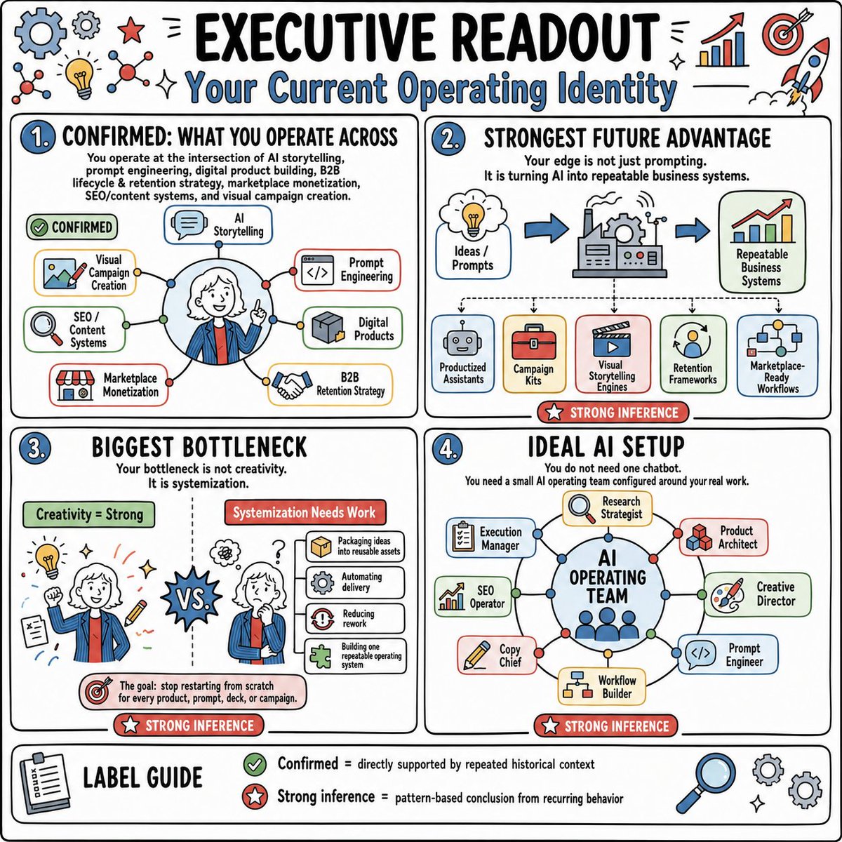
A square sketchnote-style executive infographic summarizing a personal AI operating identity, bottlenecks, future advantage, and ideal AI team setup. - AIPinMaker
Prompt
Goal: Create a hand-drawn strategy infographic titled {argument name="headline text" default="EXECUTIVE READOUT"} with the subtitle {argument name="subtitle text" default="Your Current Operating Identity"}, summarizing an AI/business operating identity in a playful consulting whiteboard style.

Canvas: Square 1:1 image, white background, thick black rounded outer border, black hand-lettered typography with blue accents, red inference badges, green confirmation badges, and small doodle icons around the margins. Use a clean sketchnote style with marker-like outlines, subtle off-white card fills, and lightly colored icon panels.

Layout: Divide the page into four large rounded rectangular panels in a 2-by-2 grid, plus one full-width label guide strip at the bottom. Each main panel has a blue numbered circle at top left. Add decorative icons around the top edge: exactly 11 visible doodles/icons consisting of a large blue gear, a small gray gear, a red star, two molecule/network icons, a yellow lightbulb, two sparkle marks, a rising bar chart with red arrow, a red target with arrow, and a rocket.

Panel 1: Numbered “1.” and titled “CONFIRMED: WHAT YOU OPERATE ACROSS.” Add the explanatory text: “You operate at the intersection of AI storytelling, prompt engineering, digital product building, B2B lifecycle & retention strategy, marketplace monetization, SEO/content systems, and visual campaign creation.” Show a central circular portrait of a smiling professional with white hair wearing a blue jacket and red tie, pointing upward, surrounded by connected nodes. Include exactly 7 labeled capability boxes around the portrait: “AI Storytelling,” “Prompt Engineering,” “Digital Products,” “B2B Retention Strategy,” “Marketplace Monetization,” “SEO / Content Systems,” and “Visual Campaign Creation.” Add a green pill label reading “CONFIRMED.”

Panel 2: Numbered “2.” and titled “STRONGEST FUTURE ADVANTAGE.” Add the text: “Your edge is not just prompting. It is turning AI into repeatable business systems.” Show a left-to-right flow with three large elements: a thought cloud labeled “Ideas / Prompts,” a central factory/machine with gears, and a chart card labeled “Repeatable Business Systems,” connected by blue arrows. Below it show exactly 5 output cards labeled “Productized Assistants,” “Campaign Kits,” “Visual Storytelling Engines,” “Retention Frameworks,” and “Marketplace-Ready Workflows.” Add a red badge at the bottom reading “STRONG INFERENCE.”

Panel 3: Numbered “3.” and titled “BIGGEST BOTTLENECK.” Add the text: “Your bottleneck is not creativity. It is systemization.” Split the panel with a dotted vertical divider. Left side has a green header “Creativity = Strong” and shows the same person from behind amid idea doodles such as a lightbulb, pencil, notes, sparkles, and a target. Right side has a red header “Systemization Needs Work” and shows the person looking stressed with question marks and a stack of process cards. Include exactly 4 process cards: “Packaging ideas into reusable assets,” “Automating delivery,” “Reducing rework,” and “Building one repeatable operating system.” Put a spiky “VS.” burst in the center. Bottom callout with target icon: “The goal: stop restarting from scratch for every product, prompt, deck, or campaign.” Add a red badge “STRONG INFERENCE.”

Panel 4: Numbered “4.” and titled “IDEAL AI SETUP.” Add the text: “You do not need one chatbot. You need a small AI operating team configured around your real work.” Show a central blue circle labeled {argument name="central system name" default="AI OPERATING TEAM"} with small person dots inside, connected to exactly 8 role cards arranged around it: “Execution Manager,” “Research Strategist,” “Product Architect,” “Creative Director,” “Prompt Engineer,” “Workflow Builder,” “Copy Chief,” and “SEO Operator.” Use thin connector lines with colored nodes. Add a red badge “STRONG INFERENCE.”

Bottom label guide: Full-width rounded strip titled “LABEL GUIDE” with a clipboard icon on the left. Include exactly 2 legend entries: green check icon with “Confirmed = directly supported by repeated historical context” and red star icon with “Strong inference = pattern-based conclusion from recurring behavior.” Add three decorative icons at the right: a magnifying glass and two gears, plus tiny sparkles.

Visual style: playful executive whiteboard infographic, thick black marker outlines, rounded cards, bright but restrained palette of sky blue, red, green, yellow, and gray, hand-drawn business icons, dense but readable composition, no photorealism, no shadows beyond simple marker shading.

Constraints: Keep all text in English, preserve the exact four-panel structure, use exactly 4 main panels and exactly 7 capability boxes, 5 output cards, 4 process cards, 8 AI role cards, and 2 legend entries. Avoid extra sections, watermarks, logos, or unrelated text.39:T13da,Goal: Create a hand-drawn strategy infographic titled {argument name="headline text" default="EXECUTIVE READOUT"} with the subtitle {argument name="subtitle text" default="Your Current OpPrompt breakdown
- Subject
- hand-drawn strategy infographic titled EXECUTIVE READOUT summarizing an AI/business operating identity across four panels with central portrait, thought-to-system flow, creativity vs systemization split, and AI operating team circle
- Style
- playful consulting whiteboard sketchnote with thick black marker outlines, hand-lettered typography, blue accents, red/green badges, off-white card fills, and small doodle icons
- Composition
- square 1:1 canvas with thick black rounded border, 2-by-2 grid of numbered panels, full-width bottom label guide strip, exactly 11 top-edge doodles including blue gear, red star, yellow lightbulb, rocket, and rising bar chart
- Mood
- dense but readable with bright restrained palette of sky blue, red, green, yellow, and gray, conveying strategic clarity through connected nodes and process cards
Remix ideas
- Replace the central portrait's white hair and blue jacket with a different professional appearance while keeping the upward-pointing pose
- Change the 8 role cards around the AI OPERATING TEAM circle to include titles like Data Analyst or Integration Specialist
- Swap the 5 output cards under the factory flow to new labels such as Agent Swarms and Content Pipelines
Reference images

How to use this AI Image prompt template
 1
1Copy the prompt — grab this template’s prompt and negative prompt.  2
2Pick a model — choose a recommended AI model for the best match.  3
3Generate — open the studio with one click and create your result.
Related templates

Japanese LP Psychology 8-Step Infographic
{"type":"Japanese marketing infographic","topic":"high-converting landing page structure guided by user psychology","style":{"look":"clean flat business infographic","palette":{"primary":"blue","secondary":"green","neutral":"white and light gray","accent":"dark navy headline with one highlighted blue numeral"},"background":"plain white","lines":"thin gray connectors and borders","icons":"simple circular line icons in blue and green","aspect_ratio":"16:9 landscape"},"headline":{"text":"CVRの高いLPは{argument name=\"number of elements\" default=\"8\"}要素で心理を前に進める","position":"top center","emphasis":"the numeral is large and bright blue"},"layout":{"columns":3,"sections":[{"title":"ユーザー心理","position":"left column","count":8,"items":[{"index":1,"icon":"eye","label":"何のサービスか気になる","subtext":"まずは目に留まり、注意が向く"},{"index":2,"icon":"magnifying glass","label":"もっと知りたいと思う","subtext":"興味を持ち、内容を読み進める"},{"index":3,"icon":"thought cloud","label":"自分ごととしてイメージする","subtext":"利用シーンを想像し、自分に関係があると感じる"},{"index":4,"icon":"heart","label":"欲しい・解決したいと思う","subtext":"メリットを感じ、欲求が高まる"},{"index":5,"icon":"balance scale","label":"他と比べて良さそうだと思う","subtext":"比較して、優位性や違いを理解する"},{"index":6,"icon":"check mark badge","label":"信頼できると感じて納得する","subtext":"根拠や実績を確認し、安心して決められる"},{"index":7,"icon":"running person","label":"今すぐ行動しようと思う","subtext":"迷いがなくなり、行動に移る"},{"index":8,"icon":"smiling face","label":"使ってよかったと感じる","subtext":"成果を実感し、満足・信頼が深まる"}]},{"title":"LP全体構成(ワイヤーフレーム)","position":"center column","count":8,"items":[{"index":1,"label":"Attention(注意)","wireframe":"logo at top, main hero block with headline and CTA button","text":"キャッチコピーで課題や価値を一言で伝える"},{"index":2,"label":"Interest(興味)","wireframe":"image placeholder and text block","text":"サービス・商品の特徴や課題の解決方法を紹介"},{"index":3,"label":"Image(想像)","wireframe":"wide image placeholder","text":"利用シーン・導入後の未来をイメージできる構成"},{"index":4,"label":"Desire(欲求)","wireframe":"three small circular icons and text","text":"得られるベネフィット/価値を提示し『欲しい』と思わせる"},{"index":5,"label":"Comparison(比較)","wireframe":"comparison table grid","text":"他社・代替手段との違いや優位性を明確にする"},{"index":6,"label":"Consent(納得)","wireframe":"star rating, avatar, testimonial lines","text":"実績・お客様の声・データで信頼性を補強し、納得を促す"},{"index":7,"label":"Action(行動)","wireframe":"large CTA area with dark button","text":"今すぐ始める/無料で試すなど行動を後押しするCTA"},{"index":8,"label":"Satisfaction(満足)","wireframe":"circular arrow support icon and text","text":"導入後のサポート・保証・返金制度など安心材料で満足・リピートにつなげる"}],"extra_labels":["LOGO","CTAボタン","今すぐ申し込む"]},{"title":"役割","position":"right column","count":8,"items":[{"index":1,"icon":"megaphone","text":"注意を引き、スクロールを促す導入パート"},{"index":2,"icon":"open book","text":"興味を持たせ、読み進める動機をつくるパート"},{"index":3,"icon":"picture frame","text":"自分ごと化を促し、利用イメージを具体化するパート"},{"index":4,"icon":"heart","text":"ベネフィットを訴求し、『欲しい』を引き出すパート"},{"index":5,"icon":"balance scale","text":"比較によって、選ぶ理由を明確にするパート"},{"index":6,"icon":"shield","text":"信頼・安心を提供し、意思決定のハードルを下げるパート"},{"index":7,"icon":"cursor arrow","text":"行動を後押しし、コンバージョンを生むパート"},{"index":8,"icon":"smile face","text":"満足・信頼を高め、継続・紹介につなげるパート"}]}],"connectors":"dotted horizontal guide lines connect each of the 8 center stages to matching items in the left and right columns; small downward arrows connect stacked cards in the left column"},"footer":{"style":"rounded rectangular note bar with light background and thin blue outline","icon":"light bulb","text":"ユーザーの心理を段階的に前へ進めることで、自然な流れでCVRを最大化できます。"},"composition":"top headline, three evenly spaced vertical columns beneath it, eight aligned horizontal rows across the page, symmetrical educational slide design for a landing page optimization manual","quality":"sharp vector text, presentation-slide clarity, polished corporate training material"}3d:T1407,{"type":"Japanese marketing infographic","topic":"high-converting landing page structure guided by user psychology","style":{"look":"clean flat business infographic","palette":{"primary":"blue","secondary":"green","neutral":"white and light gray","accent":"dark navy headline with one highlighted blue numeral"},"background":"plain white","lines":"thin gray connectors and borders","icons":"simple circular line icons in blue and green","aspect_ratio":"16:9 landscape"},"headline":{"text":"CVRの高いLPは{argument name=\"number of elements\" default=\"8\"}要素で心理を前に進める","position":"top center","emphasis":"the numeral is large and bright blue"},"layout":{"columns":3,"sections":[{"title":"ユーザー心理","position":"left column","count":8,"items":[{"index":1,"icon":"eye","label":"何のサービスか気になる","subtext":"まずは目に留まり、注意が向く"},{"index":2,"icon":"magnifying glass","label":"もっと知りたいと思う","subtext":"興味を持ち、内容を読み進める"},{"index":3,"icon":"thought cloud","label":"自分ごととしてイメージする","subtext":"利用シーンを想像し、自分に関係があると感じる"},{"index":4,"icon":"heart","label":"欲しい・解決したいと思う","subtext":"メリットを感じ、欲求が高まる"},{"index":5,"icon":"balance scale","label":"他と比べて良さそうだと思う","subtext":"比較して、優位性や違いを理解する"},{"index":6,"icon":"check mark badge","label":"信頼できると感じて納得する","subtext":"根拠や実績を確認し、安心して決められる"},{"index":7,"icon":"running person","label":"今すぐ行動しようと思う","subtext":"迷いがなくなり、行動に移る"},{"index":8,"icon":"smiling face","label":"使ってよかったと感じる","subtext":"成果を実感し、

Google Fonts Japanese Tutorial Infographic
{"type":"Japanese infographic","topic":"How to use Google Fonts","style":"clean modern flat design, white background, soft pastel blue and mint corner blobs, rounded cards with subtle shadows, tech tutorial aesthetic, crisp vector typography and UI illustrations","canvas":{"aspect_ratio":"16:9"},"headline":{"main":"Google Fontsの使い方","sub":"基本の3ステップ"},"layout":{"sections":[{"title":"1. フォントを選ぶ","position":"left","count":1,"labels":["1. フォントを選ぶ"],"card_style":"rounded white panel with light blue border/shadow","icon":"blue numbered circle with 1","illustration":"browser window showing a font search interface, 3 visible font preview rows with large Aa あ samples, a search bar at top, small colored window buttons, light gray interface lines and blue accent dashes","body_text":"Google Fontsのサイトで、好きな書体を探します。"},{"title":"2. 埋め込みコードを取得","position":"center","count":1,"labels":["2. 埋め込みコードを取得"],"card_style":"rounded white panel with light blue border/shadow","icon":"blue numbered circle with 2","illustration":"dark code panel with two labeled code examples separated by a thin divider","code_blocks":{"count":2,"labels":["<link> (HTML)","@import (CSS)"],"content":["<link href=\"https://fonts.googleapis.com/css2?family=Poppins:wght@400;600&display=swap\" rel=\"stylesheet\">","@import url('https://fonts.googleapis.com/css2?family=Noto+Sans+JP:wght@400;700&display=swap');"]},"body_text":"表示された<link>やCSSをコピーします。"},{"title":"3. CSSで適用","position":"right","count":1,"labels":["3. CSSで適用"],"card_style":"rounded white panel with light blue border/shadow","icon":"blue numbered circle with 3","illustration":"white code card containing CSS with two selectors and font-family rules","code_blocks":{"count":2,"labels":[".title","body"],"content":[".title { font-family: 'Poppins', sans-serif; }","body { font-family: 'Noto Sans JP', sans-serif; }"]},"body_text":"font-familyを指定して、デザインに反映します。"},{"title":"ポイント","position":"bottom-left","count":3,"labels":["読みやすさで選ぶ","日本語対応を確認する","使いすぎず、2〜3種類に絞る"],"card_style":"rounded white panel with pale blue tint","icon":"blue star in a circle","body_format":"bullet list"},{"title":"よく使う組み合わせ","position":"bottom-center-right","count":2,"labels":["見出し: Poppins","本文: Noto Sans JP"],"card_style":"rounded white panel with pale lavender tint","icon":"purple linked-rings symbol","body_format":"two pill-shaped example boxes"}],"connectors":{"count":2,"style":"large blue right-pointing arrows between the 3 top cards"},"pagination":{"text":"2 / 2","position":"bottom-right","style":"blue rounded corner tab"}},"text_language":"Japanese","color_palette":{"primary_blue":"#2f80ff","navy":"#0f2b5b","google_colors":["#4285F4","#DB4437","#F4B400","#0F9D58"],"lavender":"#8b6cff","background":"#ffffff"}}3a:Tbd9,{"type":"Japanese infographic","topic":"How to use Google Fonts","style":"clean modern flat design, white background, soft pastel blue and mint corner blobs, rounded cards with subtle shadows, tech tutorial aesthetic, crisp vector typography and UI illustrations","canvas":{"aspect_ratio"

Software Shortcut Infographic
Create a infographic image of Software Shortcut Infographic. Style: photorealistic. Composition: balanced and well-framed. Lighting: natural with cinematic mood. Category: illustration. Reference: software-shortcut-infographic-14722.

Momotaro Explainer Slide in Hybrid Style
Create a creative image of Momotaro Explainer Slide In Hybrid Style. Style: photorealistic. Composition: balanced and well-framed. Lighting: natural with cinematic mood. Category: photography. Reference: momotaro-explainer-slide-in-hybrid-style-13983.

Infographic Explaining Fibonacci Sequence with Math and Code
Create a cinematic image of Infographic Explaining Fibonacci Sequence With Math And Code. Style: photorealistic. Composition: balanced and well-framed. Lighting: natural with cinematic mood. Category: cinematic-video. Reference: infographic-explaining-fibonacci-sequence-with-math-and-code-1867.

Minimalist Exploded View Industrial Design Diagram - Nano Banana Pro AI Prompt for Infographic / Edu Visual
{ "prompt": { "objective": "Create a colorful minimalist exploded view of a chair with clearly labeled parts", "style": "minimalist, modern industrial design, flat yet slightly 3D, clean lines, soft shadows", "composition": "chair centered in frame, all components separated vertically in an exploded view, evenly spaced, balanced layout", "subject": { "type": "chair", "chair_style": "modern ergonomic chair", "parts": [ "Headrest", "Backrest", "Lumbar Support", "Seat Cushion", "Seat Base", "Armrests", "Armrest Pads", "Gas Lift Cylinder", "Tilt Mechanism", "Five-Star Base", "Caster Wheels", "Screws and Fasteners" ], "labels": "clear part names placed beside each component, thin connector lines, clean sans-serif font" }, "colors": "bright yet soft colors for each part, pastel and vibrant mix, each component in a different color, white or very light background", "lighting": "soft studio lighting, gentle shadows under each floating part", "camera": { "angle": "slight isometric view for depth", "focus": "all parts sharp and readable" }, "extra": "educational product diagram look, no clutter, modern design presentation, Instagram-friendly composition" }, "size": "1024x1024", "format": "png", "style_transfer": false }
Explore more prompts
Browse more AI image and video prompts by category.
FAQ
- What exact text appears in the seven capability boxes around the central portrait in panel 1?
- The seven boxes read AI Storytelling, Prompt Engineering, Digital Products, B2B Retention Strategy, Marketplace Monetization, SEO / Content Systems, and Visual Campaign Creation.
- How many process cards are shown on the right side of panel 3 and what do they list?
- Exactly four process cards appear under the red Systemization Needs Work header: Packaging ideas into reusable assets, Automating delivery, Reducing rework, and Building one repeatable operating system.