文生图
Chinese Wellness Recovery App UI — AI 图像提示词
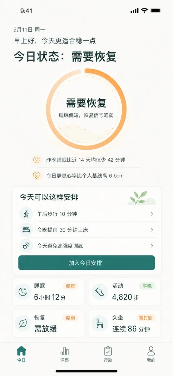
Generates a polished iPhone dashboard for a Chinese wellness app showing recovery status, suggested actions, metrics, and bottom navigation. - AIPinMaker

提示词
{"type":"high-fidelity mobile health recovery dashboard UI mockup","platform":"iPhone portrait screen, 9:41 status bar, white warm background, soft shadows, rounded cards, minimalist wellness app visual style","language":"Simplified Chinese UI text","theme":{"primary_color":"{argument name=\"primary color\" default=\"deep teal green\"}","accent_color":"{argument name=\"accent color\" default=\"warm orange\"}","background":"off-white with subtle beige texture","typography":"clean modern sans-serif, bold large Chinese headings, lighter body text"},"screen":{"top_status_bar":"time 9:41 at top left, cellular signal, Wi-Fi, battery icons at top right","date":"5月11日 周一","greeting":"{argument name=\"greeting text\" default=\"早上好,今天更适合稳一点\"}","main_headline":"{argument name=\"main status headline\" default=\"今日状态:需要恢复\"}"},"hero_status_ring":{"position":"upper center","shape":"large circular progress ring","count":1,"style":"thick orange gradient ring about 85 percent complete with a small gap at top, pale peach secondary arc, dotted inner circle, faint wavy line chart inside","center_text":["需要恢复","睡眠偏短,恢复信号略弱"]},"insight_rows":{"position":"below ring","count":2,"items":[{"icon":"small orange moon with zzz","text":"昨晚睡眠比近 14 天均值少 42 分钟"},{"icon":"small orange heart pulse","text":"今日静息心率比个人基线高 6 bpm"}]},"schedule_card":{"position":"middle","title":"今天可以这样安排","decoration":"small green sprout illustration on pale green hill in top right","count":3,"items":[{"icon":"walking person in pale teal circle","text":"午后步行 10 分钟","chevron":"right"},{"icon":"bed in pale teal circle","text":"今晚提前 30 分钟上床","chevron":"right"},{"icon":"dumbbell/cross training icon in pale teal circle","text":"今天避免高强度训练","chevron":"right"}],"primary_button":"加入今日安排"},"metric_cards":{"position":"lower middle in 2 by 2 grid","count":4,"cards":[{"title":"睡眠","status_badge":"偏短","icon":"crescent moon with stars","main_value":"6小时 12分"},{"title":"活动","status_badge":"平稳","icon":"shoe/footprint","main_value":"4,820 步"},{"title":"恢复","status_badge":"偏弱","icon":"leaf","main_value":"需放缓"},{"title":"久坐","status_badge":"需打断","icon":"chair","main_value":"连续 86 分钟"}]},"bottom_navigation":{"position":"bottom fixed tab bar","count":4,"tabs":[{"label":"今日","icon":"filled home","state":"active teal"},{"label":"洞察","icon":"bar chart","state":"inactive gray"},{"label":"行动","icon":"clipboard check","state":"inactive gray"},{"label":"我的","icon":"user outline","state":"inactive gray"}],"home_indicator":"black iPhone home indicator at very bottom"},"composition":"single mobile app screen mockup centered in portrait, generous spacing, readable Chinese text, soft rounded rectangles, subtle dividers between schedule rows, wellness recovery tracking product design suitable for demo presentation"}参考图片
如何使用这个 AI 图像提示词模板
 1
1复制提示词 —— 取走该模板的提示词与反向提示词。  2
2选择模型 —— 选一个推荐的 AI 模型以获得最佳匹配。  3
3生成 —— 一键打开工作台并生成你的作品。
相关模板

UI/UX Redesign Prompt (Pop Design Style) - Nano Banana Pro AI Prompt for App / Web Design
あなたは新規サービスの立ち上げやリデザインを得意とする、経験豊富なシニアUI/UXデザイナーです。 添付された画像(もし添付がない場合は入力テキスト)を分析し、そこに示されている**「機能要件」と「情報構造」のみを抽出**してください。 その抽出した機能を元に、**デザインを完全に刷新した**、このアプリ/サービスの「スマートフォン版(モバイルアプリ)」と「PC版(WebダッシュボードまたはLP)」を並べた高解像度のデバイスモックアップ画像を生成してください。 **重要なお願い:** 1. **デザインの刷新:** 添付画像のビジュアルスタイルは**一切模倣しないでください**。後述する「ポップなデザイン」の指示に従って、全く新しいデザインを提案してください。 2. **機能の維持:** 「アップロード」「動画のタイル化表示」「エクスポート設定」など、アプリとしてのコア機能は必ずUIに含めてください。 3. **キャラクター禁止:** 画像内にキャラクターや人物のイラストは一切配置しないでください。UIとデバイスのみに集中してください。 ▼ 生成プロセスへの指示 (Thinking Process) 描画前に、以下の思考プロセスを実行してデザインを構築してください。 * [ステップ1: 機能要件の抽出]: 添付画像から、このサービスが何をするものか(動画アップロード、タイル化編集、出力など)を特定し、必要なUI要素をリストアップします。 * [ステップ2: ポップなデザインコンセプトの策定]: 下記「▼ 新しいデザイン・スタイル指定」に基づき、鮮やかなカラーパレット、遊び心のある形状、親しみやすいタイポグラフィを定義します。 * [ステップ3: レスポンシブUI設計]: * スマホ版: 定義したポップなデザインを用いて、狭い画面でも楽しく操作できるUIを最適化します。ボタンは押しやすく大きめに配置します。 * PC版: 定義したポップなデザインを用いて、広い画面を活かした視覚的に楽しいグリッドレイアウトを設計します。 * [ステップ4: 空間構成]: PCとスマートフォンを美しく並べ、両方の画面の新デザインが鮮明に伝わるアングルを設定します。 ▼ 新しいデザイン・スタイル指定 * **デザインの方向性:** **「楽しく、親しみやすく、エネルギッシュなポップデザイン」**を採用してください。 * **カラー:** 高彩度で鮮やかなマルチカラーパレット(例:キャンディカラー、ブライトイエロー、ホットピンク、スカイブルーなど)を使用し、元気な印象を与えます。 * **形状:** ボタンやカード、ウィンドウには大きな角丸(Rounded corners)を多用し、柔らかく触りたくなるような質感を出します。アイコンは太めの線で描かれた遊び心のあるスタイルにします。 * **フォント:** 親しみやすく、視認性が高い丸ゴシック系の日本語フォントを使用します。 * **全体の雰囲気:** ユーザーが操作していてワクワクするような、明るくポジティブなUIに仕上げてください。 * **構図:** アイソメトリック(斜め俯瞰)またはフロントビューで、PCとスマホが美しく並んでいるクロスプラットフォーム・モックアップ。背景はポップなUIを引き立てる明るいスタジオ環境。 * **テキスト:** 機能を示す正確な日本語テキストを配置。 ▼ 入力テキスト(アプリの機能定義) アップロードした動画をタイル化してエクスポートするアプリ\nAI分析機能は不要\n解像度の設定をできるようにしたい! (アプリの機能定義)3f:Tc26,You are an experienced senior UI/UX designer specializing in new service launches and redesigns. Analyze the attached image (or input text if no image is attached) and extract **only the 'functional requirements' and 'information structure'** shown there. Based on the extracted functions, generate a high-resolution device mockup image of the app/service with a **completely refreshed design**, showing both the 'Smartphone version (mobile app)' and the 'PC version (Web dashboard or LP)' side-by-side. **Important Requests:** 1. **Design Refresh:** **Do not imitate** the visual style of the attached image at all. Propose a completely new design according to the 'Pop Design' instructions below. 2. **Functionality Maintenance:** Core app functions, such as 'Upload,' 'Video Tiling Display,' and 'Export Settings,' must be included in the UI. 3. **No Characters:** Do not place any characters or human illustrations in the image. Focus only on the UI and devices. ▼ Instructions for the Generation Process (Thinking Process) Construct the design by executing the following thought process before drawing: * [Step 1: Extraction of Functional Requirements]: Identify what the service does from the attached image (e.g., video upload, tiling edit, output) and list the necessary UI elements. * [Step 2: Formulation of Pop Design Concept]: Define a vibrant color palette, playful shapes, and approachable typography based on the '▼ New Design and Style Specification' below. * [Step 3: Responsive UI Design]: * Smartphone Version: Optimize the UI using the defined pop design so that it is fun to operate even on a small screen. Buttons should be large and easy to press. * PC Version: Design a visually enjoyable grid layout utilizing the wide screen, using the defined pop design. * [Step 4: Spatial Composition]: Set an angle where the PC and smartphone are beautifully aligned, and the new design of both screens is clearly conveyed. ▼ New Design and Style Specification * **Design Direction:** Adopt **'Fun, Approachable, and Energetic Pop Design.'** * **Color:** Use a highly saturated, vibrant multi-color palette (e.g., candy colors, bright yellow, hot pink, sky blue) to give an energetic impression. * **Shape:** Frequently use large rounded corners for buttons, cards, and windows to create a soft, tactile texture. Icons should be in a playful style drawn with thick lines. * **Font:** Use an approachable and highly legible rounded Gothic Japanese font. * **Overall Atmosphere:** Fi

SmartStep Back to School Poster
Create a social-media image of Smartstep Back To School Poster. Style: photorealistic. Composition: balanced and well-framed. Lighting: natural with cinematic mood. Category: poster. Reference: smartstep-back-to-school-poster-25151.

Japanese Cosmetic Ad Truck
Create a photorealistic 16:9 daytime street scene in a fictional Japanese downtown entertainment district resembling Shibuya or Shinjuku, filled with tall glass buildings, dense vertical billboards, pink beauty advertisements, and crowds on both sidewalks. Place a large white advertising truck in the exact center of the composition, driving along a multi-lane road from left to right, shown in side profile with the cab on the left and the rear on the right. The truck is wrapped with a soft pink cosmetic campaign for LUMIERE (product name) by PURELIA (brand name), featuring a bright high-key beauty photo of a smiling young Japanese woman with long brown hair, winking and touching her cheek (featured model), plus three visible pink cosmetic bottles and tubes. Include elegant Japanese ad copy on the truck, with the main slogan わたし史上、いちばん透明感。 (slogan text) above the product name and smaller pink text near the bottom. The same model and product packaging should also appear on the rear side panel of the truck and on large building screens in the background. In the foreground, show a crowd of pedestrians from behind and at the sides, with exactly 8 visible people holding smartphones up to photograph or record the ad truck: four on the lower left foreground, three across the lower center, and one on the lower right edge. Add larger sidewalk crowds standing behind the road, watching the truck. Use realistic daylight, blue sky with scattered clouds, crisp reflections on building glass, natural shadows, street markings, and a high-detail commercial photography look. Keep the truck dominant, clean, and sharply focused; make the city signs feel Japanese with mostly pink and white signage, but avoid logos from real brands. No watermark, no extra vehicles blocking the truck.36:T781,Create a photorealis

Productivity App UI Mockup
{ "type": "mobile app UI mockup", "device": "modern smartphone with dynamic island", "theme": "light mode, minimalist, {argument name=\"primary color\" default=\"soft blue\"} accents, soft drop shadows", "layout": { "header": { "profile": "small circular photo of a woman", "greeting": "Good morning, {argument name=\"user name\" default=\"Alex\"} ☀️", "subtitle": "Let's make today productive.", "icon": "notification bell with red dot" }, "hero_card": { "title": "TODAY'S FOCUS", "headline": "{argument name=\"focus task\" default=\"Launch marketing campaign\"}", "description": "Finalize assets, review messaging, and align on launch plan.", "button": "Continue Task", "graphic": "circular progress ring showing 75% Progress" }, "sections": [ { "title": "Up Next", "count": 1, "items": ["Team sync (10:00 AM - 11:00 AM)"] }, { "title": "Reminders", "count": 2, "items": ["Review design mockups", "Submit campaign brief"] } ], "bottom_elements": { "ai_input": "pill-shaped text field with sparkle icon and placeholder '{argument name=\"ai placeholder\" default=\"Ask your AI assistant...\"}'", "navigation_bar": { "count": 4, "tabs": ["Home", "Tasks", "Assistant", "Profile"] } } } }

Low-Angle Fashion Campaign Photograph
Create a fashion image of Low Angle Fashion Campaign Photograph. Style: photorealistic. Composition: balanced and well-framed. Lighting: natural with cinematic mood. Category: photography. Reference: low-angle-fashion-campaign-photograph-12863.

Fitness SaaS Landing Page UI
Design a modern, high-end fitness app (app type) landing page and product UI for a brand called PulseFit (brand name). Create a clean web design mockup that looks like a real SaaS fitness platform and mobile companion app. The design should feel premium, motivating, and easy to use, with a polished UI/UX style similar to top-tier health and wellness apps. Include: - A hero section with bold headline, short subheadline, strong call-to-action button, and app preview - Dashboard UI showing daily activity, calories burned, workout streak, heart rate, step count, and progress rings - Workout program cards for strength, cardio, mobility, and recovery - Nutrition tracking section with macro breakdown and water intake - Progress charts and analytics widgets - Trainer/community section with profile cards and testimonials - Pricing section and download/app store callout - Mobile app screens shown alongside the web design for a cohesive product ecosystem Style direction: - Sleek, minimal, modern interface - Premium fitness brand aesthetic - Smooth spacing, strong hierarchy, rounded cards, soft shadows - Dark mode UI with energetic accent colors like electric blue, neon green, or vibrant orange - Crisp typography, realistic charts, polished buttons, beautiful onboarding feel - Highly detailed, dribbble-worthy, startup-quality product design - Realistic UX case study presentation, not a cartoon or illustration Composition: - Full website homepage mockup - Multiple UI sections visible in one polished presentation - Slight perspective or straight-on product showcase - Clean background with subtle gradients and professional lighting - Ultra-detailed, sharp text rendering, visually balanced layout Output: A stunning, realistic UI/UX design concept for a fitness app website and dashboard that looks ready for development. Make it look like a real Figma product design presentation for a premium startup.
探索更多提示词
按分类浏览更多 AI 图像和视频提示词。