文生图
Character Relationship Chart Infographic - Nano Banana Pro AI Prompt for Infographic / Edu Visual — AI 图像提示词
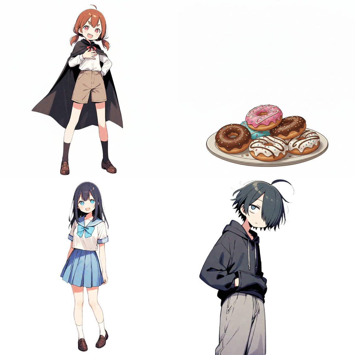
A detailed prompt template for Nano Banana Pro to generate a character relationship chart (相関図) infographic. It requires uploading character images and defining names, roles, and specific relationships, which are then visualized using color-coded arrows (red for positive, blue for negative) in a hand-drawn BD anime illustration style. - AIPinMaker
提示词
# 命令書
添付した画像を参照し、以下の要件に基づいて「キャラクター相関図」のイラストを作成してください。

# 制作スタイル
- 画像のような、手書き風の温かみのあるBDアニメ・イラストスタイル。
- 背景は白。
- キャラクターは円形のアイコンの中に描画し、配置してください。

# キャラクター設定
※アップロードした画像に対応する順序や特徴を記載します。
[キャラクターA]
- 名前: {argument name="キャラクターA 名前" default="ツノちゃん"}
- 役割: {argument name="キャラクターA 役割" default="吸血鬼とのハーフ"}

[キャラクターB]
- 名前: {argument name="キャラクターB 名前" default="しおりちゃん"}
- 役割: {argument name="キャラクターB 役割" default="新しいもの好き"}

[キャラクターC]
- 名前: {argument name="キャラクターC 名前" default="くまお君"}
- 役割: {argument name="キャラクターC 役割" default="いつも眠そう"}
[キャラクターD]
- 名前: {argument name="キャラクターD 名前" default="ドーナツ"}
- 役割: {argument name="キャラクターD 役割" default="ドーナツ"}
(※キャラクターが増える場合はここに追加してください)

# 具体的な関係性リスト

from [A] to [B] : {argument name="AからBへの関係" default="おやつ係"}
from [A] to [C] : {argument name="AからCへの関係" default="下僕1号"}
from [A] to [D] : {argument name="AからDへの関係" default="至高の1品"}
from [B] to [A] : {argument name="BからAへの関係" default="大好き!"}
from [B] to [D] : {argument name="BからDへの関係" default="ライバル?"}
from [C] to [A] : {argument name="CからAへの関係" default="関わりたくない"}
from [C] to [B] : {argument name="CからBへの関係" default="不憫"}
from [C] to [D] : {argument name="CからDへの関係" default="ドーナツだな…"}
(※関係性が増える場合はここに追加してください)
# 関係性と矢印のルール(重要)

キャラクター間を矢印で繋ぎ、以下の色分けルールを厳守してください。
- ポジティブな関係(好き、憧れ、協力など)

- 色: 赤 (Red)
- 雰囲気: 温かい色味、ハートやキラキラなどを含めても良い。
- ネガティブな関係(嫌い、敵対、迷惑など)

- 色: 青 (Blue)
- 雰囲気: 冷たい色味、ギザギザや冷や汗などを含めても良い。
# 出力時の注意点

- レイアウトはキャラクターが増えてもバランス良く円形や階層状に配置してください。
- 各キャラクターのアイコンの下に名前と役割を記載してください。
- 矢印の近くに関係性の説明テキストを配置してください。
- 関係性が設定されていない場合は矢印とテキストは不要です。
- アスペクト比: 16:93f:T9a9,# Instructions
Refer to the attached image and create an illustration of a "Character Relationship Chart" based on the following requirements.

# Production Style
- A warm, hand-drawn BD anime illustration style, similar to the image.
- White background.
- Characters should be drawn and placed inside circular icons.

# Character Settings
*List the order and characteristics corresponding to the uploaded images.
[Character A]
- Name: {argument name="Character A Name" default="Tsuno-chan"}
- Role: {argument name="Character A Role" default="Half-vampire"}

[Character B]
- Name: {argument name="Character B Name" default="Shiori-chan"}
- Role: {argument name="Character B Role" default="Loves new things"}

[Character C]
- Name: {argument name="Character C Name" default="Kumao-kun"}
- Role: {argument name="Character C Role" default="Always sleepy"}
[Character D]
- Name: {argument name="Character D Name" default="Donut"}
- Role: {argument name="Character D Role" default="Donut"}
(*Add more characters here if necessary)

# Specific Relationship List

from [A] to [B] : {argument name="Relationship A to B" default="Snack provider"}
from [A] to [C] : {argument name="Relationship A to C" default="Minion No. 1"}
from [A] to [D] : {argument name="Relationship A to D" default="Supreme item"}
from [B] to [A] : {argument name="Relationship B to A" default="Love!"}
from [B] to [D] : {argument name="Relationship B to D" default="Rival?"}
from [C] to [A] :参考图片

如何使用这个 AI 图像提示词模板
 1
1复制提示词 —— 取走该模板的提示词与反向提示词。  2
2选择模型 —— 选一个推荐的 AI 模型以获得最佳匹配。  3
3生成 —— 一键打开工作台并生成你的作品。
相关模板

GPT Image 2 Manga Planning Infographic
Goal: Create a vertical Japanese manga-style educational infographic about planning a comic before making it with GPT Image 2 (tool name). The main headline should read 「GPT Image 2で 漫画を作る前に決めること」 with 「決めること」 emphasized in yellow, and the subtitle should read 「いきなり作らず、まず“誰に何を伝えるか”を決めよう!」. Canvas: Portrait 2:3 infographic, clean white background, bright blue accent color, thick rounded comic-panel borders, cheerful instructional tone, polished digital anime illustration. Use large readable Japanese typography with blue, black, yellow, and red emphasis. Add small sparkle and motion-line decorations near the title. Layout: Arrange exactly 6 numbered manga panels in a 2-column grid, numbered with blue circles 1 through 6 in the upper-left corner of each panel, followed by one wide bottom summary box. Panel 1: A young male student in a blue hoodie sits at a wooden desk with a laptop that has a cat sticker, a notebook, and a pen. He looks confused with a scribble above his head and a question mark. Add a speech bubble: 「漫画を作りたいけど…何から?」. His face is covered by a soft beige rectangular blur. Panel 2: The same boy worries at a cluttered desk covered with papers. Around him float exactly 5 planning sheets or sticky notes labeled: 「キャラ」, 「背景」, 「色」, 「セリフ」, and 「効果・演出 コマ割り…」. Add a speech bubble: 「先に絵柄を決めるの?」. Panel 3: A young female teacher/advisor in a yellow cardigan holds a checklist and raises one finger, standing against a warm yellow radial burst background. Her face is covered by a soft beige rectangular blur. Add a speech bubble: 「まず中身を決めよう!」. The checklist title reads 「チェックリスト」 and shows three checked boxes. Panel 4: A clean list card titled 「この5つで整理!」. Show exactly 5 colored rows with matching icons and labels: 1 「誰に?」 with a people icon and note 「ターゲット・読者」; 2 「何を?」 with a pencil icon and note 「伝えたいテーマ・内容」; 3 「どう感じて?」 with a heart icon and note 「読後の気持ち・目的」; 4 「どんな雰囲気?」 with sparkles icon and note 「トーン・世界観・絵柄」; 5 「どこまで?」 with a flag icon and note 「コマ数・尺・伝える範囲」. Panel 5: The boy is now smiling and writing, with sketches and sticky notes on the wall. Add a speech bubble: 「テーマが決まると楽!」. Include a paper titled 「設計メモ」 with exactly 5 checklist items corresponding to the same five questions: 「誰に?」, 「何を?」, 「どう感じて?」, 「どんな雰囲気?」, 「どこまで?」. Panel 6: The boy in the blue hoodie and the female advisor in the yellow cardigan stand together happily. The boy's face is covered by a soft beige rectangular blur. The advisor holds a storyboard sheet labeled 「1ページ漫画の設計図(6コマ)」 containing exactly 6 small storyboard thumbnails numbered 1 to 6. On the right, place a large yellow starburst speech shape reading 「最初はプロンプトより設計!」 with 「設計!」 in large red letters. Bottom summary box: A wide rounded rectangle with a blue ribbon label 「まとめ」. Divide it into exactly 3 columns with blue check icons. Column 1 text: 「誰に向けるか決める」 with a people icon. Column 2 text: 「伝えたいことを1つに絞る」 with a pencil icon. Column 3 text: 「作る前に設計する」 with a lightbulb icon. Visual style: Friendly Japanese educational manga infographic, crisp line art, soft shadows, expressive anime characters, simple school/desk props, blue and yellow highlight palette, high legibility, balanced spacing, no photorealism. Constraints: Use exactly 6 main panels, exactly 5 planning questions in the list, exactly 3 bottom summary points, and keep all visible text in Japanese as specified. Do not add extra panels, extra checklist rows, watermarks, logos, or unrelated text.39:T105b,Goal: Create a vertical Japanese manga-style educational infographic about planning a comic before making it with GPT Image 2 (tool name). The main headline should read 「GPT Image 2で 漫画を作る前に決めること」 with 「決めること」 emphasized in yellow, and the subtitle should read 「いきなり作らず、まず“誰に何を伝えるか”を決めよう!」. Canvas: Portrait 2:3 infographic, clean white background, bright blue accent color, thick rounded comic-panel borders, cheerful instructional tone, polished digital anime illustration. Use large readable Japanese typography with blue, black, yellow, and red emphasis. Add small sparkle and motion-line decorations near the title. Layout: Arrange exactly 6 numbered manga panels in a

Manga Style Brand Identity Infographic
使用上传的标志,创建一张高度细节化的漫画风信息图海报: ⸻ 《这个品牌的感觉是什么》 目标(GOAL): 将品牌转化为一个“活着的个体”,并通过视觉方式展示它如何行为、说话以及与世界互动。 整体感觉应融合:品牌策略 + 角色设计 + 漫画叙事 ⸻ 核心规则(CORE RULE): 所有内容必须来源于Logo本身: 颜色 风格 语气 个性 ❌ 不允许使用通用、泛化的人格描述 ⸻ 主要结构(MAIN STRUCTURE): 竖版 4:5 海报 (布局) 信息密集,多面板布局 漫画 + 信息图混合风格 (风格) ⸻ 顶部区域(TOP SECTION): 品牌名称 简短个性声明(最多6个词) 示例: “安静的自信,锋利的边界” ⸻ 主角色(MAIN CHARACTER|非常重要): 创建一个代表品牌的核心角色: 品牌的人格化形象 服装体现品牌风格 姿态与表情体现个性 ⸻ 角色周围(AROUND THE CHARACTER): 设计 6–8个漫画分镜,展示品牌在不同情境下的行为。 ⸻ 情境示例(SCENARIO IDEAS): 与客户交流 面对竞争对手 销售产品 社交媒体表现 面对批评 日常“品牌生活”瞬间 ⸻ 每个分镜需包含(FOR EACH PANEL): 简短标题(最多6个词) 对话气泡或内心独白 清晰的视觉动作 ⸻ 语气示例(TONE EXAMPLES): 奢侈品牌:冷静、自信、语言简洁 活泼品牌:夸张、混乱、表达丰富 科技品牌:精准、理性、干净 ⸻ 人格特征模块(PERSONALITY TRAITS SECTION): 用小模块展示: 语气风格(如:冷静 / 大胆 / 玩味) 能量水平(低 / 中 / 高) 社交属性(内向 / 外向) 沟通方式 使用: 图标 简短标签 ⸻ DO / DON’T 模块: 分成两个区域: DO(应该): 品牌应有的行为 DON’T(避免): 破坏品牌形象的行为 ⚠️ 保持极简短表达 ⸻ 视觉元素(VISUAL ELEMENTS): 对话气泡 图标 箭头 小反应表情 夸张漫画表情 ⸻ 风格(STYLE): 漫画 + 编辑设计混合 略带夸张,但保持高级感 表达丰富但不幼稚 ⸻ 配色(COLOR): 严格基于 Logo 的配色 用颜色强化品牌个性 ⸻ 层次与细节(DEPTH): 20–40个视觉元素 多个小分镜 分层构图 ⸻ 重要规则(IMPORTANT RULES): 必须“有生命感” 必须具体、有辨识度 ❌ 不使用泛化营销语言 ❌ 不留空白区域 文案短但有冲击力 ⸻ 最终效果(FINAL FEEL): 应像: 一个被角色化的品牌策略 一块视觉叙事板 让人愿意收藏与研究的作品 而不是: 平面、单调 泛化、无个性 极简空洞3b:T491,Using the uploaded logo, create a highly detailed manga-style infographic poster: Title: "What This Brand Feels Like" Goal: Transform the brand into a "living individual" and visually demonstrate how it acts, speaks, and interacts with the world. Fusion: Brand Strategy + Character Design + Manga Storytelling Core Rule: All content must derive from the logo itself (colors, style, tone, personality). No generic personality descriptions. Structure: Vertical 4:5 poster (layout), information-dense multi-panel layout, manga + infographic hybrid style (style). Main Character: Create a core character representing the brand's personification. Clothing, posture, and expression must reflect the brand identity. Panels: 6–8 manga panels showing behaviors in scenarios like customer interaction, handling competition, or social media presence. Traits: Modular sections showing tone style, energy level, and communication methods using icons. Do/Don't: Visual guide on brand-consistent vs inconsistent behaviors. Final Feel: Should look like a personified brand strategy board worth collecting, not flat or generic.10:["$","main",null,{"className":"-mt-14 bg-[#F8F3EA] pt-14 text-[#211D16]","children":[["$","div",null,{"className":"mx-auto grid max-w-[1360px] grid-cols-1 gap-8 px-6 pb-2 pt-6 md:px-12 md:pt-8 lg:grid-cols-[minmax(0,1.35fr)_minmax(340px,0.65fr)] lg:gap-10","children":["$","div",null,{"className":"min-w-0","children":["$","nav",null,{"aria-label":"Bre

Visual Novel Screenshot Mockup
A visual novel screenshot of an anime-style classroom scene featuring exactly four high school girls in matching uniforms consisting of grey blazers, white shirts, red ribbons, and blue skirts. On the far left, a girl with short coral hair and a red bow looks excited with clenched fists. Next to her, a girl with long dark purple hair holds a red book with a gentle smile. Beside her, a girl with short pink pigtails and a red hairclip stands with crossed arms looking slightly grumpy. On the far right, a girl with long brown hair in a ponytail and a large white bow leans forward on a desk, smiling and talking. The classroom features a window on the right, a bulletin board on the left, and a foreground desk holding exactly three items: a notebook, a pink book, and a pen. On the back wall is a single poster reading Just Monika. ♥ (poster text). In the top left corner is a circular pastel logo reading Doki Doki Literature Club! (game title) decorated with a green pencil and a pink heart. At the bottom of the screen is a pink polka-dot visual novel dialogue box. The name tag reads Monika (speaker name) and the main dialogue text reads 'Welcome to the Literature Club!' 'It's a pleasure to meet you all!' ♥ (dialogue text). Below the dialogue is a menu row reading 'History Skip Auto Save Load Settings'.38:T

Hand-Drawn Character Sticker Sheet Prompt
Create a anime image of Hand Drawn Character Sticker Sheet Prompt. Style: photorealistic. Composition: balanced and well-framed. Lighting: natural with cinematic mood. Category: anime. Reference: hand-drawn-character-sticker-sheet-prompt-22720.

Anime Character Reproduction Cheat Sheet
{"type":"hand-drawn anime character reproduction cheat sheet for consistent LINE sticker generation","overall_style":"clean white paper reference sheet, black hand-drawn panel borders, casual marker-like Japanese handwriting, soft flat colors, simple manga line art, friendly and slightly plain design, educational layout, no background decoration","page_text":{"main_title":"キャラクター再現チートシート","subtitle":"キャラクターおよびトンマナ再現用 / 一貫性維持のための設定資料"},"character":{"name":"{argument name=\"character name\" default=\"unnamed friendly girl\"}","age_impression":"young adult or teenage girl, approachable and ordinary","hair":{"color":"{argument name=\"hair color\" default=\"warm light brown\"}","style":"short bob hair with front bangs, rounded silhouette, tucked slightly around the ears"},"face":"round facial outline, small simple eyes and mouth, gentle expression, minimal facial detail","outfit":"{argument name=\"outfit\" default=\"plain white T-shirt and blue jeans\"}","tone":"simple, thick lines, modestly plain, relatable, not overly decorative"},"layout":{"format":"single vertical A4-style sheet divided into seven numbered boxed sections with colored circled numbers","sections":[{"number":"①","title":"メインキャラ情報","position":"top left","count":1,"contents":"large bust portrait of the main character on the left; bullet notes on the right","visible_bullets":["ショートボブヘア","前髪あり","丸い輪郭","小さくてシンプルな目と口","親しみやすくて共感しやすい","ちょっと不器用で素直な雰囲気","派手さはなく飾らない印象"]},{"number":"②","title":"いろいろな角度","position":"top right","count":4,"labels":["正面","斜め(3/4)","横顔","少し上向き"],"contents":"four head-and-shoulder angle examples showing front view, three-quarter view, side profile, and slightly upward-looking smiling view"},{"number":"③","title":"表情パターン(6種)","position":"middle full width","count":6,"labels":["通常の笑顔","困り顔","礼儀正しい笑顔","少しパニック","無表情","ほっとした顔"],"contents":"six small head portraits in a row, each with a different simple facial expression"},{"number":"④","title":"ポーズ・動きミニ(再現用サンプル)","position":"lower left middle","count":4,"labels":["立ち姿","座り","軽く手を上げる","少し首をかしげる"],"contents":"four small full-body pose samples: standing, sitting cross-legged, waving lightly, and tilting head with a question mark"},{"number":"⑤","title":"デザインポイントメモ","position":"lower right middle","count":5,"visible_bullets":["髪:ショートボブ、前髪あり、丸みを意識","顔:丸い輪郭、小さめの目と口","雰囲気:親しみやすい、素直、やわらかい","線:太め・均一めを基本","描き込み:最小限、シンプルに","トンマナ:不器用さと親しみを感じる雰囲気"]},{"number":"⑥","title":"NGパターン(避ける方向)","position":"bottom left","count":6,"labels":["messy gloomy hair covering face","too glamorous sparkling hair","rear view only","too polished idol-like smile","body proportions too tall and realistic","chibi proportions too childish"],"contents":"six incorrect direction examples marked with black X symbols above each sample"},{"number":"⑦","title":"この方向で描く","position":"bottom right","count":1,"contents":"final approved close-up smiling face with green check list","visible_checklist":["シンプル","太い線","ちょっと不器用","親しみ重視","丸みを意識","トンマナ重視"]}]},"rendering_instructions":"Create a complete readable Japanese reference sheet matching the structure above. Use colored circled section numbers 1 through 7, black rectangular panel dividers, hand-lettered Japanese text, and small consistent drawings of the same character throughout. Keep the artwork simple, warm, and sticker-friendly. The sheet should feel like a practical consistency guide for reproducing one character across many LINE stickers.","custom_text":"Use the main title {argument name=\"headline text\" default=\"キャラクター再現チートシート\"} and keep all section labels visible and legible."}

Japanese Salaryman Character Sheet
Goal: Create a clean anime-style male character design sheet for a modern Japanese office worker, with the character's face intentionally obscured by a soft square blur in every portrait. Canvas: Wide horizontal character-reference sheet on a white background, approximately 16:9. Use thin black divider lines, neat Japanese editorial layout, and muted professional colors. Layout: Place a left information column, three full-body character views across the center, and a right detail column. The overall look should resemble a polished commercial character settings document. Left information column: At the top, draw a bordered profile card with exactly 4 labeled rows: name, occupation, height, and weight. Use Japanese text for the visible labels and values: 「名前: 高橋深月 (character name)」 with small furigana above the name and “(Takahashi Mizuki)” underneath, 「職業: サラリーマン」, 「身長: 182cm」, 「体重: 68kg」. Below it, add a section titled 「キャラクター設定」 with exactly 4 bullet points describing him as a salaryman in his late twenties, calm and intellectual with a strong sense of responsibility, serious and trusted at work, and clean-looking with a trustworthy impression. At the bottom, add a section titled 「カラー設定」 with exactly 5 color swatches: hair light brown #8B6F5E, eyes brown #5A3E2B, suit gray #646A70, shirt white #FFFFFF, tie/shoes/belt black #111111. Center character views: Show exactly 3 full-body views of the same man wearing a fitted gray business suit: left side view labeled 「側面図」, center front view labeled 「正面図」, and right back view labeled 「背面図」. The man is tall and slim, with light-brown center-parted hair, a white dress shirt, black slim tie with a tie pin, gray notch-lapel jacket, matching slim straight trousers with center crease, black belt, black dress shoes, and a simple analog wristwatch. In the side view, show one hand in pocket and a relaxed upright posture. In the front view, show one hand in pocket and the other relaxed at his side. In the back view, show the suit jacket seams and clean tapered silhouette. Center annotation callouts: Add thin leader lines and Japanese labels pointing to the outfit and traits. Include callouts for hairstyle, expression, suit, necktie, pants, and shoes. The hairstyle note should describe a center part with naturally flowing hair; the expression note should describe a calm and slightly smiling trustworthy impression; the suit note should describe a crisp fitted silhouette; the necktie note should describe a black solid tie with tie pin; the pants note should describe slim straight slacks with a center crease; the shoes note should describe black straight-tip dress shoes. Right detail column: Title the column 「ディテール」. Include exactly 4 rectangular detail panels stacked vertically: 1) close-up head and hair with blurred face, 2) close-up chest showing lapels, shirt, tie, tie pin, and pocket square, 3) close-up sleeve cuff and simple analog watch, 4) close-up fabric texture swatch. Add Japanese bullet notes beside these panels: bangs are center-parted and flow naturally, hair has neat straight texture, eyes are calm and composed, jacket has notch lapels and a pocket square, sleeves show four real buttons, watch is a simple analog type, fabric is a high-quality wool-blend suit material suitable for spring, autumn, and winter. Bottom-right notes: Add a small bordered box titled 「備考」 with exactly 3 bullet points emphasizing cleanliness and trustworthiness, a basic refined business-suit style, and a simple but polished design. Visual style: Semi-realistic anime illustration, clean line art, soft cel shading, realistic suit folds, elegant muted palette, magazine-like Japanese character sheet design, crisp legible typography, no decorative background, no watermark.39:Tf5b,Goal: Create a clean anime-style male character design sheet for a modern Japanese office worker, with the character's face intentiona
探索更多提示词
按分类浏览更多 AI 图像和视频提示词。