Text to Image
Yohaku Coffee Brand Materials Board — AI Image Prompt
Creates a refined flat-lay brand identity board for a minimalist Japanese coffee shop, useful for cafe merchandise, packaging, and visual identity presentations. - AIPinMaker
Prompt
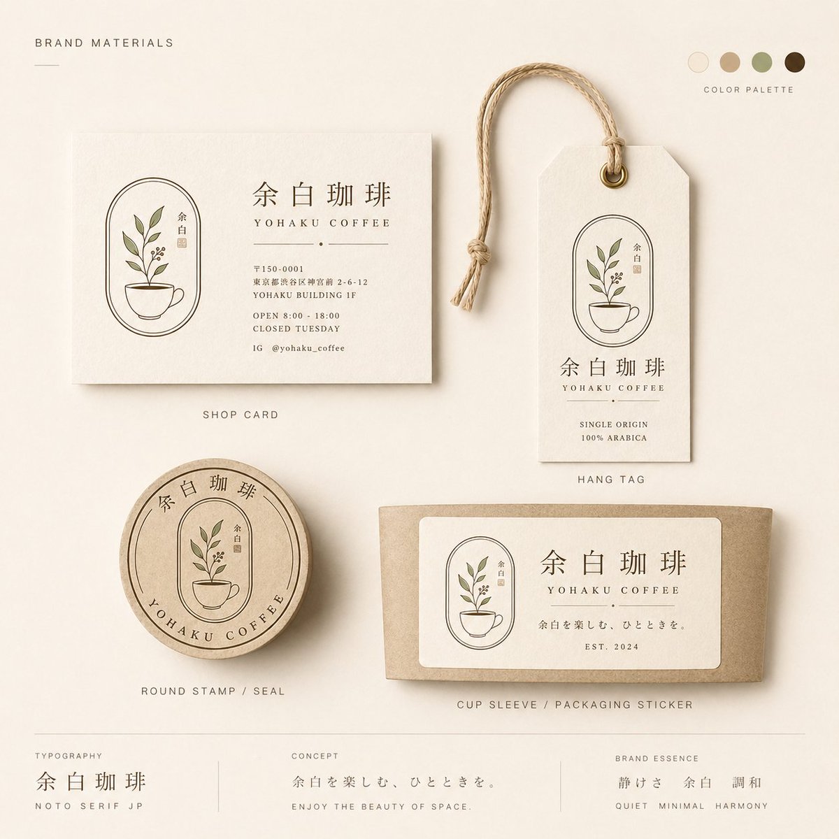
{"type":"minimal Japanese cafe brand materials flat lay and identity board","brand":{"name":"{argument name=\"brand name\" default=\"余白珈琲\"}","romanized_name":"{argument name=\"romanized brand name\" default=\"YOHAKU COFFEE\"}","concept_line":"{argument name=\"concept line\" default=\"余白を楽しむ、ひとときを。\"}","english_concept":"ENJOY THE BEAUTY OF SPACE.","aesthetic":"quiet, minimal, harmonious, warm Japanese wabi-sabi cafe branding for a fictional coffee shop in Nakameguro, Tokyo","logo_motif":"thin oval arch emblem containing a small potted coffee plant with green leaves and berries, plus a tiny vertical name seal"},"canvas":{"format":"square editorial presentation board","background":"warm ivory handmade paper texture with soft natural shadows","lighting":"diffused daylight from upper left, realistic paper texture, subtle depth, premium stationery mockup photography","composition":"top-down flat lay with carefully spaced objects and small uppercase captions"},"color_palette":{"position":"top right","count":5,"swatches":["warm ivory","light kraft beige","muted sage olive","tan khaki","dark roasted coffee brown"],"label":"COLOR PALETTE"},"layout":{"top_left_heading":"BRAND MATERIALS","sections":[{"title":"SHOP CARD","position":"upper left","count":1,"description":"cream rectangular business/shop card with the oval plant logo on the left and brand text on the right; includes large Japanese brand name, romanized name, a small dot divider, address text, hours, closed day, and Instagram handle","visible_text":["余白珈琲","YOHAKU COFFEE","〒150-0001","東京都渋谷区猿楽町 2-6-12","YOHAKU BUILDING 1F","OPEN 8:00 - 18:00","CLOSED TUESDAY","IG @yohaku_coffee"]},{"title":"HANG TAG","position":"upper right","count":1,"description":"vertical cream merchandise tag with clipped top corners, brass eyelet, looped natural jute string, oval plant logo, large Japanese brand name, romanized name, and small product copy","visible_text":["余白珈琲","YOHAKU COFFEE","SINGLE ORIGIN","100% ARABICA"]},{"title":"ROUND STAMP / SEAL","position":"lower left","count":1,"description":"round kraft paper seal or stamp with circular border, curved Japanese brand name at top, curved romanized brand name at bottom, and the potted plant logo centered"},{"title":"CUP SLEEVE / PACKAGING STICKER","position":"lower right","count":1,"description":"horizontal kraft coffee cup sleeve mockup with a large rounded-rectangle cream sticker; sticker contains the logo on the left, large Japanese brand name, romanized name, concept line, and establishment date","visible_text":["余白珈琲","YOHAKU COFFEE","余白を楽しむ、ひとときを。","EST. 2024"]},{"title":"TYPOGRAPHY","position":"bottom left","count":1,"description":"small footer typography sample separated by thin vertical divider","visible_text":["TYPOGRAPHY","余白珈琲","NOTO SERIF JP"]},{"title":"CONCEPT","position":"bottom center","count":1,"description":"small footer concept statement separated by thin vertical dividers","visible_text":["CONCEPT","余白を楽しむ、ひとときを。","ENJOY THE BEAUTY OF SPACE."]},{"title":"BRAND ESSENCE","position":"bottom right","count":1,"description":"small footer brand essence keywords in Japanese and English","visible_text":["BRAND ESSENCE","静けさ 余白 調和","QUIET MINIMAL HARMONY"]}],"total_labeled_sections":7,"discrete_brand_material_items":4,"footer_info_blocks":3},"style":{"rendering":"photorealistic premium brand presentation mockup with delicate printed ink, realistic paper fibers, embossed-looking stationery shadows, restrained Japanese typography","typography":"elegant Noto Serif JP style for Japanese text, small spaced uppercase sans-serif for English labels","mood":"calm, refined, artisanal, boutique cafe merchandise identity"},"constraints":"Keep the entire design minimal and balanced; use thin line art, muted botanical greens and coffee browns; preserve Japanese text exactly where specified; avoid clutter, bright colors, people, hands, or extra objects."}Prompt breakdown
- Subject
- minimal Japanese cafe brand materials flat lay and identity board for Yohaku Coffee with shop card, hang tag, round stamp, and cup sleeve sticker
- Style
- photorealistic premium brand presentation mockup with delicate printed ink, realistic paper fibers, embossed-looking stationery shadows, and restrained Noto Serif JP typography
- Lighting
- diffused daylight from upper left creating subtle depth and natural shadows on the textured ivory paper
- Composition
- top-down flat lay with carefully spaced objects, small uppercase captions, and labeled sections for brand materials, typography, concept, and essence
- Mood
- calm, refined, artisanal boutique cafe identity emphasizing quiet minimal harmony
Remix ideas
- swap the brass eyelet and jute string on the hang tag for a simple washi tape loop
- move the round stamp to overlap the lower edge of the shop card while keeping the plant motif aligned
- replace the muted sage olive swatch with a deeper matcha green while preserving the roasted coffee brown and ivory base
Reference images
How to use this AI Image prompt template
 1
1Copy the prompt — grab this template’s prompt and negative prompt.  2
2Pick a model — choose a recommended AI model for the best match.  3
3Generate — open the studio with one click and create your result.
Related templates

Luxury Pink Chocolatier Gift Box
Create a luxurious pastel pink limited-edition chocolate gift box product photo for Hana na chan (character name). The scene is a dreamy, romantic flat-lay/angled close-up on a lace-covered table with soft warm studio lighting, shallow depth of field, pearl and satin accents, and an elegant rose-gold and blush color palette. Show an open rectangular chocolatier box: the upper lid fills the top half and is printed like a premium keepsake package with ornate thin gold border lines, delicate cherry-blossom clusters in the corners, and a large portrait-style photo of a cute young girl with a short pale-blonde bob haircut, a pink flower hair clip, a white blouse with tiny pink floral embroidery and lace collar, black suspenders, and one arm raised making a peace sign; place a simple opaque square privacy mosaic over the face. On the lid, include refined gold typography reading "花奈ちゃん" with a small blossom mark, "HANA NA CHAN", "ÉDITION LIMITÉE", and "CHOCOLAT DE RÊVE". Add a large satin bow at the upper right of the lid with dangling gold charm beads and a small flower ornament. The lower half of the box contains exactly 10 chocolates arranged in a 2-by-5 grid in individual dark brown fluted cups inside glossy gold compartments: 1 pink flower-shaped chocolate with a gold center, 2 faceted ruby-pink heart gem chocolate, 3 cream round ridged chocolate topped with a small pink flower, 4 pink rose-swirl chocolate, 5 dark round chocolate dusted with fine gold sprinkles, 6 square milk chocolate engraved with floral line art, 7 round pink striped chocolate with white drizzle and tiny sprinkles, 8 faceted blush-pink dome chocolate, 9 square dark chocolate engraved with a gold bee or floral motif, 10 pale pink heart chocolate with pearly sheen. Around the box, include soft props: lace fabric, pale pink flower petals, a small cream gift card at lower left with cursive "Hana na chan" and Japanese-style decorative text, a vintage gold mirror edge, pearls, and pink ribbon. Style should look like a high-end Japanese kawaii chocolatier advertisement, photorealistic but slightly fantasy-polished, with crisp packaging details, embossed textures, metallic gold accents, delicate blossoms, and no extra chocolates or extra text beyond the specified lettering.38:T908,Creat

Minimalist Food Illustration and Photorealism Blend
Create a creative image of Minimalist Food Illustration And Photorealism Blend. Style: photorealistic. Composition: balanced and well-framed. Lighting: natural with cinematic mood. Category: photography. Reference: minimalist-food-illustration-and-photorealism-blend-12509.

Editable Matcha Banner in PowerPoint
Goal: Create a realistic desktop screenshot of Microsoft PowerPoint in Japanese, showing an editable banner advertisement design for a matcha drink. The scene should look like the banner is being built from separate selectable PowerPoint objects, with many resize handles, rotation icons, and bounding boxes visible. Canvas: 16:9 widescreen screenshot, approximately 1200×675 px, with the full PowerPoint application window visible. Use a light gray Windows/Office interface, Japanese ribbon labels, one slide thumbnail on the left, the main slide centered, status bar at the bottom, and a zoom level around 107%. PowerPoint interface: Show the Home tab active with Japanese menu items across the top such as File, Home, Insert, Draw, Design, Transitions, Animations, Slide Show, Record, Review, View, Help, plus contextual Shape Format and Picture Format tabs. Include a search box near the top, a red Share button at top right, and a single slide thumbnail in the left navigation pane. The filename area should suggest a saved presentation named similar to “premium_editable_matcha_banner”. Main slide layout: The slide itself is a premium café banner split into two visual halves. The left half is a cream paper-like advertisement panel over a warm blurred café/table background, and the right half is a close-up photo of an iced matcha latte in a clear glass on a wooden tray, with soft natural window light, green leaves above, a bamboo whisk in the background, and warm brown tones. Add a subtle vertical division between the cream text panel and the photo. Use a dark green, cream, beige, and warm wood color palette. Visible editable objects: Show many individual PowerPoint selection boxes and handles on the banner, as if almost every text box, line, shape, icon, and photo is selected or editable. Include white circular resize handles, rotation arrows, thin gray bounding boxes, and overlapping object outlines. Count and show exactly 13 selected/editable object groups: 1 large slide background/image frame, 1 cream left panel, 1 small brand text group, 1 English subtitle text box, 1 large Japanese headline text group, 1 round dark-green badge, 1 description paragraph text box, 1 price box, 1 green call-to-action button, 1 date text box, 1 limited-quantity text box, 1 store information label on the photo, and 1 small dotted decorative icon group. Text content on the banner: Preserve Japanese text accurately where visible. Brand area: “KISSA AOI” and “SEASONAL CAFE DRINK”. Main headline: “初摘み抹茶の” on the first line and “アイスラテ” on the second line. Round badge: “初夏限定”. Description paragraph: “香り高い抹茶に、きなこの余韻。涼やかな苦みと、やさしい甘さを一杯に。” Price: “¥680”. CTA button: “近くの店舗を見る”. Date: “6.7 SAT - 7.21 MON”. Small note: “数量限定”. Store label over the photo: “青井珈琲 淀屋橋店” and below it “本日 11:00 販売開始”. Design details: Use elegant Japanese typography with a dark forest-green headline, thin decorative horizontal rules around the headline, cream rectangles with fine green borders, rounded dark-green buttons, and small dotted white decorations on green shapes. The badge should be a dark-green circle near the upper right of the cream panel. The store label should be a dark-green rounded rectangle near the bottom right of the drink photo. The overall ad should feel premium, calm, seasonal, and café-like. Customization slots: Use the drink concept as 初摘み抹茶のアイスラテ (drink name), brand as KISSA AOI (brand name), price as ¥680 (price), CTA as 近くの店舗を見る (call to action), and store as 青井珈琲 淀屋橋店 (store name). Constraints: Make it a screenshot of PowerPoint, not a clean exported poster. Keep the editing handles and object outlines highly visible. Do not add extra slides, extra products, watermarks, or unrelated UI panels. Keep the photo realistic and the ad elements editable-looking rather than flattened.39:T1073,Goal: Create a realistic desktop screenshot of Microsoft PowerPoint in Japanese, showing an editable banner advertisement design for a matcha drink. The scene should look like the banner is being built from separate selectable PowerPoint objects, with m

Kawaii Anime Icing Cookie
Create an ultra-detailed kawaii anime-style decorated icing cookie photographed from above on an ornate cream lace doily. The cookie is a single large scalloped rectangular sugar cookie with a golden-brown baked edge and thick glossy royal icing relief, like edible 3D sugar art. The design shows a faceless blonde anime girl (character name) sitting curled up with knees raised, wearing an oversized pastel powder blue (jacket color) jacket decorated with tiny icing flowers, a white shirt, pale cream shorts, and shiny deep blue (boot color) lace-up combat boots with thick soles. Her face is intentionally covered by a plain peach square placeholder, while long pale blonde icing hair flows around it in many piped strands with two braids and small blue flower accents. She holds one vertical transparent-looking icing tube or wand filled with tiny pastel flower and pearl candies. The background icing on the cookie is soft sky blue with glossy pink heart decorations, white sparkle stars, pearl dots, and delicate sugar-bead accents. Use exactly these main decorative counts: 1 seated girl figure, 1 face-covering peach square, 2 long braids, 1 candy-filled vertical wand, 3 visible pink hearts on the blue background plus 1 large central heart, 2 blue boots, and numerous small piped flowers and pearls. Surround the cookie with soft-focus pearls, pink beads, a pale pink satin ribbon bow, and intricate cream lace details. Visual style: macro food photography, pastel colors, glossy royal icing texture, highly dimensional piping, cute handmade confectionery, soft diffused lighting, shallow depth of field, realistic edible cookie materials, vertical 3:4 composition, no text, no watermark.

Luxury Bilingual Tasting Menu Photo
A photorealistic top-down product-style photograph of a single luxury tasting menu printed on bright white textured paper and placed on a dark walnut wooden tabletop, with soft warm ambient lighting and gentle natural shadows. The sheet is portrait orientation, slightly rotated clockwise, occupying most of the frame with clean margins around it. The design is an ultra-minimal fine-dining menu with elegant editorial typography, lots of negative space, precise alignment, and a refined black-and-dark-gray ink palette. At the upper left, the restaurant identity appears in 3 stacked lines: a large serif word Silence (restaurant name), below it 2 Chinese characters "沈默", and below that a large serif French line "Le Silence". Under the title is a small location line reading "Ginza, Tokyo B3F". At the upper right is a small date line in French followed by Japanese date text: 22 Avril 2026 • 令和八年四月二十二日 (date text). The main body is organized into 3 vertical content zones: a left numbered course list, a middle translated course list, and a far-right icon column. The left list contains exactly 9 numbered courses labeled 1 through 9, each with French title and Japanese subtitle and an English ingredient line beneath; the 9 visible course titles are: "Huître de Bretagne, eau de mer", "Daurade de Kyoto, pétale de sakura", "Oursin d’Hokkaidō, consommé d’algue", "Asperge de Nemuro, sauce mousseline", "Homard de Miyako, bisque légère", "Canard de Challans, figue et balsamique", "Boeuf de Kagoshima, truffe noire", "Fromage de chèvre, miel du Japon", and "Agrume, thé vert et gin". The middle list repeats the 9 dishes in a second compact column with French titles and Japanese descriptions. The far-right column contains exactly 9 horizontal icon rows aligned to the courses, each row showing small monochrome hand-drawn ingredient or allergen pictograms; some rows have 2 icons and some 3, for a total of 19 icons overall. Near the lower left is a section titled "Le mot du chef" followed by a short French paragraph in small serif text. Below that is a section titled "Origine des ingrédients / 食材の産地" with a dense 2-row ingredient-origin grid listing exactly 15 numbered origin entries in tiny text. In the lower right quadrant, include a small label "Chef" above a large sweeping handwritten signature reading Keiichiro Aoyama (chef name). Along the very bottom edge is a thin horizontal rule and a centered allergen legend line with exactly 7 small outline icons and labels: shellfish, crustaceans, egg, fish, milk, gluten, sulfites, each labeled in French with Japanese beneath. The overall impression should be high-end Michelin-style menu design, editorial restraint, immaculate spacing, subtle paper grain, sharply legible text hierarchy, and realistic photography rather than a flat scan.3a:Tb75,A photorealistic top-down product-style p

Healthy Breakfast Flat-Lay Ad Poster
Create a premium healthy breakfast flat-lay advertising poster for [BRAND NAME] (brand name) in a monochrome flavor-inspired color palette (color palette). TOPIC: Healthy breakfast / oats / chia seeds / granola / organic wellness food (topic) STYLE: Flat-lay healthy-food commercial photography Modern nutrition infographic aesthetic Premium wellness branding Instagram lifestyle campaign style Minimal colorful composition Soft playful typography Behance-quality FMCG advertising MAIN SUBJECT: Realistic product packaging centered prominently Flat lay top-view composition Ingredients surrounding the package naturally Realistic food textures and premium commercial styling Ingredient storytelling around the product LAYOUT: Symmetrical ingredient arrangement Infographic arrows and ingredient labels Spacious monochrome background matching the flavor theme Large playful headline typography at the top Clean editorial hierarchy TEXT: Main title: “[HEALTHY BREAKFAST MESSAGE]” Supporting labels: Natural Energy Fiber Rich Organic Wellness Superfood Boost LIGHTING: Bright soft studio lighting Realistic food highlights Clean commercial shadows Fresh premium breakfast atmosphere EXTRA DETAILS: Scattered oats, seeds, fruits, or powders Minimal wellness doodles Clean infographic nutrition layout COLOR PALETTE: One dominant monochrome flavor-inspired color Natural ingredient tones Soft healthy contrast palette Premium modern wellness aesthetic OUTPUT: Ultra-realistic food rendering Premium breakfast campaign poster Ultra-high resolution Clean modern advertising finish3a:T
Explore more prompts
Browse more AI image and video prompts by category.
FAQ
- Which exact address and hours appear on the cream shop card?
- The card shows 〒150-0001 東京都渋谷区猿楽町 2-6-12 YOHAKU BUILDING 1F with OPEN 8:00 - 18:00 CLOSED TUESDAY and IG @yohaku_coffee.
- What typography distinction is used between Japanese and English elements?
- Japanese text follows elegant Noto Serif JP while English labels and captions use small spaced uppercase sans-serif.