Text to Image
Retro Namba Osaka Travel Poster — AI Image Prompt
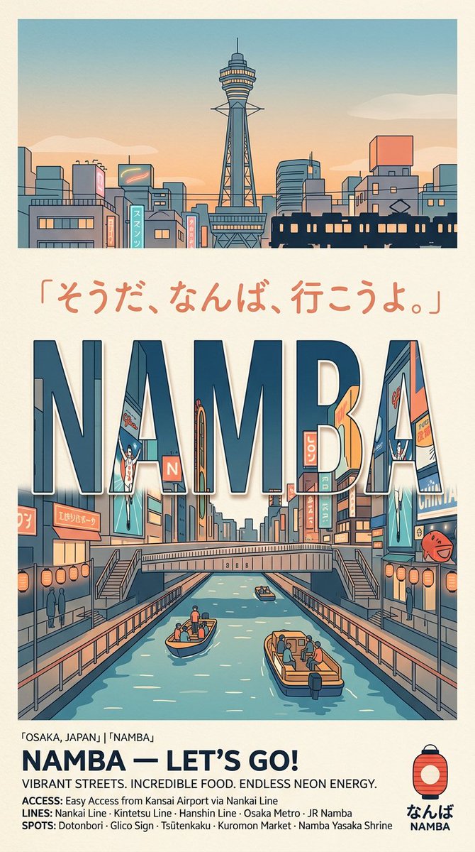
A structured prompt for generating a nostalgic illustrated Japanese travel poster featuring Namba, Osaka, neon canals, skyline, and tourism footer text. - AIPinMaker
Prompt
Goal: Create a retro illustrated travel poster promoting {argument name="destination" default="Namba, Osaka, Japan"}, with a clean Japanese tourism-board feel, warm nostalgia, and bold typography.

Canvas: Vertical poster in a 9:16 ratio on warm off-white paper with subtle grain, thin cream border, and muted teal, navy, coral, peach, beige, and orange palette. Use crisp vector-like line art, flat shading, slight print texture, and no photorealism.

Layout: Divide the poster into 4 stacked areas: 1) a top skyline illustration panel, 2) a centered Japanese quote line, 3) a large central canal street scene integrated with giant letters, and 4) a bottom information footer with logo.

Top panel: Wide rectangular illustration of an Osaka city skyline at sunset. Center Tsutenkaku-style tower with a thin antenna and observation deck, surrounded by low-rise buildings, signs, power lines, and a dark train silhouette crossing the lower right. Sky fades from pale blue to peach with a few soft clouds.

Quote text: Under the skyline, place handwritten coral Japanese text reading {argument name="quote" default="「そうだ、なんば、行こうよ。」"}. Keep it spacious and centered.

Main illustration: Large bold uppercase word {argument name="main title" default="NAMBA"} dominates the middle, using thick condensed sans-serif block letters in dark navy with pale inner highlights and thin outlines. Inside and around the letters, show a lively Dotonbori-inspired canal street: neon signs, billboards, shop facades, pedestrian bridges, stairs on both sides, railings, lanterns, and a central canal receding in perspective. The canal contains exactly 3 visible boats: one small boat near the center-left foreground with 3 people, one larger boat at the lower right with 5 people, and one tiny distant boat near the bridge with 1 person. Include exactly 2 large vertical billboard characters/figures, one on the left and one on the right, both resembling stylized running sign figures. Include exactly 2 rows of round orange lanterns, one along each canal side. Add small silhouettes of pedestrians on the walkways.

Footer text: At the bottom left, add a small location line: "OSAKA, JAPAN」 「NAMBA」". Below it, set a bold navy headline reading {argument name="footer headline" default="NAMBA — LET’S GO!"}. Under that, add the tagline {argument name="tagline" default="VIBRANT STREETS. INCREDIBLE FOOD. ENDLESS NEON ENERGY."}. Add three compact info lines: "ACCESS: Easy Access from Kansai Airport via Nankai Line", "LINES: Nankai Line · Kintetsu Line · Hanshin Line · Osaka Metro · JR Namba", and "SPOTS: Dotonbori · Glico Sign · Tsutenkaku · Kuromon Market · Namba Yasaka Shrine".

Bottom-right logo: Include a simple red-orange paper lantern icon with navy cap and outline. Under it place Japanese hiragana "なんば" and small uppercase "NAMBA".

Constraints: Keep all text legible, use the exact visible hierarchy with one skyline panel, one quote, one giant main word, one canal scene, and one footer. Avoid modern glossy effects, avoid extra logos, avoid photographic details, and preserve the retro Japanese travel poster aesthetic.38:Tc63,Goal: Create a retro illustrated travel posterPrompt breakdown
- Subject
- Namba Osaka retro poster with Tsutenkaku skyline, Dotonbori canal inside giant NAMBA letters, three specific boats, two billboards, and two rows of orange lanterns
- Style
- Crisp vector-like line art, flat shading, slight print texture on warm off-white paper with thin cream border
- Lighting
- Sunset sky fading pale blue to peach with soft clouds over the skyline panel
- Composition
- Four stacked vertical sections: top skyline rectangle, centered Japanese quote, main canal scene inside bold letters, and bottom info footer with lantern logo
- Mood
- Warm nostalgia and clean Japanese tourism-board aesthetic with bold condensed typography
Remix ideas
- Swap the coral Japanese quote while keeping handwritten spacing and centering
- Change passenger counts on the three boats or reposition the distant bridge boat for new depth
- Replace footer info lines with details for a different Namba spot like Kuromon Market while retaining navy headline style
Reference images

How to use this AI Image prompt template
 1
1Copy the prompt — grab this template’s prompt and negative prompt.  2
2Pick a model — choose a recommended AI model for the best match.  3
3Generate — open the studio with one click and create your result.
Related templates

Quirky Independent Short Film Festival Poster
A quirky and independent-style poster for a short film festival. The design is a collage of hand-drawn doodles, film strips, and vintage photographs. The typography is a mix of different typewriter and handwritten fonts, giving it a DIY, zine-like feel. The color palette is limited and has a retro vibe. The poster should look creative, unconventional, and appeal to an arthouse audience. –ar 2:3

Storyboard Director Infographic
{ "type": "educational infographic poster", "header": { "title": "{argument name=\"main title\" default=\"一图读懂 导演分镜思维\"}", "subtitle": "{argument name=\"subtitle\" default=\"从脚本到画面:导演如何用分镜讲好一个故事\"}" }, "layout": { "sections": [ { "title": "1. 分镜是什么?", "components": [ "definition text box", { "type": "flowchart", "count": 5, "labels": ["文字脚本", "导演分镜思维", "分镜画面", "拍摄执行", "成片呈现"] } ] }, { "title": "2. 导演分镜思维的核心步骤", "count": 5, "labels": ["① 理解剧本", "② 拆解场景", "③ 设计镜头", "④ 视觉调度", "⑤ 组接节奏"] }, { "title": "3. 分镜的基本构成(以一个镜头为例)", "columns": [ { "position": "left", "count": 8, "labels": ["镜号", "景别", "机位", "运动", "时长", "内容", "台词/音效", "备注"] }, { "position": "center", "image": "{argument name=\"character subject\" default=\"anime girl reading in a room\"}" }, { "position": "right", "title": "小技巧", "count": 3, "description": "icon bullet points" } ] }, { "title": "4. 分镜如何服务于叙事?", "subtitle": "{argument name=\"example scenario\" default=\"举例:女孩在房间听到异响\"}", "count": 4, "panels": ["wide shot room", "medium shot girl reading", "medium shot girl looking up", "close up door opening"], "caption_labels": ["镜号", "景别", "机位", "时长", "内容", "作用"] }, { "title": "5. 导演分镜思维的进阶心法", "count": 5, "labels": ["以观众视角思考", "情绪优先于技术", "删繁就简", "控制节奏", "保持整体感"] } ], "footer": "{argument name=\"footer quote\" default=\"好的分镜,是导演脑中电影的第一次放映。\"}" }, "style": "clean corporate infographic, blue and white palette, structured grid" }

Futuristic Yo-Yo Brand Book Board
{"type":"brand book presentation board","brand":{"name":"{argument name=\"brand name\" default=\"YOYOYO\"}","industry":"creative tech yoyo brand","version":"VERSION 1.0","website":"{argument name=\"website\" default=\"YOYOYO.COM\"}","taglines":["PLAY SERIOUSLY.","CREATE OBSESSIVELY."],"social":"@YOYOYO"},"style":{"overall":"premium futuristic graphic design, bold Swiss-inspired layout, black grid borders, high contrast editorial branding board","palette":[{"name":"VOLUME","hex":"#D9FF00","description":"neon lime"},{"name":"POCKET ORANGE","hex":"#FF6A00","description":"bright orange"},{"name":"HYPER VIOLET","hex":"#6A00FF","description":"electric violet"},{"name":"ELECTRIC PINK","hex":"#FF2BC2","description":"hot magenta"},{"name":"CYBER MINT","hex":"#A8FFD8","description":"soft mint"},{"name":"DEEP BLACK","hex":"#0A0A0A","description":"rich black"},{"name":"PURE WHITE","hex":"#FFFFFF","description":"clean white"},{"name":"CHROME","hex":"#C0C0C0","description":"reflective silver"}],"materials":["glossy translucent plastic","chrome metal","black matte surfaces","neon gradients"]},"layout":{"format":"3 rows by 3 columns plus bottom footer strip","sections":[{"index":"cover","position":"top-left","title":"brand kit cover","count":1,"elements":["large {argument name=\"brand name\" default=\"YOYOYO\"} wordmark across the top","small text BRAND KIT","small text VERSION 1.0","oversized glossy macro yoyo render in orange, pink, and purple on neon lime background","small slogan at bottom left: PLAY SERIOUSLY. CREATE OBSESSIVELY."]},{"index":"01","position":"top-center","title":"BRAND OVERVIEW","count":2,"elements":["left-aligned white headline and body copy on black background","large metallic chrome-purple robotic hand holding a neon lime yoyo on the right"]},{"index":"02","position":"top-right","title":"LOGO","count":4,"elements":["main black wordmark on white background","small logo variation in black on white","logo reversed on neon lime square","round emblem or badge mark in black"]},{"index":"03","position":"middle-left","title":"COLOR SYSTEM","count":8,"elements":["8 labeled color swatches arranged in a clean grid: VOLUME, POCKET ORANGE, HYPER VIOLET, ELECTRIC PINK, CYBER MINT, DEEP BLACK, PURE WHITE, CHROME","short paragraph describing the energetic futuristic palette"]},{"index":"04","position":"middle-center","title":"TYPOGRAPHY","count":2,"elements":["large sample text AaBbCc123","weight list showing 4 styles: Neue Montreal Light, Neue Montreal Regular, Neue Montreal Medium, Neue Montreal Bold","usage example with stacked slogan PLAY SERIOUSLY. CREATE OBSESSIVELY."]},{"index":"05","position":"middle-right","title":"VISUAL LANGUAGE","count":6,"elements":["6 image tiles in a 2 by 3 collage","abstract product photography","purple radial texture with black center","orange yoyo detail on pink background","pink staircase scene","silhouette figure in a pink-purple set","floating chrome and purple pedestal object"]},{"index":"06","position":"bottom-left","title":"PRODUCT EXPLORATION","count":5,"elements":["5 floating yoyo product variants labeled HYPER LOOP LIME, HYPER LOOP ORANGE, HYPER LOOP CLEAR, HYPER LOOP VIOLET, HYPER LOOP NIGHT","5 feature icons with captions: HIGH-SPIN BEARING, CNC ALUMINUM, RESPONSIVE SYSTEM, PRECISION BALANCED, DESIGNED TO FLOW"]},{"index":"07","position":"bottom-center","title":"PACKAGING DESIGN","count":4,"elements":["stacked packaging mockups on black background","neon lime box","iridescent gradient box","black box with bold branding","hot pink drawer-style box"]},{"index":"08","position":"bottom-right","title":"APPLICATIONS","count":6,"elements":["6 application mockups arranged in a grid","smartphone ad","billboard","mobile app screen","retail or event interior","black t-shirt","laptop website mockup"]}],"footer":{"count":4,"elements":["small {argument name=\"brand name\" default=\"YOYOYO\"} wordmark at left","tagline PLAY SERIOUSLY.","tagline CREATE OBSESSIVELY.","website and social handle at right"]}},"imagery":{"product":"sleek premium yo-yo rendered as a collectible tech object","rendering":"hyper-real 3D CGI with glossy reflections, translucent rims, metallic cores, dramatic studio lighting","mood":"energetic, obsessive, innovative, youth-tech luxury"},"composition":{"background":"alternating black and white panels with thin grid lines","camera":"front-facing flat presentation board","aspect_ratio":"16:9","finish":"polished agency-style brand guidelines sheet suitable for pitch decks, launch decks, and social posts"}}

AI CTO Types Infographic
{"type":"Chinese infographic poster","style":"clean vector editorial infographic, sharp readable Chinese typography, white background, thin colored panel borders, cartoon business/tech characters, small icons, charts, laptops, code screens, speech bubbles","canvas":"square 1:1 poster","headline":"{argument name=\"headline text\" default=\"AI时代的残酷真相:CTO/技术总监四种类型\"}","subtitle":"写不写代码不重要,拥抱AI并亲手重度参与才重要!否则,你正在变成技术界的文科生。","main_layout":{"structure":"2x2 quadrant matrix divided by thick black horizontal and vertical arrows crossing at center","vertical_axis":{"top":"拥抱 AI(亲手重度参与)","bottom":"不拥抱 AI(缺乏一线AI工程经验)"},"horizontal_axis":{"left":"写代码(亲自下场)","right":"不写代码(脱离一线)"},"quadrants_count":4,"quadrants":[{"number":1,"title":"AI工程指挥官 👑","position":"top-left","border_color":"green","summary":"既懂技术深度,又掌握AI生产力的顶级玩家","character":"hoodie-wearing engineer at laptop, code editor on screen, cute AI robot mascot, tool labels Copilot and Claude Code, speech bubble saying 让我改改prompt,5分钟验证一下!","labels":{"features_title":"特点:","features_count":4,"features":["天天下场做AI工程","深度理解能力边界","能快速验证想法","用AI放大团队战斗力"],"team_state_title":"团队状态:","team_state":"人均AI战斗力爆表,小团队打出大效果","catchphrase":"口头禅:‘先做个最小可行Demo验证一下’","result":"结果:真正的技术领导者,带团队进化"}},{"number":2,"title":"AI PPT 战略家 📈","position":"top-right","border_color":"orange","summary":"想象中的AI很美好,现实中的落地一地鸡毛","character":"executive pointing beside a presentation slide titled AI Transformation 2026 with rising bar chart and labels Agent, MCP, Multi-modal, Autonomous, AGI Ready; stacks of documents labeled AI新范式, 未来主义, 行业颠覆; speech bubble says AI会改变一切!我们要All in AI!","labels":{"features_title":"特点:","features_count":4,"features":["PPT能力MAX","道听途说懂AI","夸大AI能力上限","低估工程复杂度"],"team_state_title":"团队状态:","team_state":"Roadmap很激进,Demo很震撼,落地很痛苦","catchphrase":"口头禅:‘我觉得AI应该可以…’","result":"结果:用想象中的AI,指挥真实世界的工程(高危!)"}},{"number":3,"title":"传统黑客(老派匠人) >_","position":"bottom-left","border_color":"blue","summary":"技术功底深厚,但拒绝AI带来的范式革命","character":"long-haired programmer in black t-shirt typing at large monitor full of green code, coffee mug marked No AI Just Code, speech bubble says AI生成的代码?那叫屎山快捷键!","labels":{"features_title":"特点:","features_count":4,"features":["基本功扎实","debug能力恐怖","看不起AI工具","效率提升有限"],"team_state_title":"团队状态:","team_state":"质量很高,速度很慢,逐渐被生产力差距拉开","catchphrase":"口头禅:‘真正的工程师自己写’","result":"结果:成为数字时代的手工匠人,逐渐边缘化"}},{"number":4,"title":"流程型技术管理者 📋","position":"bottom-right","border_color":"gray","summary":"不懂技术,不懂AI,只剩流程和KPI","character":"manager in blue shirt with badge seated at desk with laptop, Jira/OKR/周报 stack, checklist poster titled 本周重点工作, document folders, speech bubble says 这个需求让下面评估一下…顺便写个周报。","labels":{"features_title":"特点:","features_count":4,"features":["KPI/流程驱动","技术隔离","对AI没感觉","安全第一,创新靠后"],"team_state_title":"团队状态:","team_state":"组织稳定,效率一般,创新基本靠撞大运","catchphrase":"口头禅:‘让下面的人评估一下’","result":"结果:最适合转职业经理人,别再顶技术帽子了"}}]},"footer":{"boxes_count":4,"boxes":[{"title":"AI时代的残酷现实:","items_count":4,"items":["AI不是新工具,是新的工程认知层","不亲手下场 = 失去技术判断力","想象力不能替代一行行打出来的经验","懂过滤一泡沫化,会被时代无情淘汰"]},{"title":"核心结论","text":"是否亲手重度参与AI工程,决定你是进化,还是退化。","emphasis":"进化 or 退化"},{"title":"给技术管理者的建议:","items_count":4,"items":["至少每周亲手做AI工程(不是看看)","把AI用到真实业务场景里","建立对AI能力边界的第一手经验","否则,最早被埋掉的是经理人角色"]},{"title":"警告!","icon":"skull and crossbones","text":"技术界最危险的状态就是:用想象指挥现实,用流程掩盖无知。这在AI时代会害死团队!"}],"note":"记住:AI不会淘汰你,但会用AI的人会淘汰你。现在开始亲手做AI工程,别再当技术界的文科生!"},"generation_notes":"Make all Chinese text crisp and legible, preserve the exact labels and quadrant numbering, use a balanced poster composition with clear arrows and color-coded panels."}

Japanese Graffiti Portrait Poster
Create a high-detail portrait poster in a bold Japanese graffiti-inspired art style, combining modern urban street aesthetics with expressive Japanese visual culture. The poster should feature dynamic graffiti typography, layered spray-paint textures, hand-drawn symbols, abstract paint splashes, neon brush strokes, urban sticker elements, Japanese calligraphy accents, and decorative ornaments that strongly reinforce the energetic atmosphere of the design. The overall composition should feel artistic, rebellious, fashionable, and visually striking, while still maintaining a premium editorial poster quality instead of looking messy or overdone. Humanity somehow turned vandalism into luxury wall art. Impressive species. The subject must not replicate the exact pose or expression from the reference photo. Instead, create a completely new pose that feels natural, confident, and full of life. The expression should appear emotionally expressive, charismatic, and engaging, avoiding stiff, awkward, flat, or emotionless body language. The pose should reflect the elegance and sophistication commonly seen in international fashion models, with stylish posture, natural movement, and subtle attitude that enhances the overall cinematic fashion aesthetic. The outfit should feature contemporary stylish casual fashion with strong visual appeal. Avoid plain or repetitive clothing designs. Use fashionable layering, modern streetwear inspiration, premium casual styling, and a balanced combination of colors, patterns, textures, and fabric types that create a rich and non-monotonous appearance. The clothing should feel trendy, fashionable, youthful, and visually premium while still fitting naturally into the Japanese graffiti poster concept. The background and poster decorations should be filled with thematic urban Japanese-inspired visual elements such as graffiti walls, spray textures, painted symbols, urban signage, layered stickers, modern Japanese graphic motifs, abstract shapes, paint drips, street fashion aesthetics, and stylish decorative compositions that enhance depth and artistic intensity without distracting from the subject. Lighting should feel cinematic and fashionable, with strong contrast, clean highlights, realistic skin texture, and high-end editorial poster quality. The final result must look like a premium modern street-fashion campaign poster with highly detailed textures, balanced composition, vibrant color harmony, realistic proportions, ultra-sharp focus, and immersive visual storytelling. Ultra-detailed, highly aesthetic, premium composition, realistic texture rendering, fashionable urban atmosphere, cinematic quality, poster-ready design, 8K ultra high resolution.

Propaganda School Trip Schedule Poster
Using REFERENCE_0 as the source document, transform the plain school trip timetable into a dramatic vintage socialist-propaganda style poster while preserving the original 2-night/3-day schedule contents and Japanese itinerary structure. Replace the clean worksheet layout with aged beige paper, heavy black ink, distressed halftone texture, bold red-and-black typography, diagonal banners, and revolutionary poster composition. Add a large top headline reading 修学旅行 (headline text) with the subheading タイムスケジュール (subheading text), plus a black banner for 関西方面 2泊3日 (region label). Split the itinerary into exactly 3 visible schedule panels labeled DAY 1 京都, DAY 2 奈良・大阪, and DAY 3 大阪, keeping the times and activities from the reference legible in each panel. Add propaganda-style supporting imagery not present in the reference: crowds of uniformed students/workers, raised fists, red flags, industrial smokestacks, dramatic city silhouettes, castle illustrations, and a red fist emblem in a star at the lower right. Add exactly 3 slogan areas: a red speech-banner at the upper right reading 学ぶことは変えること!団結する者が、未来をつくる!われらの力で、歴史をすすめよ! (top slogan), a large lower-left slogan block reading 労働する者は団結せよ!学び、考え、行動せよ!未来はわれらの手にある! (bottom slogan), and a bottom notice box titled 注意事項 with concise school-trip rules. Make the poster look like a scanned, worn, high-contrast risograph/woodblock propaganda print, with red as the dominant accent color and black borders separating the 3 day panels.3a:T728,Using REFERENCE_0 as the source document, transform the plain school trip timetable into a dramatic vintage socialist-propaganda style poster while preserving the original 2-night/3-day schedule contents an
Explore more prompts
Browse more AI image and video prompts by category.
FAQ
- Why specify exact boat passenger numbers and two vertical billboards?
- The counts and placements keep the canal illustration balanced and lively inside the thick NAMBA letterforms without visual clutter.
- Can the palette be shifted while staying retro?
- Yes, you can emphasize more beige and orange or add muted teal accents, but keep the flat shading and off-white paper grain to preserve the print-poster feel.