Text to Image
Perler Beads Style Structural Poster — AI Image Prompt
An extensive prompt for creating 16:9 infographic posters in the style of Perler beads/fuse beads, focusing on structured data visualization. - AIPinMaker

Prompt
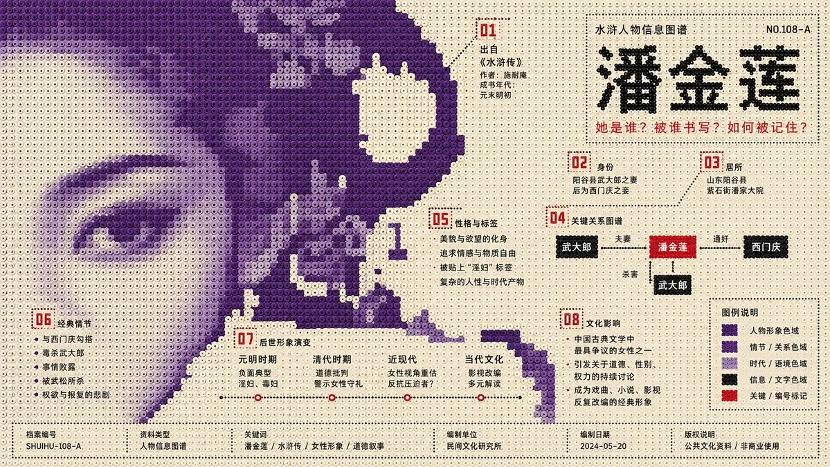
生成一张 16:9 横版信息图海报。 主题:【主题】 必须覆盖的知识点: 【知识点1】 【知识点2】 【知识点3】 【知识点4】 【知识点5】 【知识点6】 【知识点7】 【知识点8】 视觉风格定义: 这是一张“拼豆 / Perler beads / fuse beads / 像素珠阵列”风格的结构性平面信息图海报。画面由大量规则排列的圆形塑料拼豆构成,每一颗拼豆都具有清晰圆形边界、轻微中心凹点、均匀间距、低饱和塑料质感和稳定网格秩序。整体必须保持正视平面构图,像一张由拼豆拼成的公共文化信息图海报,而不是玩具摄影、3D模型、卡通插画或普通像素画。 核心构图: 将【主题】主体压缩为一个大尺度单色拼豆图像场,而不是完整写实物体、居中插画或图标集合。主体必须从画幅边缘涌入,跨越页面边界,并被出血裁切,像一个更大的拼豆媒介图像残片进入纸面。主体占据主要视觉重量,但不完整呈现;观众必须通过轮廓、方向、缺失区域、拼豆密度和局部纹理重建主题。 主体形态: 主体外缘呈现低分辨率拼豆台阶、方块断裂、硬切缺口、像素化锯齿轮廓、缺珠断面和被采样后的粗糙边界。禁止平滑剪影,禁止完整图标轮廓,禁止写实细节。主体内部只使用同一主题结构色的不同明度拼豆,形成低对比影像碎片、半调噪声、扫描颗粒、材料残影、档案纹理和局部密度变化。 背景与负空间: 背景使用高明度浅色拼豆底场,接近未印刷纸面、浅奶白塑料底板或淡灰白拼豆阵列。背景不是装饰底色,而是主动反向切入主体,形成大块空洞、曲折通道、安静文字窗口、阅读停顿区和知识点容器。空白必须像空气,也像刀口;它既提供呼吸感,也切割主体结构。大块浅色底与大块主题结构色必须互相侵入,不能简单上下分区,不能成为普通背景。 色彩系统: 采用严格的三层功能配色,不允许平均化配色。 第一层:浅色底场 面积比例约 60%–70%。功能是呼吸、切割、停顿、承载文字窗口。颜色可为旧纸白、浅米白、冷灰白、淡蓝白或淡暖灰。 第二层:主题结构色 面积比例约 25%–35%。功能是构成主体、制造空间压力、表达主题情绪和材料语义。颜色必须根据【主题】选择,例如冷主题可使用深蓝、墨绿、灰紫、石墨色;暖主题可使用赭红、土橙、棕黑、暗金色。结构色内部允许通过拼豆明度差表现颗粒密度和图像残影。 第三层:高对比信息色 面积比例约 3%–6%。功能是标题、编号、时间、注释、机构信息、图例、脚注和关键知识点标记。信息色必须少量、锐利、明确,可使用红、黑、亮蓝、荧光橙或高纯度青色。信息色不能扩散为装饰色。 信息图系统: 将【知识点1】至【知识点8】全部转化为拼豆信息节点,不使用普通图标堆叠解释。每个知识点以以下形式之一呈现: - 小型编号标签 - 微型注释框 - 拼豆图例块 - 坐标线 - 时间刻度 - 比例条 - 方向箭头 - 档案索引编号 - 局部纹理说明 - 边缘标记点 信息节点必须沿留白窗口、色场边界、切口节点、主体缺口、负空间通道和底部边缘分散布置。信息节点数量为 8 个,对应 8 个知识点。所有信息节点必须有层级关系:主标题最大,核心概念次级,知识点标签更小,脚注和编号最小。信息节点不能覆盖主体中心,不能破坏大色场结构。 阅读路线: 构建跳跃式阅读路径:上方小型标记 → 侧向主标题 → 主体边缘知识点 → 负空间注释窗口 → 底部脚注与图例。画面必须同时满足远距离识别和近距离阅读:远看是一个强烈的巨大拼豆图像残片,近看是一个精密、有秩序的知识信息系统。 字体与文字: 使用窄身现代无衬线字体、瑞士风格无衬线、方正清晰骨架字体或等宽元数据字体。字体笔画均匀,字距克制,层级精确。主标题像公共文化信息坐标,小字像档案元数据索引。文字必须排布在留白窗口、边界节点和底部信息栏中,不得压在主体中央。中文文字必须清晰、短句化、标签化,避免长段落。 主题转译规则: 不要直接用题材默认图标解释【主题】。必须把主题中的时间、地点、功能、人物关系、数据关系、因果关系或抽象概念转译为: - 拼豆色场密度 - 缺珠区域走向 - 边缘压力 - 负空间形状 - 信息节点位置 - 编号系统 - 局部纹理差异 - 拼豆明度层级 - 图例色块关系 拼豆材质: 所有视觉元素都由拼豆构成。拼豆表面为哑光塑料质感,带轻微制造不均、微弱颗粒、细小磨损和低对比表面差异。结构色区域内部可出现半调式拼豆密度变化、扫描输出感、旧纸不均匀感和专色叠印感。信息色拼豆必须边缘锐利、对比清楚、定位准确。 画面气质: 整体应像一张由拼豆重构的结构性公共文化信息海报。它不是可爱手工图,也不是儿童玩具风,而是克制、理性、现代、档案化、信息密集但秩序清晰的视觉系统。画面要有博物馆展览海报、研究机构信息图、公共文化导视和实验性平面设计的气质。 构图硬性要求: - 16:9 横版 - 正视平面视角 - 拼豆圆形颗粒清晰可见 - 主体从画幅边缘进入 - 主体被页面边界裁切 - 大块结构色与大块空白互相侵入 - 外轮廓呈拼豆像素台阶 - 至少 8 个知识点信息节点 - 远看有巨大图形冲击 - 近看有精密信息秩序 - 空白区域必须参与叙事和切割 - 信息色只能用于关键文字和标记 禁止内容: 禁止完整写实物体。 禁止居中主体插画。 禁止可爱卡通风。 禁止普通像素画。 禁止 3D 玩具摄影。 禁止景深虚化。 禁止真实相机拍摄感。 禁止强投影。 禁止发光特效。 禁止金属高光。 禁止复杂装饰背景。 禁止图标堆叠式信息图。 禁止平均分配颜色。 禁止文字覆盖主体中心。 禁止无意义信息噪声。 禁止把知识点变成随机装饰。 禁止过度拟物化。 禁止真实照片拼贴。 禁止渐变炫光。 禁止赛博霓虹背景。 禁止柔和插画风。 禁止水彩、油画、厚涂、3D渲染风。 最终效果: 画面应呈现为一张高级拼豆风格结构性信息图海报。【主题】不是被直接画出来,而是被压缩成巨大的拼豆色场、像素化珠阵边缘、缺珠空洞、负空间刀口、编号节点、档案注释和颗粒秩序。观众远距离看到强烈的抽象主题冲击,近距离能够沿信息节点阅读完整知识结构。 主题:潘金莲39:Te31,Generate a 16:9 horizontal infographic poster. Theme: Pan Jinlian. Must cover knowledge points: [Point 1] through [Point 8]. Visual Style Definition: This is a structural flat infographic poster in the style of 'Perler beads / fuse beads / pixel bead array.' The image consists of a large number of regularly arranged circular plastic beads, each with clear circular boundaries, a slight central indentation, uniform spacing, low-saturation plastic texture, and stable grid order. The overall composition must maintain a front-facing flat view, resembling a public cultural infographic poster made of beads, rather than toy photography, 3D models, cartoon illustrations, or ordinary pixel art. Core Composition: Compress the [Theme] subject into a large-scale monochromatic bead image field rather than a complete realistic object or centered illustration. The subject must flow in from the edges of the frame, crossing page boundaries with a bleed cut, like a larger fragment of bead media entering the page. The subject occupies the main visual weight but is not fully presented; viewers must reconstruct the theme through silhouettes, directions, missing areas, bead density, and local textures. Subject Morphology: The outer edges of the subject show low-resolution bead steps, block fractures, hard-cut gaps, pixelated jagged outlines, missing bead sections, and rough boundaries after sampling. Smooth silhouettes, complete icon outlines, and realistic details are prohibited. The interior uses only different brightness levels of the same thematic structural color to form low-contrast image fragments, halftone noise, scanning grains, material afterimages, archival textures, and local density changes. Background and Negative Space: The background uses a high-brightness light-colored bead field, similar to unprinted paper, light creamy white plastic baseboards, or pale grey-white bead arrays. The background is not a decorative base color but actively cuts into the subject, forming large voids, winding paths, quiet text windows, reading pause zones, and knowledge point containers. Whitespace must act like air and a blade; it provides breathing room and cuts the subject structure. Large light-colored areas and large structural color areas must invade each other. Color System: Adopt a strict three-layer functional color scheme. Layer 1: Light-colored base (60%-70% area) for breathing and windows. Layer 2: Theme structural color (25%-35% area) for the subject and mood. Layer 3: High-contrast information color (3%-6% area) for titles, numbers, and annotations. Infographic System: Convert all 8 knowledge points into bead information nodes using forms like numbered tags, coordinate lines, or time scales. Reading Path: Build a jumping reading path from top markers to main titles to peripheral knowledge points and finally to the footer. Typography: Use narrow modern sans-serif fonts with precise hierarchy. Theme Translation Rules: Do not use default icons; translate concepts into bead density, missing areas, or spatial pressure. Material: All elements are made of beads with matte plastic textures and slight manufacturing irregularities. Visual Ambience: Restrained, rational, modern, and archival. Hard Requirements: 16:9, flat view, circular bead particles clearly visible, subject bleed-cut, at least 8 information nodes. Forbidden: Realistic objects, centered illustrations, cartoon styles, 3D toy photography, depth of field, glows, or gradients. Final Effect: A high-end structural infographic poster where the theme is represented by bead fields and pixelated voids rather than being directly drawn.10:["$","main",null,{"className":"-mt-14 bg-[#F8F3EA] pt-14 text-[#211D16]","children":[["$","div",null,{"className":"mx-auto grid max-w-[1360px] grid-cols-1 gap-8 px-6 pb-2 pt-6 md:px-12 md:pt-8 lg:grid-cols-[minmax(0,1.35fr)_minmax(340px,0.65fr)] lg:gap-10","children":["$","div",null,{"className":"min-w-0","children":["$","nav",null,{"aria-label":"Breadcrumb","className":"text-xs tracking-wide text-black/60 md:text-sm","children":["$","ol",null,{"className":"flex flex-wrap items-center gap-1.5","children":[["$","$1","Prompts-0",{"children":[false,["$","li",null,{"children":"$L33"}]]}],["$","$1","Image Prompt-1",{"children":[["$","span",null,{"aria-hidden":"true","className":"text-black/40","children":"›"}],["$","li",null,{"children":"$L34"}]]}],["$","$1","GPT Image 2-2",{"children":[["$","span",null,{"aria-hidden":"trPrompt breakdown
- Subject
- Pan Jinlian compressed into a large-scale monochromatic bead image field with jagged pixelated boundaries, hard-cut gaps, and internal low-contrast density variations
- Style
- Perler beads / fuse beads array with visible circular boundaries, slight center indents, uniform spacing, and matte low-saturation plastic texture in strict flat front view
- Composition
- 16:9 horizontal layout with subject flowing in from edges and bleed-cut, large light bead background invading the structural color field, and eight dispersed information nodes along negative-space channels
- Mood
- Restrained, rational, modern and archival like a public cultural information poster or research-institution infographic
Remix ideas
- Change the theme structural color to deep graphite with subtle brightness shifts to mirror the archival, morally ambiguous tone of Pan Jinlian's narrative
- Route one knowledge-point node along a winding negative-space corridor that slices through the bead field to emphasize fractured storylines
- Tighten the information color to pure high-contrast cyan limited to numbered tags and footer metadata while expanding the light bead base to 65 percent area
Reference images
How to use this AI Image prompt template
 1
1Copy the prompt — grab this template’s prompt and negative prompt.  2
2Pick a model — choose a recommended AI model for the best match.  3
3Generate — open the studio with one click and create your result.
Related templates

Chinese AI Retirement Planning Infographic
{"type":"editorial Chinese infographic poster","topic":"AI and retirement planning boundaries","style":"clean academic magazine infographic, flat vector icons, soft textured off-white paper background, balanced Chinese editorial typography, minimal Japanese-inspired decorative motifs","canvas":{"orientation":"portrait","aspect_ratio":"3:4"},"palette":{"background":"warm ivory","primary_text":"black","secondary_text":"deep blue","accent_red":"rose pink","accent_green":"muted olive green","accent_yellow":"golden yellow","accent_blue":"navy blue","line_color":"soft gray-blue"},"headline":{"text":"{argument name=\"headline text\" default=\"AI 能帮你规划退休,但不能替你负责\"}","position":"top left","font":"bold Chinese serif or Song-style display","large":true},"subheadline":{"text":"MIT Sloan 对“AI + 退休规划”的边界判断","position":"below headline","color":"deep blue","font":"bold Chinese sans-serif"},"source_line":{"text":"来源:MIT Sloan / Andrew Lo","position":"below subheadline","color":"gray"},"layout":{"sections":[{"title":"高责任场景","position":"upper middle","count":2,"shape":"rounded rectangle with pink border and pale pink fill","icon_count":3,"labels":["AI = 辅助工具,不是最终决策者","适合帮助思考,不适合替你拍板"],"left_icon":"large pink warning triangle inside circle over wave pattern","item_icons":["person badge","exclamation mark"]},{"title":"强在帮你想清楚,弱在替你承担后果","position":"center","count":2,"shape":"large framed comparison panel","subsections":[{"title":"AI 更适合做:认知辅助","position":"left","count":4,"color":"green","labels":["解释复杂概念","比较不同方案","做情景推演","提醒行为偏差"],"icons":["book","balance scale","upward chart","exclamation in speech bubble"]},{"title":"AI 不能替代:责任判断","position":"right","count":4,"color":"pink-red","labels":["承担法律责任","精确税务与收益计算","处理复杂合规细节","托管敏感隐私风险"],"icons":["courthouse","calculator","clipboard","lock"]}],"center_icon":"blue circle with white balance scale"},{"title":"正确用法:把 AI 当分析伙伴,不当神谕","position":"lower middle","count":3,"shape":"rounded rectangle with yellow border and pale cream fill","labels":["先用 AI 做认知准备:理解概念、列变量、梳理方案","再让 AI 挑战你的假设:问它哪里可能错、缺了什么信息","关键决策交给自己,并由专业人士复核"],"left_illustration":"yellow rising sun over stylized landscape with bamboo leaves","step_markers":"three yellow numbered circles: 1, 2, 3"},{"title":"注:本文强调的是“辅助决策边界”,不是投资建议","position":"bottom","count":1,"shape":"rounded rectangle with blue-gray border","labels":["Source: MIT Sloan, Want to use AI to plan your retirement? Here’s how to proceed"],"left_icon":"blue fountain pen nib in circle","right_decoration":"gray-blue wave pattern"}],"decorations":{"count":5,"items":["top right cherry blossom branch with pink flowers and falling petals","top left pagoda silhouette","top left distant mountain silhouette","small cloud-line motifs near upper corners of comparison section","subtle wave patterns inside circular icons and lower right footer"]}},"composition":"ample margins, all text in Chinese except the English source line at bottom, strong hierarchy from headline to colored content boxes, symmetrical comparison layout in the middle, polished social-media-ready infographic","rendering":"sharp vector infographic, crisp text, subtle paper grain, no photorealism"}3e:Te44,{"type":"editorial Chinese infographic poster","topic":"AI and retirement planning boundaries","style":"clean academic magazine infographic, flat vector icons, soft textured off-white paper background, balanced Chinese editorial typography, minimal Japanese-inspired decorative motifs","canvas":{"orientation":"portrait","aspect_ratio":"3:4"},"palette":{"background":"warm ivory","primary_text":"black","secondary_text":"deep blue","accent_red":"rose pink","accent_green":"muted olive green",

Cloisonné Craft PPT Cover
Create a 16:9 widescreen PowerPoint cover slide in an elegant Chinese traditional craft presentation style, with an ivory rice-paper background, dark teal and gold ornamental border, and decorative Chinese corner brackets. The main headline on the left is large dark blue Chinese calligraphy text reading 掐丝珐琅 (headline text), with a smaller gold subtitle underneath reading 火与金线中的东方华彩 (subtitle text). Below it, place a centered rounded label plaque with teal text reading 传统工艺主题分享 (section label), and a small explanatory line near the lower left reading 认识一种以金属胎、细丝与珐琅釉色共同构成的华美工艺 (footer note). In the top-right corner, add a small ornate dark teal page indicator reading 01 / 10 (page indicator). On the right half, feature a highly detailed blue-and-gold cloisonné enamel vase on a dark wooden stand, decorated with lotus flowers, green lotus leaves, curling gold wire patterns, turquoise accents, and ornate gold handles. The tabletop foreground contains exactly 7 discrete craft objects: 1 coil of gold wire, 1 flat cloisonné floral medallion, 1 gold key-shaped ornament, 1 fine metalworking brush or stylus, and 4 small bowls of enamel powder in blue, green, turquoise, and white/gold. Add pale ink-wash mountains, a distant pavilion, soft lotus line art, and floating auspicious cloud motifs in the background. Use a refined museum-course aesthetic, realistic product rendering mixed with delicate Chinese illustration, harmonious cream, deep navy, turquoise, and metallic gold palette, crisp typography, balanced negative space, premium educational PPT title-slide composition.36:T715,Create a 16:9 widescreen PowerPoint cover slide in an elegant Chinese traditional craft

Soft Autumn Personal Color Card
{"type":"personal color analysis infographic card","style":"clean editorial beauty infographic, soft neutral background, elegant serif headline, Chinese typography, minimalist luxury layout","canvas":{"orientation":"portrait","background":"warm ivory paper tone with thin taupe divider lines"},"headline":{"main":"PERSONAL COLOR ANALYSIS","sub":"四季色彩诊断卡"},"subject":{"count":1,"gender_presentation":"female","pose":"front-facing studio portrait, shoulders visible","face":"intentionally blurred and featureless","hair":{"color":"dark brown","length":"shoulder length","style":"soft layered bob with slight outward flip at the ends and side part"},"top":{"color":"light cream beige knit","neckline":"soft V-neck"}},"layout":{"sections":[{"title":"main portrait","position":"left column upper","count":1,"labels":[]},{"title":"适合色对比","position":"top right","count":4,"labels":["燕麦米白 #F3E5D0","茶绿 #8A9A5B","陶土橘 #C77D5C","春色玫瑰 #B87B7B"]},{"title":"中性色对比","position":"middle right","count":6,"labels":["驼色 #A78B6A","灰梅 #7D6B5D","奶茶米 #D4BFA4","雾灰绿 #92A092","暗金 #A68A5C","暖可可 #5C4838"]},{"title":"本人基色","position":"left column middle","count":6,"labels":["脸颊","中庭","颈部","唇色","发色","瞳色"]},{"title":"风格关键词","position":"left column lower","count":4,"labels":["柔和","知性","温婉","老钱风"]},{"title":"推荐色","position":"center right lower","count":15,"labels":["燕麦米白 #F3E5D0","奶茶米 #D4BFA4","驼色 #A78B6A","陶土橘 #C77D5C","豆沙粉 #D4A495","暮色玫瑰 #B87B7B","茶绿 #8A9A5B","雾灰绿 #92A092","鼠尾草绿 #A4AF91","柔紫 #A691A3","灰蓝 #7890A0","芥末黄 #B8A055","砖红 #A85A48","暗金棕 #8B6F47","深可可 #5C4838"]},{"title":"强调色","position":"below recommended colors","count":6,"labels":["砖红 #A85A48","芥末黄 #B8A055","墨绿 #445D4A","深茶棕 #6B4E34","枫叶红 #A0522D","古铜金 #8B6B3D"]},{"title":"可用色","position":"below accent colors","count":4,"labels":["象牙白 #F0E9D6","柔灰蓝 #8FA3AD","暖灰 #9D9489","浅紫灰 #B0A3AC"]},{"title":"避雷色","position":"bottom left strip","count":6,"labels":["荧光粉 #FF1493","纯黑 #000000","正红 #FF0000","冰蓝 #00BFFF","冷白 #FFFFFF","亮紫 #9B30FF"]},{"title":"次适合","position":"bottom right strip","count":6,"labels":["珊瑚粉 #E89080","浅橄榄 #B3A580","深墨绿 #3B4D3B","浅木桃 #CDB89B","柔玫瑰金 #B89088","淡灰紫 #AFA0B0"]}],"left_info_table":{"count":5,"labels":["季型:柔秋","亚型:柔秋","底调:暖中性","彩度:柔和","对比度:中"]},"footer_notes":{"title":"关键提示","count":4,"labels":["底调偏暖,首选奶茶米、驼色、茶绿、陶土橘","彩度柔和,选低饱和色调,避免高纯度色","对比中等,造型保持柔和过渡","金属首饰选暖金系,避开冷银"]}},"color_palette":"muted soft autumn palette, warm-neutral undertone, low saturation, medium contrast","rendering":"high-resolution polished app-style infographic, realistic fabric and hair, subtle shadows, precise grid alignment, print-ready beauty consultation card","customization":{"headline text":"{argument name=\"headline text\" default=\"PERSONAL COLOR ANALYSIS\"}","subtitle text":"{argument name=\"subtitle text\" default=\"四季色彩诊断卡\"}","season result":"{argument name=\"season result\" default=\"柔秋\"}","character hair color":"{argument name=\"character hair color\" default=\"dark brown\"}","background color":"{argument name=\"background color\" default=\"warm ivory\"}"}}3a:Te21,{"type":"personal color analysis infographic card","style":"clean editorial beauty infographic, soft neutral background, elegant serif headline, Chinese typography, minimalist luxury layout","canvas":{"orientation":"portrait","background":"warm ivory paper tone with thin taupe divider lines"},"headline":{"main":"PERSONAL COLOR ANALYSIS","sub":"四季色彩诊断卡"},"subject":{"count":1,"gender_presentation":"female","pose":"front-facing studio portrait, shoulders visible","face":"intentionally blurred and featureless","hair":{"color":"dark brown","length":"shoulder length","style":"soft

Informative Climate Change Seminar Poster
An informative and engaging poster for a public seminar on climate change. The poster is designed as a mini-infographic, with a large, central graphic showing the earth with a thermometer, and smaller icons and data points around it explaining the causes and effects. The design is clean, organized, and aims to educate the viewer quickly and effectively. –ar 3:4

Japanese Insurance Staff Directory Mockup
{"type":"Japanese insurance company staff directory webpage mockup","brand":{"company_name":"ほげほげ生命","romanized_name":"HOGEHOGE LIFE","theme":"friendly, trustworthy, feminine corporate design in bright pink and white"},"page":{"title":"営業担当一覧","subtitle":"ご相談内容やご希望に応じて、担当希望をお出しいただけます。","format":"full-page website screenshot, square composition, dense card grid layout"},"layout":{"header":{"left":"company logo with flower icon and company name","center":"large pink title banner","right":{"count":3,"labels":["簡単希望の出し方","よくあるご質問","お問い合わせ"]}},"intro":{"headline":"安心の未来を、ご一緒にかんがえちゃうぞ♪","body":"保険のこと、将来のこと、ちょっとした疑問でも大丈夫。 ほげほげ生命の担当者は、あなたの『話しやすいパートナー』です。 ライフステージや価値観に寄り添い、最適なプランをご提案します。","features":{"count":6,"items":["生命保険・医療保険・がん保険","学資保険・個人年金・介護保険","ライフプラン相談・見直し相談","資産形成・NISA・iDeCo","相続・贈与・事業承継サポート","やさしい言葉で丁寧に案内"]},"cta_box":{"title":"担当希望の出し方","body":"気になる担当者の『担当希望する』ボタンから、ご希望の相談内容とともにお申し込みください。","button":"担当希望の申し込みはこちら"}},"staff_grid":{"count":12,"numbered_cards":true,"columns":4,"rows":3,"card_style":"rounded white cards with thin gray border, pink accents, each card has a small colored number tab on the top left","shared_elements":["upper-body portrait photo of a smiling Japanese female consultant with intentionally blurred face","name and age line","job title and profile text in Japanese","multiple pink category labels","short friendly catchphrase near bottom","bright pink CTA button labeled 担当希望する"],"cards":[{"number":1,"name":"小林 ゆい","age":"27歳","photo":"light blue shirt, hand near chin, soft indoor background","catchphrase":"はじめての保険相談も安心しておまかせください♪"},{"number":2,"name":"田中 ひより","age":"29歳","photo":"cream blouse, shoulder-length hair, thoughtful pose","catchphrase":"お客様の夢や目標の実現を全力でサポートします!"},{"number":3,"name":"佐藤 あかり","age":"31歳","photo":"beige jacket, finger near lips, long dark hair","catchphrase":"お子さまの未来に向けたプラン作りが得意です♪"},{"number":4,"name":"高橋 まなみ","age":"34歳","photo":"blue striped shirt, hair up, hand near cheek","catchphrase":"将来の『もしも』に備える安心づくりをお手伝いします♡"},{"number":5,"name":"山口 さやか","age":"28歳","photo":"yellow cardigan, seated by window, soft smile","catchphrase":"資産形成の小さな一歩を一緒にサポートします♪"},{"number":6,"name":"中村 ひかる","age":"32歳","photo":"pink blouse, bob haircut, gentle pose","catchphrase":"ご家族と会社の未来を一緒に考えます♡"},{"number":7,"name":"石井 里奈","age":"25歳","photo":"navy blazer, braided or tied hair, confident pose","catchphrase":"ライフステージの変化に合わせて、やさしくご提案します♡"},{"number":8,"name":"松本 真咲","age":"30歳","photo":"dark blouse, one hand raised near face, casual office portrait","catchphrase":"企業さまの課題に寄り添い、最適な保険を提案します♪"},{"number":9,"name":"加藤 さつき","age":"33歳","photo":"lavender top, hand near chin, bright background","catchphrase":"将来に向けた安心を一緒にカタチにします♡"},{"number":10,"name":"渡辺 優花","age":"29歳","photo":"white blouse, short bob, clean minimal portrait","catchphrase":"いざという時に安心してご相談いただけます♪"},{"number":11,"name":"宮下 由紀","age":"31歳","photo":"beige jacket, hand near face, warm indoor lighting","catchphrase":"今の備えと一緒に見直して、未来の安心につなげます♡"},{"number":12,"name":"長谷川 彩","age":"26歳","photo":"pale yellow top, holding a smartphone, natural smile","catchphrase":"オンラインでも安心してご相談くださいね♪"}]},"footer":{"count":5,"items":["担当者の変更も可能です。お気軽にご相談ください。","相談無料","秘密厳守","オンライン相談可","土日相談OK(予約制)"],"note":"※各担当者のスケジュールにより、ご希望に添えない場合がございます。"}},"style":{"visual_tone":"cute, polished Japanese corporate advertising, trustworthy but playful","color_palette":{"primary":"hot pink","secondary":"soft pink","background":"very light pink and white","text":"dark gray with pink highlights"},"typography":"clean Japanese sans-serif with handwritten-style pink headline accents","rendering":"high-resolution web UI mockup, realistic portrait photography embedded in designed cards, crisp Japanese text, symmetrical spacing, professional ecommerce-style landing page"}}3d:T147c,{"type":"Japanese insurance company staff directory webpage mockup","brand":{"company_name":"ほげほげ生命","romanized_name":"HOGEHOGE LIFE","theme":"friendly, trustworthy, feminine corporate design in bright pink and white"},"page":{"title":"営業担当一覧","subtitle":"ご相談内容やご希望に応じて、担当希望をお出しいただけます。","format":"full-page website screenshot, square composition, dense card grid layout"},"layout":{"header":{"left":"company logo with flower icon and company name","center":"large pink title banner","right":{"count":3,"labels":["簡単希望の出し方","よくあるご質問","お問い合わせ"]}},"intro":{"headline":"安心の未来を、ご一緒にかんがえちゃうぞ♪","body":"保険のこと、将来のこと、ちょっとした疑問でも大丈夫。 ほげほげ生命の担当者は、あなたの『話しやすいパートナー』です。 ライフステージや価値観に寄り添い、最適なプランをご提案します。","features":{"count":6,"items":["生命保険・医療保険・がん保険","学資保険・個人年金・介護保険","ライフプラン相談・見直し相談","資産形成・NISA・iDeCo","相続・贈与・事業承継サポート","やさしい言葉で丁寧に案内"]},"cta_box":{"title":"担当希望の出し方","body":"気になる担当者の『担当希望する』ボタンから、ご希望の相談内容とともにお申し込みください。","button":"担当希望の申し込みはこちら"}},"staff_grid":{"count":12,"numbered_cards":true,"columns":4,"rows":3,"card_style":"rounded white cards with thin gray border, pink accents, each card has a small colored number tab on the top left","shared_elements":["upper-body portrait photo of a smiling Japanese female consultant with intentionally blurred face","name and age line","job title and profile text in Japanese","multiple pink category labels","short friendly catchphrase near bottom","bright pink CTA button labeled 担当希望する"],"cards":[{"number":1,"name":"小林 ゆい","

Light Mode UI Design System Board
{ "type": "UI Design System presentation board", "theme": "{argument name=\"visual theme\" default=\"optical science and light refraction\"}", "overall_aesthetic": "clean white background, light mode, futuristic, premium, featuring {argument name=\"primary gradient colors\" default=\"iridescent rainbow, pastel orange, yellow, cyan, purple, pink\"} accents", "header": { "title": "{argument name=\"system name\" default=\"LIGHTCORE PRISM\"}", "subtitle": "UI Design System - Light Mode", "tags": ["FUTURISTIC", "PREMIUM", "FOCUS"], "hero_graphic": "3D transparent glass ring refracting iridescent light" }, "layout": { "sections": [ { "title": "COLOR", "count": 5, "labels": ["WHITE #FFFFFF", "SNOW #FAFAFC", "SLATE #F2F4F8", "BORDER #E6E8EF", "BLACK #0A0A0C"], "description": "5 solid color swatches in rounded squares" }, { "title": "PRISM GRADIENTS", "count": 1, "description": "1 long horizontal gradient bar with 5 hex codes below it" }, { "title": "TYPOGRAPHY", "description": "Large 'Aa' with 4 font weights listed (Light, Regular, Medium, Semibold) and full alphabet/numbers" }, { "title": "ICONOGRAPHY", "count": 12, "description": "12 minimalist line-art icons arranged in a 2x6 grid" }, { "title": "BUTTONS", "count": 8, "categories": ["PRIMARY", "SECONDARY", "TEXT", "ICON"], "description": "8 total buttons showing normal and disabled states for each category. Primary button features an iridescent border and {argument name=\"primary button text\" default=\"GET STARTED\"} text." }, { "title": "NAVIGATION", "count": 2, "variants": ["DESKTOP", "MOBILE"], "description": "Desktop nav has logo, 4 text links, search, sign in, and a button. Mobile nav has logo, search, and hamburger menu." }, { "title": "COMPONENTS", "count": 6, "items": [ "CARD: 'Photon Engine' with abstract iridescent graphic and button", "INPUT FIELD: Search bar and email input with label", "PROGRESS: Iridescent progress bar at 68%", "TABS: Overview, Analytics, Settings", "TOGGLE: 2 switches (on/off)", "DATA VISUALIZATION: 1 donut chart with 3 legend items, 1 line chart over 7 days" ] }, { "title": "WEB PAGE", "description": "Desktop browser mockup featuring the header '{argument name=\"hero headline\" default=\"Build the Future with Light & Color\"}', 2 buttons, a flowing 3D iridescent wave graphic, and 5 partner logos at the bottom." }, { "title": "MOBILE APP", "description": "Smartphone mockup displaying a balance of $24,880, a line chart, 4 quick action icons, a recent activity list with 3 items, and a bottom navigation bar with 4 icons." } ] } }
Explore more prompts
Browse more AI image and video prompts by category.
FAQ
- How does the prompt translate Pan Jinlian's story without using any figurative icons?
- It converts time, relationships, and key events into bead-density gradients, missing-bead voids, edge pressure, and the placement of numbered nodes within the negative-space cuts.
- Why must the eight knowledge points stay outside the central bead mass?
- Placing them only in light-background windows and boundary nodes preserves the large-scale graphic impact from a distance while allowing precise close-range reading of the metadata hierarchy.