Text to Image
Bento Grid Infographic Prompt for Food Science - Nano Banana Pro AI Prompt for Infographic / Edu Visual — AI Image Prompt
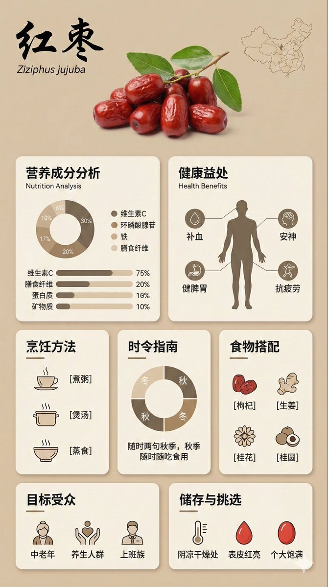
A highly structured JSON prompt for Nano Banana Pro designed to generate a high-quality, educational infographic poster (9:16 aspect ratio) about a specific food ingredient. It uses a modular 'Bento Grid' UI design style, specifying sections for nutrition analysis, health benefits, cooking methods, seasonality, food pairings, and storage tips, all rendered with a minimalist aesthetic and warm, low-saturation color palette. - AIPinMaker
Prompt
{
  "image_analysis": {
    "subject": "{argument name="食材名称" default="枸杞"} 科普信息图,9:16",
    "style": "模块化Bento Grid设计 (便当盒网格布局) / 极简主义UI设计",
    "tone": "专业、温暖、高端、教育性",
    "primary_colors": ["米色 (Beige)", "奶油色 (Cream)", "深棕色 (Dark Brown)", "暖土色 (Warm Earth Tones)"]
  },
  "prompt_elements": {
    "subject_description": "一张关于 {argument name="食材名称" default="枸杞"} 的高质量科普信息海报。",
    "layout": "便当盒风格的模块化网格布局,干净的UI/UX界面设计,分为清晰的矩形卡片。",
    "visual_details": [
      "顶部页眉带有醒目的优雅中文书法标题“食材中文名称”及其学名",
      "顶部中央是 [新鲜食材的视觉描述] 的超写实摄影图片",
      "角落里有一幅 [产地/国家] 的轮廓小地图",
      "第1部分:带有甜甜圈图和柱状图的营养成分分析,百分比表示比例",
      "第2部分:显示健康益处并带有连接线的人体剪影图",
      "第3部分:带有极简线条图标([烹饪方法1]、[烹饪方法2]、[烹饪方法3])的烹饪方法矩阵",
      "第4部分:带有圆形图表的时令食用指南",
      "第5部分:带有简单图标([搭配1]、[搭配2]、[搭配3])的食物搭配网格",
      "第6部分:目标受众画像图标",
      "第7部分:带有温度和天气图标的储存与挑选指南"
    ],
    "art_style": "极简平面设计,柔和的矢量插图与产品摄影相结合,扁平化设计图标,干净的排版。",
    "lighting": "柔和的漫射摄影棚灯光,无阴影且平铺的美学风格。",
    "color_palette": "单色暖米色背景,乳白色卡片,深棕色和炭灰色文字,点缀柔和。”
  "negative_prompt": "杂乱,霓虹色,布局混乱,低分辨率,模糊,文字扭曲,3D渲染,深色背景,混乱,过饱和,水印"
}3f:T81e,{
  "image_analysis": {
    "subject": "Infographic about {argument name="ingredient name" default="Goji Berry"}, 9:16",
    "style": "Modular Bento Grid Design / Minimalist UI Design",
    "tone": "Professional, warm, high-end, educational",
    "primary_colors": ["Beige", "Cream", "Dark Brown", "Warm Earth Tones"]
  },
  "prompt_elements": {
    "subject_description": "A high-quality educational infographic poster about {argument name="ingredient name" default="Goji Berry"}.",
    "layout": "Bento box style modular grid layout, clean UI/UX interface design, divided into clear rectangular cards.",
    "visual_details": [
      "Top header with a striking, elegant Chinese calligraphy title 'Ingredient Chinese Name' and its scientific name",
      "Center top features a hyper-realistic photographic image of [visual description of fresh ingredient]",
"A small outline map of [origin/country] in the corner",Prompt breakdown
- Subject
- High-quality educational infographic poster about Goji Berry in 9:16 ratio featuring hyper-realistic berry photo, origin map, nutrition donut/bar charts, human silhouette health benefits, cooking method icons, seasonal circular chart, pairing grid, and storage guide
- Style
- Modular Bento Grid Design with Minimalist UI Design, combining hyper-realistic photography and flat vector icons on clean typography
- Lighting
- Soft diffused studio lighting with shadowless flat aesthetic
- Composition
- Bento box style modular grid layout divided into clear rectangular cards with top header, central image, and seven distinct informational sections
- Mood
- Professional, warm, high-end, educational tone using warm earth tones
Remix ideas
- Swap the central fresh Goji Berry photo for dried berries to emphasize shelf-life details
- Update the origin map corner to Tibet or Ningxia for region-specific localization
- Replace the three cooking method icons with actual Chinese terms like 泡茶, 煮粥, 打汁 while keeping the line-art style
Reference images

How to use this AI Image prompt template
 1
1Copy the prompt — grab this template’s prompt and negative prompt.  2
2Pick a model — choose a recommended AI model for the best match.  3
3Generate — open the studio with one click and create your result.
Related templates

Chinese Food Map Infographic Poster
制作一张《中华美食地图》的图文海报。整体基于中国地图,每个省份用单独的色块背景标识,并在省份上方标注代表美食的名称和一个立体感强的小图标(如火锅、烤鸭、点心 (美食图标示例)),确保食物图标具有真实质感。主标题写《中华美食地图》,排版整齐、采用扁平插画风与立体元素结合,颜色柔和。

Chinese AI Retirement Planning Infographic
{"type":"editorial Chinese infographic poster","topic":"AI and retirement planning boundaries","style":"clean academic magazine infographic, flat vector icons, soft textured off-white paper background, balanced Chinese editorial typography, minimal Japanese-inspired decorative motifs","canvas":{"orientation":"portrait","aspect_ratio":"3:4"},"palette":{"background":"warm ivory","primary_text":"black","secondary_text":"deep blue","accent_red":"rose pink","accent_green":"muted olive green","accent_yellow":"golden yellow","accent_blue":"navy blue","line_color":"soft gray-blue"},"headline":{"text":"{argument name=\"headline text\" default=\"AI 能帮你规划退休,但不能替你负责\"}","position":"top left","font":"bold Chinese serif or Song-style display","large":true},"subheadline":{"text":"MIT Sloan 对“AI + 退休规划”的边界判断","position":"below headline","color":"deep blue","font":"bold Chinese sans-serif"},"source_line":{"text":"来源:MIT Sloan / Andrew Lo","position":"below subheadline","color":"gray"},"layout":{"sections":[{"title":"高责任场景","position":"upper middle","count":2,"shape":"rounded rectangle with pink border and pale pink fill","icon_count":3,"labels":["AI = 辅助工具,不是最终决策者","适合帮助思考,不适合替你拍板"],"left_icon":"large pink warning triangle inside circle over wave pattern","item_icons":["person badge","exclamation mark"]},{"title":"强在帮你想清楚,弱在替你承担后果","position":"center","count":2,"shape":"large framed comparison panel","subsections":[{"title":"AI 更适合做:认知辅助","position":"left","count":4,"color":"green","labels":["解释复杂概念","比较不同方案","做情景推演","提醒行为偏差"],"icons":["book","balance scale","upward chart","exclamation in speech bubble"]},{"title":"AI 不能替代:责任判断","position":"right","count":4,"color":"pink-red","labels":["承担法律责任","精确税务与收益计算","处理复杂合规细节","托管敏感隐私风险"],"icons":["courthouse","calculator","clipboard","lock"]}],"center_icon":"blue circle with white balance scale"},{"title":"正确用法:把 AI 当分析伙伴,不当神谕","position":"lower middle","count":3,"shape":"rounded rectangle with yellow border and pale cream fill","labels":["先用 AI 做认知准备:理解概念、列变量、梳理方案","再让 AI 挑战你的假设:问它哪里可能错、缺了什么信息","关键决策交给自己,并由专业人士复核"],"left_illustration":"yellow rising sun over stylized landscape with bamboo leaves","step_markers":"three yellow numbered circles: 1, 2, 3"},{"title":"注:本文强调的是“辅助决策边界”,不是投资建议","position":"bottom","count":1,"shape":"rounded rectangle with blue-gray border","labels":["Source: MIT Sloan, Want to use AI to plan your retirement? Here’s how to proceed"],"left_icon":"blue fountain pen nib in circle","right_decoration":"gray-blue wave pattern"}],"decorations":{"count":5,"items":["top right cherry blossom branch with pink flowers and falling petals","top left pagoda silhouette","top left distant mountain silhouette","small cloud-line motifs near upper corners of comparison section","subtle wave patterns inside circular icons and lower right footer"]}},"composition":"ample margins, all text in Chinese except the English source line at bottom, strong hierarchy from headline to colored content boxes, symmetrical comparison layout in the middle, polished social-media-ready infographic","rendering":"sharp vector infographic, crisp text, subtle paper grain, no photorealism"}3e:Te44,{"type":"editorial Chinese infographic poster","topic":"AI and retirement planning boundaries","style":"clean academic magazine infographic, flat vector icons, soft textured off-white paper background, balanced Chinese editorial typography, minimal Japanese-inspired decorative motifs","canvas":{"orientation":"portrait","aspect_ratio":"3:4"},"palette":{"background":"warm ivory","primary_text":"black","secondary_text":"deep blue","accent_red":"rose pink","accent_green":"muted olive green",

Moroccan Restaurant Brand Board
Using the provided reference image of the couscous dish as the hero food photo, transform it into a polished one-page brand identity board for a Moroccan restaurant named La Casbah (restaurant name). Keep the dish itself recognizable, but integrate it as the main visual in the top-right hero area and build a complete premium branding presentation around it on a warm beige editorial layout with refined Moroccan-inspired styling. Add a top-left brand block with the restaurant name as a large serif logotype, a small geometric emblem above it, and the French tagline “SAVEURS D’AILLEURS, SOURIRES D’ICI.” Include a short French brand paragraph and a bold closing sentence beneath. Then create a structured grid brand guide with exactly 9 sections: 1) “LOGO PRINCIPAL” showing the main logo on a light background, 2) “VARIATIONS” with 3 logo variations — one red square version, one green square version, and one circular seal version, 3) “TYPOGRAPHIES” showing 3 text styles — titles, subtitles, and body copy, 4) “PALETTE DE COULEURS” with 6 color swatches labeled Casbah Red, Sahara Sand, Olive Green, Spice Orange, Mint Green, and Charcoal, each with hex codes, 5) “INSPIRATION” with 3 image tiles — Moroccan arch tilework, colorful spices, and fresh mint leaves, 6) “PACKAGING” with 3 mockups — paper takeout bag, food bowl with sleeve, and takeaway coffee cup, 7) “MERCHANDISE” with 3 mockups — apron, tote bag, and cap, 8) “RÉSEAUX SOCIAUX” with 3 social post designs using the food and ingredient imagery plus short French marketing copy, and 9) “VOIX DE LA MARQUE” with 4 brand voice traits and short French descriptions. Add a minimalist quote block on the right reading “BIEN MANGER. SOURIRE. RECOMMENCER.” Finish with a full-width deep red footer band containing the logo centered and subtle Moroccan geometric patterns. Overall look: luxury restaurant branding board, clean agency presentation, cohesive Moroccan visual identity, elegant typography, realistic mockups, soft natural textures, editorial spacing.39:T83d,Using the provided reference image of the couscous

Cloisonné Craft PPT Cover
Create a 16:9 widescreen PowerPoint cover slide in an elegant Chinese traditional craft presentation style, with an ivory rice-paper background, dark teal and gold ornamental border, and decorative Chinese corner brackets. The main headline on the left is large dark blue Chinese calligraphy text reading 掐丝珐琅 (headline text), with a smaller gold subtitle underneath reading 火与金线中的东方华彩 (subtitle text). Below it, place a centered rounded label plaque with teal text reading 传统工艺主题分享 (section label), and a small explanatory line near the lower left reading 认识一种以金属胎、细丝与珐琅釉色共同构成的华美工艺 (footer note). In the top-right corner, add a small ornate dark teal page indicator reading 01 / 10 (page indicator). On the right half, feature a highly detailed blue-and-gold cloisonné enamel vase on a dark wooden stand, decorated with lotus flowers, green lotus leaves, curling gold wire patterns, turquoise accents, and ornate gold handles. The tabletop foreground contains exactly 7 discrete craft objects: 1 coil of gold wire, 1 flat cloisonné floral medallion, 1 gold key-shaped ornament, 1 fine metalworking brush or stylus, and 4 small bowls of enamel powder in blue, green, turquoise, and white/gold. Add pale ink-wash mountains, a distant pavilion, soft lotus line art, and floating auspicious cloud motifs in the background. Use a refined museum-course aesthetic, realistic product rendering mixed with delicate Chinese illustration, harmonious cream, deep navy, turquoise, and metallic gold palette, crisp typography, balanced negative space, premium educational PPT title-slide composition.36:T715,Create a 16:9 widescreen PowerPoint cover slide in an elegant Chinese traditional craft

Soft Autumn Personal Color Card
{"type":"personal color analysis infographic card","style":"clean editorial beauty infographic, soft neutral background, elegant serif headline, Chinese typography, minimalist luxury layout","canvas":{"orientation":"portrait","background":"warm ivory paper tone with thin taupe divider lines"},"headline":{"main":"PERSONAL COLOR ANALYSIS","sub":"四季色彩诊断卡"},"subject":{"count":1,"gender_presentation":"female","pose":"front-facing studio portrait, shoulders visible","face":"intentionally blurred and featureless","hair":{"color":"dark brown","length":"shoulder length","style":"soft layered bob with slight outward flip at the ends and side part"},"top":{"color":"light cream beige knit","neckline":"soft V-neck"}},"layout":{"sections":[{"title":"main portrait","position":"left column upper","count":1,"labels":[]},{"title":"适合色对比","position":"top right","count":4,"labels":["燕麦米白 #F3E5D0","茶绿 #8A9A5B","陶土橘 #C77D5C","春色玫瑰 #B87B7B"]},{"title":"中性色对比","position":"middle right","count":6,"labels":["驼色 #A78B6A","灰梅 #7D6B5D","奶茶米 #D4BFA4","雾灰绿 #92A092","暗金 #A68A5C","暖可可 #5C4838"]},{"title":"本人基色","position":"left column middle","count":6,"labels":["脸颊","中庭","颈部","唇色","发色","瞳色"]},{"title":"风格关键词","position":"left column lower","count":4,"labels":["柔和","知性","温婉","老钱风"]},{"title":"推荐色","position":"center right lower","count":15,"labels":["燕麦米白 #F3E5D0","奶茶米 #D4BFA4","驼色 #A78B6A","陶土橘 #C77D5C","豆沙粉 #D4A495","暮色玫瑰 #B87B7B","茶绿 #8A9A5B","雾灰绿 #92A092","鼠尾草绿 #A4AF91","柔紫 #A691A3","灰蓝 #7890A0","芥末黄 #B8A055","砖红 #A85A48","暗金棕 #8B6F47","深可可 #5C4838"]},{"title":"强调色","position":"below recommended colors","count":6,"labels":["砖红 #A85A48","芥末黄 #B8A055","墨绿 #445D4A","深茶棕 #6B4E34","枫叶红 #A0522D","古铜金 #8B6B3D"]},{"title":"可用色","position":"below accent colors","count":4,"labels":["象牙白 #F0E9D6","柔灰蓝 #8FA3AD","暖灰 #9D9489","浅紫灰 #B0A3AC"]},{"title":"避雷色","position":"bottom left strip","count":6,"labels":["荧光粉 #FF1493","纯黑 #000000","正红 #FF0000","冰蓝 #00BFFF","冷白 #FFFFFF","亮紫 #9B30FF"]},{"title":"次适合","position":"bottom right strip","count":6,"labels":["珊瑚粉 #E89080","浅橄榄 #B3A580","深墨绿 #3B4D3B","浅木桃 #CDB89B","柔玫瑰金 #B89088","淡灰紫 #AFA0B0"]}],"left_info_table":{"count":5,"labels":["季型:柔秋","亚型:柔秋","底调:暖中性","彩度:柔和","对比度:中"]},"footer_notes":{"title":"关键提示","count":4,"labels":["底调偏暖,首选奶茶米、驼色、茶绿、陶土橘","彩度柔和,选低饱和色调,避免高纯度色","对比中等,造型保持柔和过渡","金属首饰选暖金系,避开冷银"]}},"color_palette":"muted soft autumn palette, warm-neutral undertone, low saturation, medium contrast","rendering":"high-resolution polished app-style infographic, realistic fabric and hair, subtle shadows, precise grid alignment, print-ready beauty consultation card","customization":{"headline text":"{argument name=\"headline text\" default=\"PERSONAL COLOR ANALYSIS\"}","subtitle text":"{argument name=\"subtitle text\" default=\"四季色彩诊断卡\"}","season result":"{argument name=\"season result\" default=\"柔秋\"}","character hair color":"{argument name=\"character hair color\" default=\"dark brown\"}","background color":"{argument name=\"background color\" default=\"warm ivory\"}"}}3a:Te21,{"type":"personal color analysis infographic card","style":"clean editorial beauty infographic, soft neutral background, elegant serif headline, Chinese typography, minimalist luxury layout","canvas":{"orientation":"portrait","background":"warm ivory paper tone with thin taupe divider lines"},"headline":{"main":"PERSONAL COLOR ANALYSIS","sub":"四季色彩诊断卡"},"subject":{"count":1,"gender_presentation":"female","pose":"front-facing studio portrait, shoulders visible","face":"intentionally blurred and featureless","hair":{"color":"dark brown","length":"shoulder length","style":"soft

Informative Climate Change Seminar Poster
An informative and engaging poster for a public seminar on climate change. The poster is designed as a mini-infographic, with a large, central graphic showing the earth with a thermometer, and smaller icons and data points around it explaining the causes and effects. The design is clean, organized, and aims to educate the viewer quickly and effectively. –ar 3:4
Explore more prompts
Browse more AI image and video prompts by category.
FAQ
- How do I change this prompt for a different ingredient like chrysanthemum?
- Replace the default Goji Berry name, Chinese calligraphy title, hyper-realistic photo description, and map region while retaining the same bento grid sections and beige-cream palette.
- Why use both donut and bar charts in the nutrition section?
- The dual charts give viewers quick percentage proportions alongside comparative values, fitting the educational goal of the Goji Berry infographic without cluttering the modular layout.