텍스트 투 이미지
SynClub Chat Sound Effects Guide — AI 이미지 프롬프트
A Japanese SynClub infographic listing chat-triggered sound effects with category cards, a chibi guide character, and a sample chat screen. - AIPinMaker
프롬프트
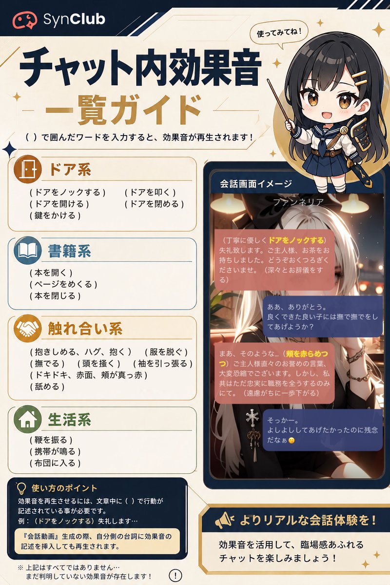
Goal: Create a vertical Japanese infographic guide for SynClub explaining in-chat sound effects triggered by typing words in parentheses. Use the headline {argument name="headline text" default="チャット内効果音 一覧ガイド"} and the brand name {argument name="brand name" default="SynClub"}.

Canvas: Portrait 2:3 layout, cream parchment background with navy and gold accents, thin geometric lines, small sparkle icons, rounded cards, clean app-guide styling. Top left has the SynClub logo icon and wordmark on a dark navy header strip. Main title is large, bold Japanese typography in dark navy and gold. Under the title, add the instruction: 「( )で囲んだワードを入力すると、効果音が再生されます!」.

Layout: Left two-thirds contains the main guide list in four stacked rounded category cards. Right side contains a chibi anime guide character at the top and a smartphone-like chat screen mockup below. Bottom left contains a navy usage-tip box, and bottom right contains a gold-bordered callout banner.

Subject details: At upper right, draw a cute chibi schoolgirl-style anime character with long dark hair, navy uniform, gold hairpins, and a pointing stick; include a speech bubble saying 「使ってみてね!」. Her face is covered by a centered soft gray square blur/censor block. Use {argument name="guide character style" default="chibi anime schoolgirl with long dark hair and navy uniform"} for the character styling.

Guide list: Show exactly 4 sound-effect categories, each with an icon, colored title, and visible trigger phrases in Japanese parentheses.
1. 「ドア系」 with a door icon, brown/gold header, 5 trigger phrases: 「(ドアをノックする)」「(ドアを叩く)」「(ドアを開ける)」「(ドアを閉める)」「(鍵をかける)」.
2. 「書籍系」 with an open-book icon, blue header, 3 trigger phrases: 「(本を開く)」「(ページをめくる)」「(本を閉じる)」.
3. 「触れ合い系」 with a handshake icon, gold header, 8 trigger phrases: 「(抱きしめる、ハグ、抱く)」「(服を脱ぐ)」「(撫でる)」「(頭を撫く)」「(袖を引っ張る)」「(ドキドキ、赤面、頬が真っ赤)」「(舐める)」 plus one line spacing/continuation style as in a compact list.
4. 「生活系」 with a house icon, green header, 3 trigger phrases: 「(靴を振る)」「(携帯が鳴る)」「(布団に入る)」.

Chat mockup: Right middle shows a dark navy rounded phone frame labeled 「会話画面イメージ」. Inside is an anime chat scene with a silver-haired fantasy woman in warm café lighting. At the top of the chat image, show the name {argument name="chat character name" default="ファンネリア"}. Overlay exactly 4 rounded chat bubbles: two salmon/pink narrator bubbles and two navy user-response bubbles. Highlight some trigger words in yellow inside the pink bubbles, including 「ドアをノックする」 and 「頬を赤らめつつ」. Keep Japanese chat text small and atmospheric; it does not need to be fully legible, but must resemble a real roleplay chat screen.

Bottom text: Bottom left navy box titled 「使い方のポイント」 with a lightbulb icon. Include explanatory Japanese text saying sound effects trigger when actions are written in parentheses in the sentence, example 「(ドアをノックする)失礼します…」, and a highlighted note: 「『会話動画』生成の際、自分側の台詞に効果音の記述を挿入しても再生されます。」 Add a small disclaimer below: 「※上記はすべてではありません…まだ判明していない効果音が存在します!」 with a small exclamation icon. Bottom right gold callout with megaphone icon says 「よりリアルな会話体験を!」 and underneath 「効果音を活用して、臨場感あふれるチャットを楽しみましょう!」.

Visual style: Polished Japanese social-media infographic, high-resolution, crisp readable typography, warm cream background, dark navy borders, gold highlights, rounded rectangles, subtle star sparkles. Keep all Japanese text clean and correctly placed. No watermark beyond the SynClub brand mark.38:T10c9,Goal: Create a vertical Japanese infographic guide for SynClub explaining in-chat sound effects triggered by typing words in parentheses. Use the headline {argument name="headline text" default="チャット内効果音 一覧ガイド"} and the brand name {argument name="brand name" default="SynClub"}.

Canvas: Portrait 2:3 layout, cream parchment background with navy and gold accents, thin geometric lines, small sparkle icons, rounded cards, clean app-guide styling. Top left has the SynClub logo icon and wordmark on a dark navy header strip. Main title is large, bold Japanese typography in dark navy and gold. Under the title, add the instruction: 「( )で囲んだワードを入力すると、効果音が再生されます!」.

Layout: Left two-thirds contains the main guide list in four stacked rounded category cards. Right side contains a chibi anime guide character at the top and a smartphone-like chat screen mock참고 이미지
이 AI 이미지 프롬프트 템플릿 사용 방법
 1
1프롬프트 복사 — 템플릿의 프롬프트와 네거티브 프롬프트를 가져오세요.  2
2모델 선택 — 가장 잘 맞는 추천 AI 모델을 고르세요.  3
3생성 — 클릭 한 번으로 스튜디오를 열어 결과를 만드세요.
관련 템플릿

GitHub Project Infographic Poster
生成一张高密度信息图海报,主题为《GitHub项目名称/链接 (项目名称) 项目详解》 【项目基础信息】 - 项目名称:项目名 (项目名) - 核心功能一句话:一句话说明项目解决什么问题 (功能说明) - 技术栈:如 Next.js / React / Node.js / Python 等 (技术栈) - GitHub定位:工具类 / UI库 / 学习项目 / SaaS / AI项目 等 (定位) 【整体风格】 - 现代极简UI + 技术感信息图风格 - 背景使用柔和浅色(奶油色 / 浅灰 / 浅蓝) - 配色低饱和(蓝 / 绿 / 紫),强调科技感 - 扁平插画 + 图标化表达(类似产品文档风) - 信息密度高,但层级清晰,适合快速扫描 【标题设计】 - 主标题:{项目名} - 副标题:一句话描述项目核心价值(吸引点击) 【内容结构(关键)】 根据项目特点自由组织模块,但建议包含: 1️⃣ 项目是做什么的(What) - 核心用途 - 解决的问题 - 适用人群 2️⃣ 核心功能(Features) - 用图标 + 短句列出 4–6 个关键功能 - 每点尽量具体(避免空泛) 3️⃣ 技术亮点(Tech Highlights) - 架构特点 - 性能优化 - 特殊设计(如 SSR / 边缘计算 / AI能力等) 4️⃣ 使用方式(How to Use) - 简要步骤(1-2-3) - 或代码/命令式表达(简化版) 5️⃣ 适用场景(Use Cases) - 用 2–4 个真实场景说明 6️⃣ 优缺点分析(Pros & Cons) - ✅ 优点(2–3条) - ⚠️ 注意点(1–2条) 7️⃣ 总结一句话(Takeaway) - 用一句话总结项目价值 【视觉要求(重点)】 - 使用卡片式布局(类似Notion / Linear风格) - 每个模块有明确分区 - 使用小图标增强理解(如 ⚙️ 🚀 📦) - 重点信息加粗或高亮 - 保持“高信息密度但不拥挤” 【输出要求】 - 所有内容为中文 - 表达简洁、有节奏感 - 避免大段文字,偏“信息块 + 标签化”10:["$","main",null,{"className":"-mt-14 bg-[#F8F3EA] pt-14 text-[#211D16]","children":[["$","div",null,{"className":"mx-auto grid max-w-[1360px] grid-cols-1 gap-8 px-6 pb-2 pt-6 md:px-12 md:pt-8 lg:grid-cols-[minmax(0,1.35fr)_minmax(340px,0.65fr)] lg:gap-10","children":["$","div",null,{"className":"min-w-0","children":["$","nav",null,{"aria-label":"Breadcrumb","className":"text-xs tracking-wide text-black/60 md:text-sm","children":["$","ol",null,{"className":"flex flex-wrap items-center gap-1.5","children":[["$","$1","Prompts-0",{"children":[false,["$","li",null,{"children":"$L33"}]]}],["$","$1","Image Prompt-1",{"children":[["$","span",null,{"aria-hidden":"true","className":"text-black/40","children":"›"}],["$","li",null,{"children":"$L34"}]]}],["$","$1","GPT Image 2-2",{"children":[["$","span",null,{"aria-hidden":"true","className":"text-black/40","children":"›"}],["$","li",null,{"children":"$L35"}]]}]]}]}]}]}],["$","div",null,{"className":"mx-auto grid max-w-[1360px] grid-cols-1 gap-8 px-6 py-8 md:px-12 md:py-10 lg:grid-cols-[minmax(0,1.35fr)_minmax(

Japanese AI Design Webinar Thumbnail
Create a clean, modern Japanese webinar thumbnail in a wide 16:9 layout with a corporate tech-design aesthetic. Use a very light gray background with subtle diagonal translucent panels and bold electric-blue geometric accents, including 3 angular blue-and-white ribbon shapes on the right side behind the speaker. The composition is split into 2 main horizontal sections: a large hero area on top and an information bar across the bottom. In the top-left hero area, place a large bold sans-serif Japanese headline in vivid blue on 2 lines reading AI×デザインで\n新事業を創出 (headline text). Beneath it, add a dark-blue rectangular banner with centered white bold text reading 〜社員AI活用率90%超・デザイン費削減達成する方法〜 (subheadline text). On the right half, show a sharply lit half-body portrait of 川合 卓也 (speaker name), an East Asian man in his 30s with short black hair, wearing a navy blazer over a white crew-neck shirt, arms folded, facing slightly left toward the headline. His face is intentionally obscured by a square skin-tone blur block centered over the face. Next to his torso, place a white rectangular name card with 2 lines of small black Japanese text above a larger bold black name: 株式会社SHIFT AI\nデザイン部長/講師 (speaker title) and 川合 卓也 (speaker name). Across the bottom, create a white info bar with thin blue vertical dividers and 4 visual components from left to right: 1) a blue gradient angular K logo with the brand text KAWAI DESIGN in black uppercase sans-serif, 2) the date in large blue text reading 2026/2/9, 3) a blue filled circle containing the white Japanese weekday 月 followed by the time 21:30〜22:30 in large blue text, 4) a blue outlined laptop-and-chat icon followed by the blue text オンライン. Keep typography bold and highly legible, with strong hierarchy, generous spacing, precise alignment, minimal clutter, and a polished webinar promotional design suitable for a business landing page or social media thumbnail.3b:T87d,Create a clean, modern Japanese webinar thumbnail in a wide 16:9 layout with a corporate tech-design aesthetic. U

YouTube Subtitle Base Generation Prompt
【YouTubeで使えるテロップベースを作成】 ●基本情報 ・テキストは入力せず、あくまでテロップベースのみ作成 ・不透明 ・横長 ・背景は透過させやすいように緑単色 ・別なデザインパターンを縦に3つ並べて作成 ・アスペクト比は「16:9」 ・解像度は「2K」 ---------------- ●デザイン情報(ビジネス系 (ジャンル)) ・スッキリしたシンプルデザイン ・ビジネス系 (ジャンル)動画に使いやすいデザイン ・信頼感のあるデザイン (ジャンル) ---------------- ●デザイン情報(ゲーム実況系) ・スッキリしたシンプルデザイン ・ゲーム実況に使いやすいデザイン ---------------- ●デザイン情報(エンタメ系) ・スッキリしたシンプルデザイン ・日本のエンタメ系YouTuberが使っているようなデザイン ---------------- ●デザイン情報(Vlog・日常系) ・スッキリとしたシンプルデザイン ・おしゃれなVlog系動画で使いやすい落ち着きのあるデザイン

Chinese AI Retirement Planning Infographic
{"type":"editorial Chinese infographic poster","topic":"AI and retirement planning boundaries","style":"clean academic magazine infographic, flat vector icons, soft textured off-white paper background, balanced Chinese editorial typography, minimal Japanese-inspired decorative motifs","canvas":{"orientation":"portrait","aspect_ratio":"3:4"},"palette":{"background":"warm ivory","primary_text":"black","secondary_text":"deep blue","accent_red":"rose pink","accent_green":"muted olive green","accent_yellow":"golden yellow","accent_blue":"navy blue","line_color":"soft gray-blue"},"headline":{"text":"{argument name=\"headline text\" default=\"AI 能帮你规划退休,但不能替你负责\"}","position":"top left","font":"bold Chinese serif or Song-style display","large":true},"subheadline":{"text":"MIT Sloan 对“AI + 退休规划”的边界判断","position":"below headline","color":"deep blue","font":"bold Chinese sans-serif"},"source_line":{"text":"来源:MIT Sloan / Andrew Lo","position":"below subheadline","color":"gray"},"layout":{"sections":[{"title":"高责任场景","position":"upper middle","count":2,"shape":"rounded rectangle with pink border and pale pink fill","icon_count":3,"labels":["AI = 辅助工具,不是最终决策者","适合帮助思考,不适合替你拍板"],"left_icon":"large pink warning triangle inside circle over wave pattern","item_icons":["person badge","exclamation mark"]},{"title":"强在帮你想清楚,弱在替你承担后果","position":"center","count":2,"shape":"large framed comparison panel","subsections":[{"title":"AI 更适合做:认知辅助","position":"left","count":4,"color":"green","labels":["解释复杂概念","比较不同方案","做情景推演","提醒行为偏差"],"icons":["book","balance scale","upward chart","exclamation in speech bubble"]},{"title":"AI 不能替代:责任判断","position":"right","count":4,"color":"pink-red","labels":["承担法律责任","精确税务与收益计算","处理复杂合规细节","托管敏感隐私风险"],"icons":["courthouse","calculator","clipboard","lock"]}],"center_icon":"blue circle with white balance scale"},{"title":"正确用法:把 AI 当分析伙伴,不当神谕","position":"lower middle","count":3,"shape":"rounded rectangle with yellow border and pale cream fill","labels":["先用 AI 做认知准备:理解概念、列变量、梳理方案","再让 AI 挑战你的假设:问它哪里可能错、缺了什么信息","关键决策交给自己,并由专业人士复核"],"left_illustration":"yellow rising sun over stylized landscape with bamboo leaves","step_markers":"three yellow numbered circles: 1, 2, 3"},{"title":"注:本文强调的是“辅助决策边界”,不是投资建议","position":"bottom","count":1,"shape":"rounded rectangle with blue-gray border","labels":["Source: MIT Sloan, Want to use AI to plan your retirement? Here’s how to proceed"],"left_icon":"blue fountain pen nib in circle","right_decoration":"gray-blue wave pattern"}],"decorations":{"count":5,"items":["top right cherry blossom branch with pink flowers and falling petals","top left pagoda silhouette","top left distant mountain silhouette","small cloud-line motifs near upper corners of comparison section","subtle wave patterns inside circular icons and lower right footer"]}},"composition":"ample margins, all text in Chinese except the English source line at bottom, strong hierarchy from headline to colored content boxes, symmetrical comparison layout in the middle, polished social-media-ready infographic","rendering":"sharp vector infographic, crisp text, subtle paper grain, no photorealism"}3e:Te44,{"type":"editorial Chinese infographic poster","topic":"AI and retirement planning boundaries","style":"clean academic magazine infographic, flat vector icons, soft textured off-white paper background, balanced Chinese editorial typography, minimal Japanese-inspired decorative motifs","canvas":{"orientation":"portrait","aspect_ratio":"3:4"},"palette":{"background":"warm ivory","primary_text":"black","secondary_text":"deep blue","accent_red":"rose pink","accent_green":"muted olive green",

Cloisonné Craft PPT Cover
Create a 16:9 widescreen PowerPoint cover slide in an elegant Chinese traditional craft presentation style, with an ivory rice-paper background, dark teal and gold ornamental border, and decorative Chinese corner brackets. The main headline on the left is large dark blue Chinese calligraphy text reading 掐丝珐琅 (headline text), with a smaller gold subtitle underneath reading 火与金线中的东方华彩 (subtitle text). Below it, place a centered rounded label plaque with teal text reading 传统工艺主题分享 (section label), and a small explanatory line near the lower left reading 认识一种以金属胎、细丝与珐琅釉色共同构成的华美工艺 (footer note). In the top-right corner, add a small ornate dark teal page indicator reading 01 / 10 (page indicator). On the right half, feature a highly detailed blue-and-gold cloisonné enamel vase on a dark wooden stand, decorated with lotus flowers, green lotus leaves, curling gold wire patterns, turquoise accents, and ornate gold handles. The tabletop foreground contains exactly 7 discrete craft objects: 1 coil of gold wire, 1 flat cloisonné floral medallion, 1 gold key-shaped ornament, 1 fine metalworking brush or stylus, and 4 small bowls of enamel powder in blue, green, turquoise, and white/gold. Add pale ink-wash mountains, a distant pavilion, soft lotus line art, and floating auspicious cloud motifs in the background. Use a refined museum-course aesthetic, realistic product rendering mixed with delicate Chinese illustration, harmonious cream, deep navy, turquoise, and metallic gold palette, crisp typography, balanced negative space, premium educational PPT title-slide composition.36:T715,Create a 16:9 widescreen PowerPoint cover slide in an elegant Chinese traditional craft

Soft Autumn Personal Color Card
{"type":"personal color analysis infographic card","style":"clean editorial beauty infographic, soft neutral background, elegant serif headline, Chinese typography, minimalist luxury layout","canvas":{"orientation":"portrait","background":"warm ivory paper tone with thin taupe divider lines"},"headline":{"main":"PERSONAL COLOR ANALYSIS","sub":"四季色彩诊断卡"},"subject":{"count":1,"gender_presentation":"female","pose":"front-facing studio portrait, shoulders visible","face":"intentionally blurred and featureless","hair":{"color":"dark brown","length":"shoulder length","style":"soft layered bob with slight outward flip at the ends and side part"},"top":{"color":"light cream beige knit","neckline":"soft V-neck"}},"layout":{"sections":[{"title":"main portrait","position":"left column upper","count":1,"labels":[]},{"title":"适合色对比","position":"top right","count":4,"labels":["燕麦米白 #F3E5D0","茶绿 #8A9A5B","陶土橘 #C77D5C","春色玫瑰 #B87B7B"]},{"title":"中性色对比","position":"middle right","count":6,"labels":["驼色 #A78B6A","灰梅 #7D6B5D","奶茶米 #D4BFA4","雾灰绿 #92A092","暗金 #A68A5C","暖可可 #5C4838"]},{"title":"本人基色","position":"left column middle","count":6,"labels":["脸颊","中庭","颈部","唇色","发色","瞳色"]},{"title":"风格关键词","position":"left column lower","count":4,"labels":["柔和","知性","温婉","老钱风"]},{"title":"推荐色","position":"center right lower","count":15,"labels":["燕麦米白 #F3E5D0","奶茶米 #D4BFA4","驼色 #A78B6A","陶土橘 #C77D5C","豆沙粉 #D4A495","暮色玫瑰 #B87B7B","茶绿 #8A9A5B","雾灰绿 #92A092","鼠尾草绿 #A4AF91","柔紫 #A691A3","灰蓝 #7890A0","芥末黄 #B8A055","砖红 #A85A48","暗金棕 #8B6F47","深可可 #5C4838"]},{"title":"强调色","position":"below recommended colors","count":6,"labels":["砖红 #A85A48","芥末黄 #B8A055","墨绿 #445D4A","深茶棕 #6B4E34","枫叶红 #A0522D","古铜金 #8B6B3D"]},{"title":"可用色","position":"below accent colors","count":4,"labels":["象牙白 #F0E9D6","柔灰蓝 #8FA3AD","暖灰 #9D9489","浅紫灰 #B0A3AC"]},{"title":"避雷色","position":"bottom left strip","count":6,"labels":["荧光粉 #FF1493","纯黑 #000000","正红 #FF0000","冰蓝 #00BFFF","冷白 #FFFFFF","亮紫 #9B30FF"]},{"title":"次适合","position":"bottom right strip","count":6,"labels":["珊瑚粉 #E89080","浅橄榄 #B3A580","深墨绿 #3B4D3B","浅木桃 #CDB89B","柔玫瑰金 #B89088","淡灰紫 #AFA0B0"]}],"left_info_table":{"count":5,"labels":["季型:柔秋","亚型:柔秋","底调:暖中性","彩度:柔和","对比度:中"]},"footer_notes":{"title":"关键提示","count":4,"labels":["底调偏暖,首选奶茶米、驼色、茶绿、陶土橘","彩度柔和,选低饱和色调,避免高纯度色","对比中等,造型保持柔和过渡","金属首饰选暖金系,避开冷银"]}},"color_palette":"muted soft autumn palette, warm-neutral undertone, low saturation, medium contrast","rendering":"high-resolution polished app-style infographic, realistic fabric and hair, subtle shadows, precise grid alignment, print-ready beauty consultation card","customization":{"headline text":"{argument name=\"headline text\" default=\"PERSONAL COLOR ANALYSIS\"}","subtitle text":"{argument name=\"subtitle text\" default=\"四季色彩诊断卡\"}","season result":"{argument name=\"season result\" default=\"柔秋\"}","character hair color":"{argument name=\"character hair color\" default=\"dark brown\"}","background color":"{argument name=\"background color\" default=\"warm ivory\"}"}}3a:Te21,{"type":"personal color analysis infographic card","style":"clean editorial beauty infographic, soft neutral background, elegant serif headline, Chinese typography, minimalist luxury layout","canvas":{"orientation":"portrait","background":"warm ivory paper tone with thin taupe divider lines"},"headline":{"main":"PERSONAL COLOR ANALYSIS","sub":"四季色彩诊断卡"},"subject":{"count":1,"gender_presentation":"female","pose":"front-facing studio portrait, shoulders visible","face":"intentionally blurred and featureless","hair":{"color":"dark brown","length":"shoulder length","style":"soft
더 많은 프롬프트 탐색
카테고리별 AI 이미지·영상 프롬프트를 더 찾아보세요.