텍스트 투 이미지
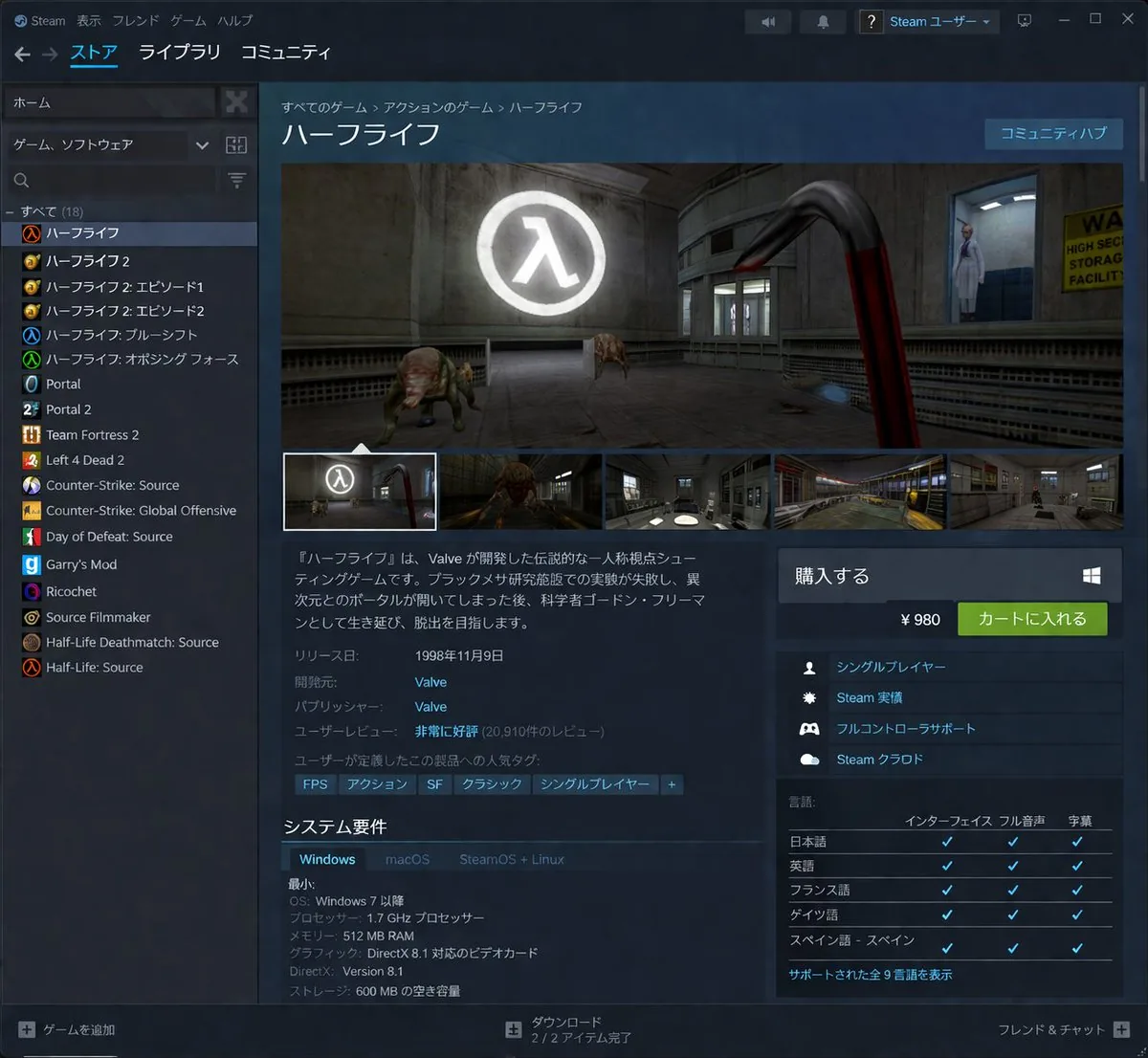
Steam Store Page UI Mockup — AI 이미지 프롬프트
Generates a highly detailed, localized desktop application interface resembling a digital game storefront. - AIPinMaker

프롬프트
{"type":"desktop application UI mockup","application":"Steam client","theme":"dark mode","header":{"top_menu":["Steam","表示","フレンド","ゲーム","ヘルプ"],"main_navigation":["ストア","ライブラリ","コミュニティ"],"user_profile":"Steam ユーザー"},"layout":{"left_sidebar":{"title":"game library","search_bar":true,"game_count":18,"game_list":["ハーフライフ","ハーフライフ 2","ハーフライフ 2: エピソード 1","ハーフライフ 2: エピソード 2","ハーフライフ: ブルーシフト","ハーフライフ: オポージング フォース","Portal","Portal 2","Team Fortress 2","Left 4 Dead 2","Counter-Strike: Source","Counter-Strike: Global Offensive","Day of Defeat: Source","Garry's Mod","Ricochet","Source Filmmaker","Half-Life Deathmatch: Source","Half-Life: Source"]},"main_content":{"breadcrumbs":"すべてのゲーム > アクションのゲーム > ハーフライフ","title":"{argument name=\"game title\" default=\"ハーフライフ\"}","media_gallery":{"main_image":"first-person view holding a red crowbar, facing a headcrab and a scientist in a lab with a glowing Lambda logo","thumbnail_count":5},"description":"{argument name=\"game description\" default=\"『ハーフライフ』は、Valve が開発した伝説的な一人称視点シューティングゲームです。ブラックメサ研究施設での実験が失敗し、異次元とのポータルが開いてしまった後、科学者ゴードン・フリーマンとして生き延び、脱出を目指します。\"}","metadata":{"release_date":"{argument name=\"release date\" default=\"1998年11月9日\"}","developer":"{argument name=\"developer\" default=\"Valve\"}","publisher":"Valve","user_reviews":"非常に好評 (20,910件のレビュー)"},"tags":["FPS","アクション","SF","クラシック","シングルプレイヤー","+"],"system_requirements":{"title":"システム要件","tabs":["Windows","macOS","SteamOS + Linux"],"specs":["OS: Windows 7 以降","プロセッサー: 1.7 GHz プロセッサー","メモリー: 512 MB RAM","グラフィック: DirectX 8.1 対応のビデオカード","DirectX: Version 8.1","ストレージ: 600 MB の空き容量"]}},"right_sidebar":{"purchase_box":{"title":"購入する","price":"{argument name=\"price\" default=\"¥ 980\"}","button":"カートに入れる"},"features_count":4,"features":["シングルプレイヤー","Steam 実績","フルコントローラサポート","Steam クラウド"],"languages_table":{"title":"言語","columns":["インターフェイス","フル音声","字幕"],"language_count":5,"languages":["日本語","英語","フランス語","ドイツ語","スペイン語 - スペイン"]}},"footer":{"left":"+ ゲームを追加","center":"ダウンロード 2 / 2 アイテム完了","right":"フレンド & チャット +"}}}참고 이미지
이 AI 이미지 프롬프트 템플릿 사용 방법
 1
1프롬프트 복사 — 템플릿의 프롬프트와 네거티브 프롬프트를 가져오세요.  2
2모델 선택 — 가장 잘 맞는 추천 AI 모델을 고르세요.  3
3생성 — 클릭 한 번으로 스튜디오를 열어 결과를 만드세요.
관련 템플릿

Meta Quest 3 Exploded View Poster
Create a clean premium Japanese tech infographic poster for Meta Quest 3 (product name), centered on a vertically stacked exploded view of a white mixed-reality headset floating in space against a soft lavender-to-blue gradient background. At the top, place the Meta logo in blue followed by a large bold black sans-serif headline reading Meta Quest 3 (headline text), with a smaller Japanese tagline beneath: 「まったく新しい現実を、まったく新しい構造から。」. The central subject is a highly polished 3D product render shown as an engineering breakdown with exactly 9 numbered layers, each layer separated evenly from top to bottom and labeled with blue circular number markers on the left side from 1 to 9. The 9 visible layers are: 1) the white outer faceplate shell with three front sensor/camera openings, 2) a row of exactly 3 black tracking camera modules, 3) the main logic board with chips and a clearly visible Snapdragon XR2 Gen 2 processor graphic at the center, 4) a pair of large pancake lens assemblies with vivid purple-blue glass reflections, 5) the black internal frame chassis with openings for optics, 6) the battery/electronics bar with glowing blue accents, 7) two white articulated side strap arms, 8) a white fabric head strap loop, 9) a black soft facial interface cushion at the bottom. Add rounded rectangular annotation boxes with thin white borders and subtle transparency on both sides, each connected by fine white leader lines to the corresponding layer. There are exactly 7 feature callout boxes total: 3 on the left and 4 on the right. Left side boxes, from top to bottom, read: 「Snapdragon XR2 Gen 2」 with a chip icon and smaller Japanese body text, 「調整可能なIPD機構」 with an optics adjustment icon and smaller Japanese body text, 「精密設計されたヘッドストラップ」 with a headset strap icon and smaller Japanese body text. Right side boxes, from top to bottom, read: 「フェイスプレート」 with a simple faceplate icon and smaller Japanese body text, 「トラッキングカメラ」 with a camera icon and smaller Japanese body text, 「パンケーキレンズ」 with a dual-lens icon and smaller Japanese body text, 「高性能バッテリー」 with a battery icon and smaller Japanese body text, plus a lower-right box reading 「柔らかなフェイスインターフェース」 with a soft cushion icon and smaller Japanese body text; keep the overall visual balance elegant and symmetric. At the bottom, add a wide white rounded banner spanning most of the width. On its left side place a large bold Japanese statement in blue: 「体験は、構造から進化する。」 and below it smaller Japanese explanatory copy in black. On the right side of the banner place the blue Meta logo and the wordmark “Meta”. Use a sleek Apple-like product marketing style, ultra-sharp 3D rendering, soft studio lighting, subtle glow, precise shadows, glossy plastics, realistic materials, minimal clutter, and a high-end corporate presentation aesthetic.3b:Tc2b,Create a clean premium Japanese tech infographic poster for Meta Quest 3 (product name), centered on a vertically stacked exploded view of a white mixed-reality headset floating in space against a soft lavender-to-blue gradi

Professional Physical Product Design Board
{ "prompt": { "title": "High-End Physical Product Design Board", "trigger": "Upload a simple sketch or outline of a product. Use it to build a full, professional product design poster—the kind that wins over investors and gets featured on top design websites.", "prime_directive": { "rule": "Every shape, material, screen, and accessory must come directly from the lines and style of the uploaded sketch.", "enforcement": "Do not use standard templates. Look closely at the shape. Build a complete physical and digital world from its basic design." }, "format": { "orientation": "Horizontal", "aspect_ratio": "16:9", "layout": "Clean technical grid", "composition": "Neat, spacious, and purposeful—balancing big, beautiful images with clear technical details" }, "sections": { "01_product_header": { "label": "The Main Shot", "elements": [ "Product name (product name) in strong, clean text", "Short product goal—5 words max, sharp and clear", "Three main feeling words (e.g., Smooth / Tough / Smart (style keywords))" ] }, "02_materials_system": { "label": "Colors, Materials, and Finishes", "palettes": { "primary_body": "Main materials (e.g., dark metal, smooth plastic (primary materials))", "secondary_parts": "Materials for buttons, ports, or edges", "touch_areas": "Materials you feel (e.g., soft rubber, textured fabric)" }, "per_material_display": [ "Close-up picture of the material", "Material name", "Finish type (matte, shiny, or rough)" ] }, "03_exploded_view": { "label": "Inside the Product", "components": [ "Outer shell floating above the inside parts", "Visible battery, main circuit board, or switches", "Connecting wires and cooling parts" ], "requirement": "Must look like it can actually be built in real life, with clear guide lines." }, "04_digital_screen": { "label": "The App or Screen", "define": [ "The main device screen or a mobile app that controls it", "The screen design must match the physical product's shape" ], "visual_tiles": { "count": "2–3 key screens", "style": "Dark mode with high contrast and simple buttons" } }, "05_unboxing_experience": { "label": "The Packaging", "rule": "The box must look premium, sturdy, and environmentally friendly.", "mockups": [ { "type": "Outer Box", "detail": "Clean logo pressed into thick, high-quality cardboard" }, { "type": "Inside Tray", "detail": "Perfectly cut spaces to hold the product and wires safely" } ] }, "06_real_world_use": { "label": "Human Interaction", "scenarios": [ "Product sitting naturally on a desk or outdoors", "A person's hand pressing the main button or holding the handle", "Realistic lighting and shadows that match the background" ], "requirement": "Must look like a real photograph to show the actual size of the item." }, "07_text_and_specs": { "label": "Technical Details", "tiers": { "model_number": "Clear, typewriter-style text for small numbers" } } } }

Fitness SaaS Landing Page UI
Design a modern, high-end fitness app (app type) landing page and product UI for a brand called PulseFit (brand name). Create a clean web design mockup that looks like a real SaaS fitness platform and mobile companion app. The design should feel premium, motivating, and easy to use, with a polished UI/UX style similar to top-tier health and wellness apps. Include: - A hero section with bold headline, short subheadline, strong call-to-action button, and app preview - Dashboard UI showing daily activity, calories burned, workout streak, heart rate, step count, and progress rings - Workout program cards for strength, cardio, mobility, and recovery - Nutrition tracking section with macro breakdown and water intake - Progress charts and analytics widgets - Trainer/community section with profile cards and testimonials - Pricing section and download/app store callout - Mobile app screens shown alongside the web design for a cohesive product ecosystem Style direction: - Sleek, minimal, modern interface - Premium fitness brand aesthetic - Smooth spacing, strong hierarchy, rounded cards, soft shadows - Dark mode UI with energetic accent colors like electric blue, neon green, or vibrant orange - Crisp typography, realistic charts, polished buttons, beautiful onboarding feel - Highly detailed, dribbble-worthy, startup-quality product design - Realistic UX case study presentation, not a cartoon or illustration Composition: - Full website homepage mockup - Multiple UI sections visible in one polished presentation - Slight perspective or straight-on product showcase - Clean background with subtle gradients and professional lighting - Ultra-detailed, sharp text rendering, visually balanced layout Output: A stunning, realistic UI/UX design concept for a fitness app website and dashboard that looks ready for development. Make it look like a real Figma product design presentation for a premium startup.

Pastel Running App UI with Sloth Mascot
{"type":"mobile fitness app UI mockup","style":"clean modern pastel app design, soft beige and warm white surfaces, muted sage green accents, rounded cards and buttons, subtle shadows, thin minimalist line icons, friendly playful branding with a sloth mascot, dribbble-style presentation on a dark brown dotted background","theme":"running tracker app","layout":{"device_count":3,"arrangement":"three tall smartphone screens side by side, evenly spaced, front view","background":"very dark brown with a faint evenly spaced dot grid","screens":[{"position":"left","screen_type":"home dashboard","header":{"greeting":"Good morning, Runner! 👋","left_icon":"none","right_icon":"notification bell"},"hero_card":{"headline":"Ready for a great day?","subcard_text_line_1":"Every step forward is a win.","subcard_text_line_2":"Let's make it count. 🌱","illustration":"cute sloth wearing a cream headband and mint-green workout outfit, standing and waving inside the card on the right"},"sections":[{"title":"This Week","position":"upper middle","count":3,"labels":["Runs","Distance","Time"],"values":["3","12.6 km","1h 45m"],"presentation":"single rounded stats card with three equal columns and pale green circular icons"},{"title":"NEXT GOAL","position":"middle lower","count":1,"labels":["20 km this month"],"values":["63%"],"presentation":"rounded progress card with green progress bar and small waving sloth illustration on the right"},{"title":"Recent Activity","position":"lower","count":1,"labels":["Recent Activity"],"presentation":"top edge of another rounded card visible, cropped by the bottom navigation"}],"bottom_nav":{"count":4,"labels":["Home","Run","Progress","Profile"],"active":"Home"}},{"position":"center","screen_type":"run summary","header":{"left_icon":"back chevron","center_text":"Great job!","subtext":"You did it. Time to celebrate. 🎉","right_icon":"share"},"hero_illustration":"cute sloth wearing a headband, mint athletic outfit, and a gold medal, both arms raised in celebration","stats_row":{"count":3,"labels":["DISTANCE","TIME","PACE"],"values":["5.00km","32:15","6:27"],"presentation":"three rounded statistic pills"},"achievement_card":{"count":1,"title":"New Personal Best! 🌟","subtitle":"You shaved 1:12 off your previous 5K.","icon":"small gold medal badge"},"table_section":{"title":"Splits","count":2,"columns":["KM","PACE","TIME"],"rows":[["1","6:35","6:35"],["2","6:23","12:58"]],"presentation":"rounded white table card with light dividers"}},{"position":"right","screen_type":"run goal setup","header":{"left_icon":"close x","center_text":"Time to run!","subtext":"You've got this. We'll take it slow. 🦥","right_icon":"settings gear"},"goal_visual":{"type":"circular progress selector","top_label":"CHOOSE A GOAL","main_value":"5.00","unit":"kilometers","ring":"thick partial sage-green arc on a pale beige circle","illustration":"small sloth stretching on the upper-right edge of the circle"},"goal_options":{"count":4,"labels":["2 km","5 km","10 km","Half"],"active":"5 km"},"primary_cta":{"label":"Start Run","style":"large rounded sage-green button"},"secondary_action":{"label":"Just Track","icon":"location pin"},"bottom_nav":{"count":4,"labels":["Home","Run","Progress","Profile"],"active":"Run"}}]}}

Exploded View Smartphone Infographic Prompt
Create a infographic image of Exploded View Smartphone Infographic Prompt. Style: photorealistic. Composition: balanced and well-framed. Lighting: natural with cinematic mood. Category: illustration. Reference: exploded-view-smartphone-infographic-prompt-6101.

Dark AI Coding Dashboard UI
{ "type": "dark SaaS analytics dashboard UI", "product": { "brand": "{argument name=\"brand name\" default=\"AICode\"}", "theme": "dark navy blue glassmorphism interface with subtle gradients, soft glow, rounded cards, thin borders, modern developer-tool aesthetic" }, "canvas": { "aspect_ratio": "16:9", "background": "deep midnight blue with faint vignette and soft radial lighting" }, "layout": { "structure": "left sidebar plus main content area", "sections": [ { "title": "Sidebar", "position": "left", "count": 8, "labels": ["AICode", "Overview", "Projects", "AI Assistants", "API & Usage", "Code Quality", "Team", "Settings"], "details": "logo at top, Overview selected with purple highlight, lower subscription card showing Pro Plan, renews in 12 days, horizontal progress bar at 75%, user profile at bottom with avatar, {argument name=\"user name\" default=\"Alex Morgan\"}, and email alex@morgan.dev" }, { "title": "Header", "position": "top main area", "count": 4, "labels": ["Welcome back, Alex 👋", "Here's what's happening with your AI coding platform today.", "May 12 – Jun 12, 2024", "Export Report"], "details": "large greeting on left, date range picker and export button on right" }, { "title": "Metric cards", "position": "top row under header", "count": 4, "labels": ["Total Users", "Active Projects", "API Calls", "Code Quality Score"], "values": ["12,842", "2,153", "1.28M", "876"], "details": "each card has a small colored icon, large main value, comparison text vs Apr 12 – May 12, 2024, positive change percentages 14.6%, 8.3%, 23.7%, 5.9%, and a miniature line chart at the bottom; colors are purple, green, amber, and blue" }, { "title": "Main analytics panels", "position": "middle and bottom rows", "count": 4, "labels": ["API Calls Over Time", "Top Projects", "User Activity Heatmap", "Code Quality Trends"], "details": "API Calls Over Time is a wide area chart with Daily dropdown and rising purple line ending near 250K; Top Projects is a ranked list of 5 items with progress bars and percentage changes; User Activity Heatmap is a 7-row weekly heatmap with hour labels from 12 AM to 9 PM; Code Quality Trends is a line chart with Weekly dropdown and smooth upward purple trend from about 70 to low 90s" }, { "title": "Top Projects list", "position": "middle right panel", "count": 5, "labels": ["AI Code Assistant", "Smart Refactor", "Code Review Bot", "Doc Generator", "Test Builder"], "values": ["485K", "321K", "214K", "132K", "98K"], "details": "green positive deltas for first four items 12.4%, 8.7%, 3.1%, 6.8%, and red negative delta -1.2% for Test Builder; each row has a colored square icon and thin horizontal progress bar" } ] }, "style": { "visual_language": "premium fintech and AI product design mockup", "rendering": "crisp high-fidelity UI mockup, subtle shadows, neon edge lighting, polished charts, clean sans-serif typography", "primary_accent": "{argument name=\"accent color\" default=\"electric purple\"}", "secondary_accents": ["emerald green", "amber yellow", "cyan blue"], "density": "information-rich but spacious, balanced grid, highly legible" } }
더 많은 프롬프트 탐색
카테고리별 AI 이미지·영상 프롬프트를 더 찾아보세요.