텍스트 투 이미지
Professional Logo VI Design Manual — AI 이미지 프롬프트
A comprehensive prompt for generating a professional Brand Identity (VI) manual with customizable name, style, and color palette. - AIPinMaker
프롬프트
Create a creative image of Professional Logo Vi Design Manual. Style: photorealistic. Composition: balanced and well-framed. Lighting: natural with cinematic mood. Category: photography. Reference: professional-logo-vi-design-manual-18072.
참고 이미지

이 AI 이미지 프롬프트 템플릿 사용 방법
 1
1프롬프트 복사 — 템플릿의 프롬프트와 네거티브 프롬프트를 가져오세요.  2
2모델 선택 — 가장 잘 맞는 추천 AI 모델을 고르세요.  3
3생성 — 클릭 한 번으로 스튜디오를 열어 결과를 만드세요.
관련 템플릿

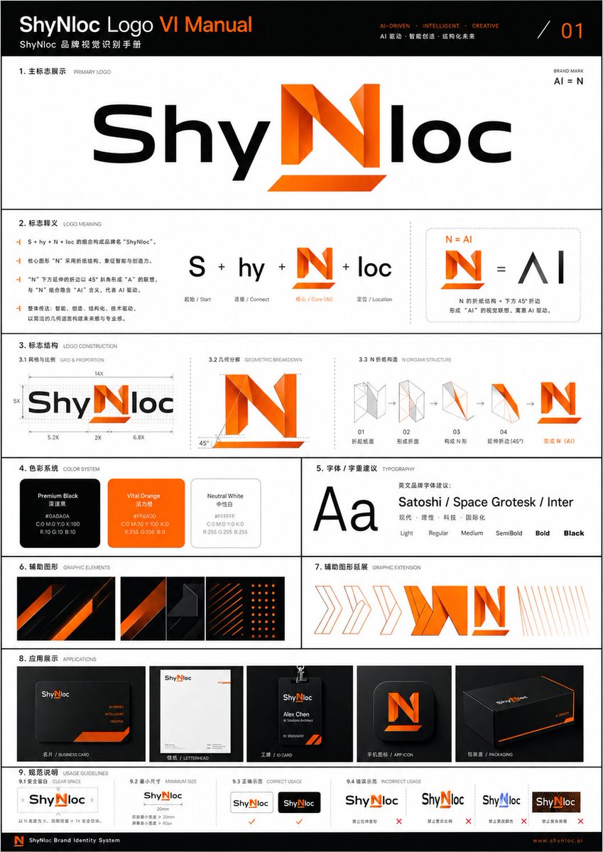
Shynloc Brand Identity Sheet
{"type":"clean corporate visual identity presentation sheet","format":"single page brand identity guideline, page 01, portrait orientation","brand":{"name":"{argument name=\"brand name\" default=\"Shynloc\"}","system title":"{argument name=\"system title\" default=\"SHYNLOC VISUAL IDENTITY SYSTEM\"}","tagline":"{argument name=\"tagline\" default=\"AI-DRIVEN FOLDED N\"}","logo concept":"a futuristic wordmark where the central letter N is transformed into a folded origami-like angular symbol that also reads as AI, using black italic script lettering for the surrounding word and bright orange gradient folded geometry for the N"},"style":{"background":"pure white with generous negative space","layout":"minimal Swiss grid, thin light gray divider lines, uppercase micro typography, premium brand-book aesthetic","typography":"bold sans-serif section headers, small widely spaced uppercase captions, clean body copy","colors":"black, white, gray, vivid orange gradient"},"layout":{"header":{"position":"top edge","left text":"SHYNLOC VISUAL IDENTITY SYSTEM","right text":"PAGE 01","divider":"thin horizontal gray rule across the page"},"hero section":{"position":"upper half center","title block":"BRAND IDENTITY with subtitle Logo Concept and a vertical orange accent bar","right label":"AI-DRIVEN FOLDED N with a small orange slash","primary logo":"large centered Shynloc wordmark; black glossy italic custom lettering, orange folded N in the middle, labeled PRIMARY LOGO underneath"},"sections":[{"title":"SYMBOL MARK","position":"middle-left","count":1,"items":["standalone orange folded N symbol with sharp triangular facets, subtle shadow below"]},{"title":"CONCEPT DIAGRAM","position":"middle-right","count":3,"labels":["N, Letter N Identity","AI, Artificial Intelligence","Folded N, AI-Driven"],"content":"gray N plus gray AI equals orange folded N icon"},{"title":"CONCEPT","position":"below concept diagram","count":1,"body text":"The logo centers on a bold folded N that intelligently integrates the essence of AI. The lower diagonal fold forms an A, while the vertical stroke completes the I, creating a forward-looking mark that communicates innovation, intelligence, and precision. Origami-inspired geometry reflects adaptability, engineering, and future-ready thinking."},{"title":"COLOR PALETTE","position":"bottom-left","count":2,"swatches":["Onyx Black #0A0A0A","Shynloc Orange #FF7A00 – #FFB400"]},{"title":"CONSTRUCTION","position":"bottom-right","count":1,"content":"small grayscale wordmark with the orange N overlaid by dotted construction grid, angular guide lines, and two 45° annotations"}],"footer":{"position":"bottom boxed strip","count":4,"items":["small black square logo tile containing the orange folded N","SHYNLOC VISUAL IDENTITY SYSTEM","VERSION 1.0 / MAY 2024","DESIGNED FOR THE FUTURE. DRIVEN BY INTELLIGENCE. with orange slash"]}},"rendering":"crisp vector graphic design, high-resolution brand guideline mockup, perfectly aligned grid, thin rules, precise spacing, professional agency presentation, no photo texture, no people","customization":{"primary color":"{argument name=\"primary color\" default=\"vivid orange gradient #FF7A00 to #FFB400\"}","secondary color":"{argument name=\"secondary color\" default=\"onyx black #0A0A0A\"}"}}37:

Outdoor Brand Kit Concept Board
Goal: Create a polished branding concept board showing how GPT Image 2 generates a complete outdoor apparel brand kit for The North Face (brand name), combining an existing logo, an agency mark, and style references into a grid of deliverables. Canvas: Square 4:3-ish presentation board on a light gray background, clean modern pitch-deck style, thin white gutters between panels, high-resolution mockup aesthetic. Top workflow strip: Show 5 discrete elements arranged left to right: 1) a red square logo tile with the white text/logo “THE NORTH FACE” labeled “logo”; 2) a large black plus sign; 3) a circular blue “gh” Growthhub mark with an upward arrow labeled “Growthhub”; 4) three rectangular mountain style-reference thumbnails in red, icy blue, and red snowy tones; 5) two curved black arrows pointing down toward centered text reading “GPT Image 2”. Main layout: Below the workflow strip, create a 3-column grid of brand-kit tiles with numbered captions in small uppercase black text. Use a dominant palette of deep red (primary color), white, black, snow gray, and mountain photography. The brand feels premium, rugged, alpine, adventurous, and eCommerce-ready. Sections and exact visible counts: - 01 Brand Essence: 1 wide red mountain banner with large white “THE NORTH FACE” logo over dramatic snowy mountains. - 02 Logo Variations: exactly 6 logo variation tiles: 1 red square full logo, 1 red square “TNF” monogram, 1 red square cropped half-dome icon, 1 horizontal red wordmark/half-dome lockup, 1 stacked red wordmark, and 1 outlined red square lockup. - 03 Icon Set: exactly 12 thin white line icons on a red panel: mountain, compass, snowflake, tent, carabiner, trail flag on mountain, hiker jacket/person, hiking boot, backpack, ice axe, sun, and folded map. - 04 Brand Baseline: 1 red-and-black mountain poster with large white serif text “Never Stop Exploring.” - 05 Product Mockups: exactly 3 red merchandise items on a light background: 1 insulated bottle, 1 tote bag, and 1 baseball cap, each with a small white brand logo. - 06 Apparel Lifestyle: 1 alpine lifestyle photo panel showing exactly 3 people wearing red puffer jackets in front of snowy mountains. - 07 Brand Baseline: repeat the mountain poster concept once more, again with the white serif phrase “Never Stop Exploring.” - 05 Product Mockups: repeat the 3 product mockups once more: bottle, tote, cap. - 06 Apparel Lifestyle: repeat the 3-person red jacket mountain lifestyle panel once more. - 07 Urban Campaign Ads: exactly 3 vertical ad cards with mountain/hiker imagery and red logo tags, with headlines “Built to Endure.”, “Climb Higher.”, and “Never Stop Exploring.” - 06 App Interface: exactly 3 smartphone screens showing a mobile shopping app for red jackets: product grid, product detail page, and checkout/order summary. - 09 Social Media Visuals: exactly 3 vertical social cards with snowy mountain imagery and red logo tags, with headlines “SUMMIT SUNDAYS”, “PROTECT OUR PEAKS”, and “EXPLORE. ENDURE. REPEAT.” Typography: Use bold sans-serif for labels and UI text, the authentic-looking white brand logo styling, and an elegant bold serif for the “Never Stop Exploring.” campaign line. Keep all text crisp and readable. Image style: Realistic product mockups and lifestyle photography mixed with vector logo-system elements; cinematic alpine lighting, snowy mountain backgrounds, premium brand presentation, clean agency case-study layout. Constraints: Preserve the exact section numbering shown, including the repeated 05, 06, and 07 labels. Use exactly the counts listed above. Do not add extra panels, extra icons, extra products, watermarks, or decorative text.37:Tece,Goal: Create a polished branding concept board showing h

Multi-page Brand Kit Generator
Create a creative image of Multi Page Brand Kit Generator. Style: photorealistic. Composition: balanced and well-framed. Lighting: natural with cinematic mood. Category: photography. Reference: multi-page-brand-kit-generator-14382.

Number Puzzle App Icon Concepts
Goal: Create a polished presentation board of number-play and logic puzzle (app theme) app icon concepts, showing multiple alternative icon directions for a modern mobile app. Canvas: Wide 16:9 landscape canvas on a warm off-white background, minimal gallery-style spacing, soft shadows, premium design-review mockup aesthetic. Header: Centered at the top, large elegant serif title text: App Icon Concepts (headline text). Under it, a small uppercase tagline with spaced letters: PLAY WITH NUMBERS • LOGIC • PATTERN • RHYTHM • CURIOSITY (tagline text). Use tiny colored dots between the words. Layout: Arrange exactly 10 rounded-square app icons in a clean 2-row by 5-column grid. Each icon is the same size with consistent corner radius and subtle drop shadow. Add a single centered letter label beneath each icon, exactly A through J. Icon concepts, exactly 10: A: Cream monochrome icon with stacked 3D numerals 1, 2, and 3 standing on a circular pedestal, sculptural clay/plaster look. B: Dark navy icon with four raised rounded number tiles, colored blue 7, cream 3, orange 5, and teal 8, arranged like playful puzzle blocks. C: Deep purple-black icon with a large gradient numeral 9 in orange-to-magenta-to-violet, with colorful particle dots bursting from the right edge. D: Dark teal icon showing an orbital logic pattern: concentric circular paths, small white spheres, and a glowing cyan center. E: Warm ivory icon with flowing rainbow wave bands rising from left to right, small Fibonacci-like numbers above the wave: 1, 2, 3, 5, 8, 13, 21. F: Dark indigo icon with a geometric network made of thin white connecting lines and dots, with a glowing golden center point like a constellation. G: Dark teal icon with a luminous infinity loop made from many fine parallel lines, transitioning from cyan on the left to golden orange on the right. H: Light cream icon with a 3x3 grid of tactile number tiles, numbers 2 4 7 on the top row, 1 5 6 in the middle, 8 3 9 on the bottom; the 5 tile is blue and the 7 and 8 tiles are dark. I: Dark navy icon with a large glossy white 3D question mark, small colored buttons/dots on it, suggesting curiosity and puzzles. J: Near-black icon with a circular color wheel or dial around a dark central disk, segmented rainbow colors, plus a small white sphere at the upper right edge. Visual style: High-end app store icon exploration sheet, soft 3D rendering mixed with clean vector precision, rounded corners, realistic highlights, subtle ambient occlusion, crisp typography, balanced white space, no watermark. Constraints: Keep the board uncluttered, preserve exactly 10 concepts and the A–J labels, avoid adding extra icons or explanatory text beyond the title, tagline, numbers inside icons, and labels.38:Tb1b,Go

Restaurant Logo Guidelines Board
Using the provided reference image as the brand inspiration, transform the fried chicken burger and waffle fries meal into a polished one-page logo guidelines board for a restaurant brand named Can Dende (brand name). Create a cheerful, modern fast-casual identity derived from the food in the reference: turn the crispy fried topping into a playful mascot/icon above the wordmark, and build a bold custom logo in a warm palette inspired by the photo. Design the output as a clean editorial brand sheet on an off-white background with navy and red typography, yellow scalloped borders at the top and bottom, and small sparkle doodles. Include these exact sections and counts: 1 main header reading "LOGO GUIDELINES" with the brand name beneath it; 1 "PRIMARY LOGO" section with the main logo and an "ABOUT THE LOGO" text block; 1 "LOGO VARIANTS" section with 3 variants labeled "FULL COLOR", "SINGLE COLOR", and "REVERSED"; 1 "COLOR VARIATIONS" section with 4 tiles labeled "YELLOW BACKGROUND", "NAVY BACKGROUND", "PINK BACKGROUND", and "NAVY ON CREAM"; 1 "MINIMUM SIZE" section showing the logo with a width guide and the text "1.25 in / 120 px MINIMUM WIDTH"; 1 "CLEAR SPACE" section with a spacing diagram based on the height of the letter C; 1 "INCORRECT USAGE" section with 4 wrong examples labeled "Don't change the colors", "Don't stretch or distort", "Don't rotate the logo", and "Don't add effects or shadows"; 1 "USAGE NOTES" section with 4 bullet points; and a handwritten-style closing tagline at bottom right that says It's a vibe. It's a smile. It's yours. (tagline text). Keep the composition crisp, print-ready, highly legible, and presentation-quality, like a real branding deliverable for a restaurant.

Pet Brand Identity System Board
{"type":"brand identity system board","brand":{"name":"{argument name=\"brand name\" default=\"狗东西\"}","english_mark":"{argument name=\"logo letters\" default=\"GDX\"}","industry":"{argument name=\"industry\" default=\"宠物行业\"}","date":"{argument name=\"date\" default=\"2024.05\"}","tagline":"爱它・懂它・陪伴它"},"style":{"overall":"minimalist premium corporate presentation, clean Swiss-inspired layout, large white margins, light gray divider lines, muted neutral background","palette":"deep forest green and warm off-white with small accent swatches","mood":"modern, trustworthy, pet-friendly, refined"},"canvas":{"aspect_ratio":"3:4 vertical","background":"soft warm white"},"header":{"left_title_cn":"品牌视觉识别系统","left_title_en":"BRAND IDENTITY SYSTEM","right_tagline":"爱它・懂它・陪伴它","center_logo":"large custom GDX wordmark with a white dog silhouette integrated into the middle of the logo, bold geometric curves and diagonal strokes, dark green","center_subtitle":"狗东西"},"layout":{"sections":[{"title":"基础信息","position":"upper left","count":3,"labels":["品牌名称","行业属性","设计时间"]},{"title":"设计网格","position":"mid upper left","count":1,"labels":["logo construction grid with ratio 1.618:1"]},{"title":"概念草图","position":"mid upper center","count":4,"labels":["dog head and letters sketch","outline refinement","intermediate combined mark","final simplified mark"]},{"title":"灵感来源","position":"mid upper right","count":6,"labels":["minimal white architectural arch","golden retriever profile photo","curved arch block composition","green leaf close-up","dark green material square","light wood texture square"]},{"title":"创意理念","position":"middle left","count":4,"labels":["设计哲学与符号意义","品牌定位服务","色彩心理学与策略","可扩展性与适应性"]},{"title":"品牌应用","position":"middle center to right","count":7,"labels":["名片 正反面","信纸信封","APP图标","网站首页 / 网站图标","产品包装 / 购物袋","店面门头 / 标识牌","mobile app icon variants"]},{"title":"色彩规范","position":"lower middle left","count":5,"labels":["主色","辅助色","暖灰色","浅绿色","强调色"]},{"title":"字体规范","position":"lower middle center","count":2,"labels":["思源黑体 CN","思源柔黑体 CN"]},{"title":"最小使用尺寸","position":"lower middle right","count":2,"labels":["horizontal logo minimum size","stacked logo minimum size"]},{"title":"安全留白区域","position":"bottom left","count":1,"labels":["clear space diagram around logo"]},{"title":"错误使用示例","position":"bottom center to right","count":5,"labels":["do not distort","do not change colors","do not add effects","do not stretch vertically","do not place on busy photo background"]}],"grid":"strict multi-column editorial board with thin dividing rules and consistent spacing"},"logo_design":{"form":"GDX lettermark","integration":"negative-space dog silhouette embedded between G and X, reading as the letter D while showing a standing dog profile facing right","color":"dark green","subtitle":"Chinese brand name centered below with thin horizontal lines on both sides"},"color_swatches":[{"name":"墨绿色","hex":"#1E3D34"},{"name":"米白色","hex":"#F5F3EF"},{"name":"暖灰色","hex":"#E5E2DB"},{"name":"浅绿色","hex":"#A8C5B1"},{"name":"暖橙色","hex":"#E0A86E"}],"applications":{"mockups":7,"details":"business card set, stationery set, smartphone app icon screen, website hero with dog photo, dark green and kraft shopping bags, storefront signage, grouped square app icon variations"},"typography":{"families":["思源黑体 CN","思源柔黑体 CN"],"weights":["Bold","Medium","Regular"]},"rendering":"high-resolution graphic design presentation board, flat front-facing view, crisp vector logo, realistic mockup inserts, subtle shadows only inside product mockups, no perspective distortion"}
더 많은 프롬프트 탐색
카테고리별 AI 이미지·영상 프롬프트를 더 찾아보세요.