텍스트 투 이미지
Global Deforestation Data Visualization — AI 이미지 프롬프트
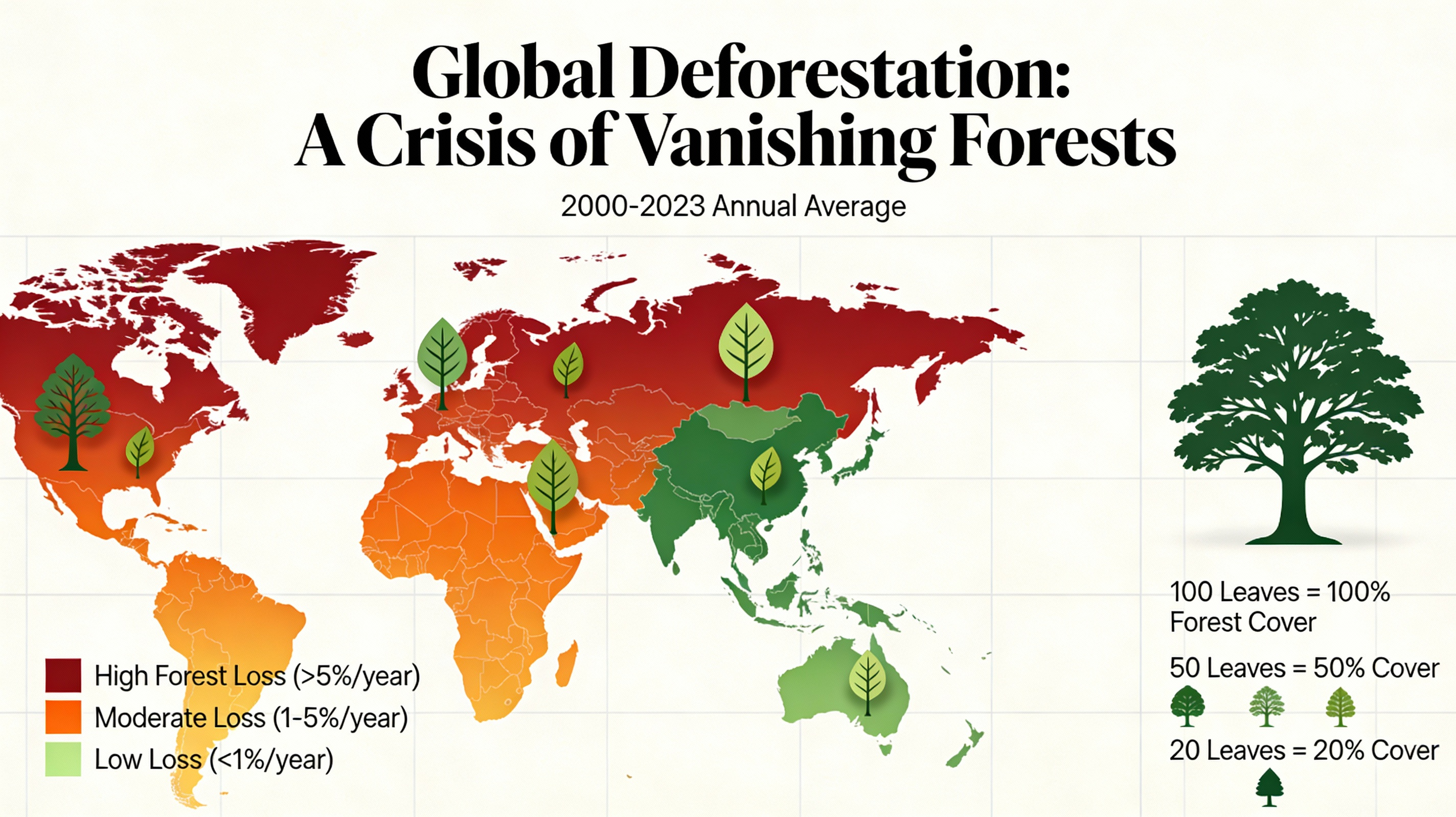
This prompt generates a beautiful and informative data visualization for a report on global deforestation. It uses compelling visuals like a colored world map or stylized tree graphics to turn data into an impactful and emotionally resonant story. - AIPinMaker
프롬프트
A beautiful and informative data visualization for a report on global deforestation. The main visual could be a world map where countries are colored based on their rate of forest loss, or a series of stylized tree graphics where the number of leaves represents the remaining forest cover. The design should be impactful and emotionally resonant, not just a dry chart, demonstrating the ability to turn data into a compelling visual story. –ar 16:9
이 AI 이미지 프롬프트 템플릿 사용 방법
 1
1프롬프트 복사 — 템플릿의 프롬프트와 네거티브 프롬프트를 가져오세요.  2
2모델 선택 — 가장 잘 맞는 추천 AI 모델을 고르세요.  3
3생성 — 클릭 한 번으로 스튜디오를 열어 결과를 만드세요.
관련 템플릿

Cloudflare Catch-All Email Routing Infographic
Goal: Create a landscape hand-drawn notebook-style Chinese infographic explaining how to register multiple ChatGPT accounts by using Cloudflare Email Routing to create catch-all mailbox aliases. Canvas: Wide 16:9 whiteboard page, clean off-white background, surrounded by a thick black dashed rounded border. Use a casual marker-and-pen sketch style with slightly imperfect lines, doodle arrows, stars, question marks, pins, and small expressive icons. Title and intro: At the top center, write the bold headline 注册 ChatGPT 第 N 个账号:用 Cloudflare 造邮箱(手绘笔记) (headline text). Underline “Cloudflare” in blue. Beneath it on the left, write the pain point line: “痛点:同个邮箱只能注册一个账号,换邮箱麻烦。” Add a small curved arrow doodle and star near the title. Main layout: Use exactly 7 main content boxes/cards plus decorative doodles. Arrange them left-to-right as a process with bold black arrows connecting sections. The 7 cards are: 1 pain card, 1 solution card, 1 core-principle card, and 4 numbered step cards. Card 1, pain card: A red outlined sticky-note box on the upper left with a sad red face icon. Text: “想注册新号?没新邮箱!” Make it look like a folded-corner note. Card 2, solution card: A blue rounded rectangle in the upper middle with a blue cloud icon. Text: “解决方案:Cloudflare Email Routing(邮箱路由)”. Put a blue arrow pointing toward the core principle box. Card 3, core principle card: A large black-outlined rounded rectangle in the upper right. Header text: “核心原理:Catch-all(通配符 / 捕获所有)”. Include a funnel icon. Show exactly 4 example incoming aliases on the left: “chatgpt@”, “netflix@”, “test1@”, and “任意前缀@”. Draw arrows from all four into a large “@” symbol and “@你的域名.com”, then a thick black arrow to a mailbox icon labeled “真实邮箱(如 Gmail)”. Bottom line with green check icon: “全部自动转发,统一汇总!无需提前创建。” Step cards along the bottom: Use exactly 4 numbered boxes. Step 1 card, bottom left: Title “第一步:准备工作”. Include exactly 3 numbered requirements: “1. Cloudflare 账号(免费注册)”, “2. 你的域名(DNS 托管在 CF)”, “3. 真实邮箱(接收转发)”. Add a globe icon, a green check mark, and a yellow key icon. Below it add small text: “域名推荐:性价比高(如 top域名)”. Step 2 card, bottom center-left: Title “第二步:启用并验证目标邮箱”. Include a small computer icon labeled “CF 控制台”. Text flow: “添加域名 → 解析 → 激活”. Draw an arrow down to a mini DNS nameserver panel with two columns: left “阿里云(修改 NS)”, right “Cloudflare(等待生效,状态:活动)”. Beneath the card, draw a red circled nameserver list with exactly 2 entries: “gene.ns.cloudflare.com” and “peyton.ns.cloudflare.com”. Add a small clock icon and text “约30分钟”. Step 3 card, bottom center-right: Title “第三步:设置邮件路由”. Show a mini Cloudflare UI mockup with exactly 2 top tabs/boxes: “Email(电子邮件)” and “Email Routing(路由)”. Include a small “Get Started” button pointing to “绑定目标地址(Destination address)”. At the bottom add an envelope icon and text: “验证邮件 → 点击确认”. Under this card place a small blue status note titled “测试转发成功” with two arrow lines showing an alias forwarding to a Gmail address. Step 4 card, bottom right: Title “第四步:设置路由规则(核心步骤)”. Show a UI panel titled “Catch-all 规则设置”. Include a blue toggle switch labeled “Active(启用)”. Include a two-row table with headers and values: row 1 “Action(操作)” to “Send to(发送至)”; row 2 “Destination(目标)” to “你的真实邮箱”. Add a red star near the corner. Final result box: At the bottom right below Step 4, add a green rounded rectangle with a smiling face icon. Text: “效果:注册时随意编造前缀(例如 chatgpt@yourdomain.com)邮件全部统一汇总到真实邮箱,实现「邮箱自由」!全程免费!” Visual style: Handwritten Chinese typography, thick black marker outlines, simple vector doodles, blue/red/green/yellow accent colors, informal classroom note-taking feel. Keep all arrows bold and directional, with minor sketchy imperfections. Constraints: Keep the entire infographic in Chinese as specified, use no photorealism, no 3D rendering, no watermark, no extra sections beyond the 7 cards and final result box, and make the text legible.3b:T12a5,Goal: Create a landscape hand-drawn notebook-style Chinese infographic explaining how to register multiple ChatGPT accounts by using Cloudflare Email Routing to create catch-all mailbox aliases. Canvas: Wide 16:9 whiteboard page, clean off-white background, surrounded by a thick black dashed rounded border. Use a casual marker-and-pen sketch style with slightly imperfect lines, doodle arrows, stars, question marks, pins, and small expressive icons. Title and intro: At the top center, write the bold headline 注册 ChatGPT 第 N 个账号:用 Cloudflare 造邮箱(手绘笔记) (headline text). Underline “Cloudflare” in blue. Beneath it on the left, write the pain point line: “痛点:同个邮箱只能注册一个账号,换邮箱麻烦。” Add a small curved arrow doodle and star near the title. Main layout: Use exactly 7 main content boxes/cards plus deco

Stylized Tech Illustration Template
Create a creative image of Stylized Tech Illustration Template. Style: photorealistic. Composition: balanced and well-framed. Lighting: natural with cinematic mood. Category: photography. Reference: stylized-tech-illustration-template-8777.

Visually Stunning Slide Generation from Content
Create a infographic image of Visually Stunning Slide Generation From Content. Style: photorealistic. Composition: balanced and well-framed. Lighting: natural with cinematic mood. Category: illustration. Reference: visually-stunning-slide-generation-from-content-1776.

Stylish Japanese Summer Fan Illustration
Create a stylish contemporary Japanese summer illustration on a clean white vertical canvas, centered on one traditional round uchiwa fan with a bamboo handle. The fan face should be teal and deep blue with layered translucent graphic shapes, combining ukiyo-e-inspired motifs and modern poster design. Show exactly 6 main decorative motif groups on and around the fan: 1) a white flowing river or wave ribbon sweeping from the lower left across the fan, 2) green bamboo leaves clustered across the upper left edge, 3) morning glory flowers on the right side with one large pink bloom, one large navy bloom, and several small dark blue blossoms, 4) round green leaves near the flowers and lower left, 5) a partial pale parasol-like circular arc with cream and coral bands behind the upper right of the fan, and 6) abstract halftone dots, splatter marks, and diagonal geometric strokes in turquoise, lime green, coral pink, and navy around the fan. Render the fan ribs and frame as realistic pale bamboo, with many thin spokes radiating from the base, a small turquoise binding at the handle joint, and a natural bamboo handle extending downward. Use a crisp mixed-media look: flat vector illustration blended with subtle paper texture, screen-print halftones, translucent overlays, fine white vertical fan fold lines, and slight shadows to give the fan depth. Keep the composition airy and elegant with generous white space. Add a small date and artist signature in the bottom right reading May 15, 2026 (date text) and Oyagi (signature text). Use a refined fashionable illustration mood inspired by Japanese summer, with dominant colors teal, indigo, lime green, white, coral pink (main palette). No extra text, no watermark, no border.

Soft UI Style Illustration Generator
Soft minimal illustration of [SUBJECT] (subject), rounded shapes, gentle gradients, calming tones, modern UI illustration style, friendly, clean, and contemporary.

Japanese Branding Strategy Infographic
{"type":"Japanese branding infographic","style":{"visual":"clean corporate flat design, website-brand-consistent explainer graphic, teal and dark navy color palette, soft off-white background, thin mint-green outlines, rounded cards, minimal vector icons, generous spacing, editorial layout","mood":"professional, trustworthy, educational, easy to understand"},"canvas":{"aspect_ratio":"16:9","background":"light warm gray"},"header":{"badge":{"text":"まとめ","shape":"rounded hexagon badge","color":"teal"},"title":"記憶のショートカットを作る戦い"},"intro":{"position":"below header","shape":"large rounded rectangle","text":"『ブランディングの科学 独自のブランド資産構築篇』を読み解くと、ブランディングとは決してポエムや雰囲気作りではなく、『消費者の記憶の構造を理解し、購買という行為の摩擦を極限まで減らすための科学』であることが分かります。","emphasis":"the quoted sentence in teal and slightly bolder"},"layout":{"sections":[{"title":"1","position":"left middle","count":3,"labels":["バラバラな施策","ブリッジ(つなぐ)","アンカー(記憶に定着)"],"heading":"ブリッジとアンカーを機能させ、すべての活動を資産に変える。","graphics":{"icon_count":5,"icons":["speech bubble with card","brochure or folded leaflet","display stand or signboard","suspension bridge","anchor with small waves"],"connector":"dotted line connecting the sequence toward bridge and anchor"},"footer":"一貫した独自のブランド資産が、あらゆる施策をつなぎ、消費者の記憶という海にしっかりと錨を下ろします。"},{"title":"2","position":"center middle","count":5,"labels":["ギフト","お土産","自分へのご褒美","出張","家族旅行"],"heading":"狭いポジショニングに逃げず、CEP(思い出すきっかけ)の数を愚直に増やす。","graphics":{"center":"teal filled circle labeled ブランド","outer_icon_count":5,"outer_icons":["gift box","shopping bag","sparkles in circle","briefcase","group of people"],"extra_icon":"coffee cup at left as daily-use cue","connector":"dotted radial lines from center brand circle to each surrounding cue"},"footer":"CEPの数=思い出す入口の数。多くのシーンで思い出してもらえるブランドが、市場シェアを拡大します。"},{"title":"3","position":"right middle","count":3,"labels":["5秒","独自のブランド資産(視覚的・感覚的シグナル)","色・形・ロゴ"],"heading":"5秒で選ばれるための『独自のブランド資産(視覚的・感覚的シグナル)』を研ぎ澄ます。","graphics":{"icon_count":4,"icons":["stopwatch with large text たった5秒","eye symbol","bottle on shelf","two cartons or packaged products on shelf"],"accent":"short motion lines around stopwatch and eye"},"footer":"遠くからでも一瞬で認識される『色』『形』『ロゴ』といった強烈なシグナルが、わずか数秒の勝負を制します。"}],"bottom_band":{"count":2,"left_block":{"graphics":"waist-up illustration of a thinking businessman in suit, hand on chin, simplified flat vector style","text":"『良いものを作れば売れる』という時代はとうの昔に終わり、今は『思い出され、すぐに見つけられるものが売れる』時代です。 自社のブランドは、お客様の記憶の中でどんな『入り口』を持ち、どんな『記号』で認識されているのか。"},"right_block":{"graphics":"circular badge containing an open book icon","text":"ローカルビジネスを一段上のステージへ引き上げるためのバイブルとして、手元に置いておきたい一冊です。 ぜひ、自社のブランド資産を棚卸しするきっかけにしてみてください。"}}},"typography":{"language":"Japanese","title_weight":"bold heavy sans-serif","body_weight":"clean sans-serif","number_badges":"white numerals inside teal circles"},"composition":{"grid":"three evenly spaced rounded cards across the middle row, with a full-width intro panel above and a full-width concluding panel below","alignment":"balanced, centered, spacious","shadow":"very subtle or none"}}3c:T10cd,{"type":"Japanese branding infographic","style":{"visual":"clean corporate flat design, website-brand-consistent explainer graphic, teal and dark navy color palette, soft off-white background, thin mint-green outlines, rounded cards, minimal vector icons, generous spacing, editorial layout","mood":"professional, trustworthy, educational, easy to understand"},"canvas":{"aspect_ratio":"16:9","background":"light warm gray"},"header":{"badge":{"text":"まとめ","shape":"rounded hexagon badge","color":"teal"},"title":"記憶のショートカットを作る戦い"},"intro":{"position":"below header","shape":"large rounded rectangle","text":"『ブランディングの科学 独自のブランド資産構築篇』を読み解くと、ブランディングとは決してポエムや雰囲気作りではなく、『消費者の記憶の構造を理解し、購買という行為の摩擦を極限まで減らすための科学』であることが分かります。","emphasis":"the quoted sentence in teal and slightly bolder"},"layout":{"sections":[{"title":"1","position":"left middle","count":3,"labels":["バラバラな施策","ブリッジ(つなぐ)","アンカー(記憶に定着)"],"heading":"ブリッジとアンカーを機能させ、すべての活動を資産に変える。","graphics":{"icon_count":5,"icons":["speech bubble with card","brochure or folded leaflet","display stand or signboard","suspension bridge","anchor with small waves"],"connector":"dotted line connecting the sequence toward bridge and anchor"},"footer":"一貫した独自のブランド資産が、あらゆる施策をつなぎ、消費者の記憶という海にしっかりと錨を下ろします。"},{"title":"2","position":"center midd
더 많은 프롬프트 탐색
카테고리별 AI 이미지·영상 프롬프트를 더 찾아보세요.