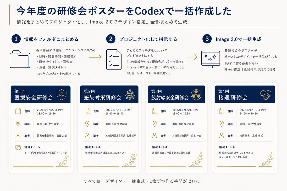
텍스트 투 이미지
Codex Training Poster Workflow Infographic — AI 이미지 프롬프트
A Japanese 16:9 infographic explaining a three-step Codex and Image 2.0 workflow for batch-generating four unified training seminar posters. - AIPinMaker
프롬프트
Goal: Create a clean Japanese presentation-style infographic showing how annual training seminar posters were batch-created with Codex and Image 2.0.

Canvas: 16:9 horizontal slide, off-white background, dark navy and muted gold accent colors, modern corporate healthcare aesthetic, generous margins, subtle shadows, thin divider lines, crisp vector icons.

Header: Large bold navy Japanese headline: {argument name="headline text" default="今年度の研修会ポスターをCodexで一括作成した"}. Add a thin vertical gold line to the left of the headline. Under it, a smaller gray subtitle: {argument name="subtitle text" default="情報をまとめてプロジェクト化し、Image 2.0でデザイン指定。全部まとめて生成。"}. Place a thin horizontal divider below the subtitle.

Top process section: Show exactly 3 numbered steps in one row, connected left-to-right by two gold arrow lines. Each step has a navy circular number badge, a navy title, a simple line icon, and short Japanese explanatory text.
1. Step 1 title: 「情報をフォルダにまとめる」 with a folder icon. Body says the information for each seminar is gathered into one folder, with three bullet items: date/time/place, seminar title/division, speaker/lecture title; then says this becomes project material.
2. Step 2 title: 「プロジェクト化して指示する」 with a checklist document icon. Body explains turning the folder into a Codex project and instructing it to create seminar posters using the information, including design directions such as colors, layout, and mood.
3. Step 3 title: 「Image 2.0で一括生成」 with a monitor icon containing sparkle marks. Body explains that all seminar posters are generated together in a unified design, no need to make them one by one, and small corrections can be handled with additional instructions.

Bottom poster gallery: Display exactly 4 vertical seminar poster cards in a single row, evenly spaced, each with rounded corners, soft drop shadow, white body, navy header band, gold icons, gold botanical line decoration at the bottom right, and a gold horizontal line near the bottom. Each card has four information rows with icons and labels: 「日時」, 「場所」, 「演者」, 「講演タイトル」.

Poster card 1: Header text 「第1回 医療安全研修会」 with a shield-and-cross icon. Date row: 「2025年6月20日(金) 18:00~19:30」. Place row: 「本館 3階 大会議室」. Speaker row: 「医療安全管理室 山田 太郎」. Lecture title row: 「インシデントを防ぐための実践的アプローチ」.

Poster card 2: Header text 「第2回 感染対策研修会」 with a virus/network icon. Date row: 「2025年7月18日(金) 18:00~19:30」. Place row: 「本館 3階 大会議室」. Speaker row: 「感染管理認定看護師 佐藤 花子」. Lecture title row: 「標準予防策の再確認と実践のポイント」.

Poster card 3: Header text 「第3回 放射線安全研修会」 with a radiation symbol icon. Date row: 「2025年8月22日(金) 18:00~19:30」. Place row: 「本館 3階 大会議室」. Speaker row: 「診療放射線技師 鈴木 一郎」. Lecture title row: 「放射線被ばくの最小化と防護の実践」.

Poster card 4: Header text 「第4回 接遇研修会」 with a handshake icon. Date row: 「2025年9月19日(金) 18:00~19:30」. Place row: 「本館 3階 大会議室」. Speaker row: 「接遇担当 高橋 美咲」. Lecture title row: 「信頼される医療者になるためのコミュニケーションの基本」.

Footer: Center a small gray Japanese summary line below the cards: {argument name="footer text" default="すべて統一デザイン・一括生成・1枚ずつ作る手間がゼロに"}.

Visual style: Use dark navy for headings and card headers, muted gold for accents/icons/arrows, light gray for dividers and secondary text. Keep typography highly legible, Japanese sans-serif, with the headline bold and all body text aligned neatly. Maintain a polished autogenerated-report look with no photos, no people, no watermark, and no extra poster cards or extra steps.39:T105e,Goal: Create a clean Japanese presentation-style infographic showing how annual training seminar posters were batch-created with Codex and Image 2.0.

Canvas: 16:9 horizontal slide, off-white background, dark navy and muted gold accent colors, modern corporate healthcare aesthetic, generous margins, subtle shadows, thin divider lines, crisp vector icons.

Header: Large bold navy Japanese headline: {argument name="headline text" default="今年度の研修会ポスターをCodexで一括作成した"}. Add a thin vertical gold line to the left of the headline. Under it, a smaller gray subtitle: {argument name="subtitle text" default="情報をまとめてプロジェクト化し、Image 2.0でデザイン指定。全部まとめて生成。"}. Place a thin horizontal divider below the subtitle.

Top process section: Show exactly 3 numbered steps in one row, connecte참고 이미지

이 AI 이미지 프롬프트 템플릿 사용 방법
 1
1프롬프트 복사 — 템플릿의 프롬프트와 네거티브 프롬프트를 가져오세요.  2
2모델 선택 — 가장 잘 맞는 추천 AI 모델을 고르세요.  3
3생성 — 클릭 한 번으로 스튜디오를 열어 결과를 만드세요.
관련 템플릿

Cloisonné Craft PPT Cover
Create a 16:9 widescreen PowerPoint cover slide in an elegant Chinese traditional craft presentation style, with an ivory rice-paper background, dark teal and gold ornamental border, and decorative Chinese corner brackets. The main headline on the left is large dark blue Chinese calligraphy text reading 掐丝珐琅 (headline text), with a smaller gold subtitle underneath reading 火与金线中的东方华彩 (subtitle text). Below it, place a centered rounded label plaque with teal text reading 传统工艺主题分享 (section label), and a small explanatory line near the lower left reading 认识一种以金属胎、细丝与珐琅釉色共同构成的华美工艺 (footer note). In the top-right corner, add a small ornate dark teal page indicator reading 01 / 10 (page indicator). On the right half, feature a highly detailed blue-and-gold cloisonné enamel vase on a dark wooden stand, decorated with lotus flowers, green lotus leaves, curling gold wire patterns, turquoise accents, and ornate gold handles. The tabletop foreground contains exactly 7 discrete craft objects: 1 coil of gold wire, 1 flat cloisonné floral medallion, 1 gold key-shaped ornament, 1 fine metalworking brush or stylus, and 4 small bowls of enamel powder in blue, green, turquoise, and white/gold. Add pale ink-wash mountains, a distant pavilion, soft lotus line art, and floating auspicious cloud motifs in the background. Use a refined museum-course aesthetic, realistic product rendering mixed with delicate Chinese illustration, harmonious cream, deep navy, turquoise, and metallic gold palette, crisp typography, balanced negative space, premium educational PPT title-slide composition.36:T715,Create a 16:9 widescreen PowerPoint cover slide in an elegant Chinese traditional craft

Enterprise landing page with interactive responsive design
Generate an enterprise-grade professional [DESCRIBE YOUR BUSINESS] (business_description) landing page. Add interactive elements, animations, and make it fully responsive. Surprise me, be creative, do this step by step.

Chinese AI Retirement Planning Infographic
{"type":"editorial Chinese infographic poster","topic":"AI and retirement planning boundaries","style":"clean academic magazine infographic, flat vector icons, soft textured off-white paper background, balanced Chinese editorial typography, minimal Japanese-inspired decorative motifs","canvas":{"orientation":"portrait","aspect_ratio":"3:4"},"palette":{"background":"warm ivory","primary_text":"black","secondary_text":"deep blue","accent_red":"rose pink","accent_green":"muted olive green","accent_yellow":"golden yellow","accent_blue":"navy blue","line_color":"soft gray-blue"},"headline":{"text":"{argument name=\"headline text\" default=\"AI 能帮你规划退休,但不能替你负责\"}","position":"top left","font":"bold Chinese serif or Song-style display","large":true},"subheadline":{"text":"MIT Sloan 对“AI + 退休规划”的边界判断","position":"below headline","color":"deep blue","font":"bold Chinese sans-serif"},"source_line":{"text":"来源:MIT Sloan / Andrew Lo","position":"below subheadline","color":"gray"},"layout":{"sections":[{"title":"高责任场景","position":"upper middle","count":2,"shape":"rounded rectangle with pink border and pale pink fill","icon_count":3,"labels":["AI = 辅助工具,不是最终决策者","适合帮助思考,不适合替你拍板"],"left_icon":"large pink warning triangle inside circle over wave pattern","item_icons":["person badge","exclamation mark"]},{"title":"强在帮你想清楚,弱在替你承担后果","position":"center","count":2,"shape":"large framed comparison panel","subsections":[{"title":"AI 更适合做:认知辅助","position":"left","count":4,"color":"green","labels":["解释复杂概念","比较不同方案","做情景推演","提醒行为偏差"],"icons":["book","balance scale","upward chart","exclamation in speech bubble"]},{"title":"AI 不能替代:责任判断","position":"right","count":4,"color":"pink-red","labels":["承担法律责任","精确税务与收益计算","处理复杂合规细节","托管敏感隐私风险"],"icons":["courthouse","calculator","clipboard","lock"]}],"center_icon":"blue circle with white balance scale"},{"title":"正确用法:把 AI 当分析伙伴,不当神谕","position":"lower middle","count":3,"shape":"rounded rectangle with yellow border and pale cream fill","labels":["先用 AI 做认知准备:理解概念、列变量、梳理方案","再让 AI 挑战你的假设:问它哪里可能错、缺了什么信息","关键决策交给自己,并由专业人士复核"],"left_illustration":"yellow rising sun over stylized landscape with bamboo leaves","step_markers":"three yellow numbered circles: 1, 2, 3"},{"title":"注:本文强调的是“辅助决策边界”,不是投资建议","position":"bottom","count":1,"shape":"rounded rectangle with blue-gray border","labels":["Source: MIT Sloan, Want to use AI to plan your retirement? Here’s how to proceed"],"left_icon":"blue fountain pen nib in circle","right_decoration":"gray-blue wave pattern"}],"decorations":{"count":5,"items":["top right cherry blossom branch with pink flowers and falling petals","top left pagoda silhouette","top left distant mountain silhouette","small cloud-line motifs near upper corners of comparison section","subtle wave patterns inside circular icons and lower right footer"]}},"composition":"ample margins, all text in Chinese except the English source line at bottom, strong hierarchy from headline to colored content boxes, symmetrical comparison layout in the middle, polished social-media-ready infographic","rendering":"sharp vector infographic, crisp text, subtle paper grain, no photorealism"}3e:Te44,{"type":"editorial Chinese infographic poster","topic":"AI and retirement planning boundaries","style":"clean academic magazine infographic, flat vector icons, soft textured off-white paper background, balanced Chinese editorial typography, minimal Japanese-inspired decorative motifs","canvas":{"orientation":"portrait","aspect_ratio":"3:4"},"palette":{"background":"warm ivory","primary_text":"black","secondary_text":"deep blue","accent_red":"rose pink","accent_green":"muted olive green",
Eye Color Analysis Guide
Goal: Create a clean Korean prompt-collection webpage/card showcasing an example GPT Image 2 prompt for a modern ice cream shop interior. Canvas: Vertical 9:16 off-white page, warm cream background, generous margins, editorial web layout. Use crisp black typography and a realistic architectural render as the central visual. Layout: At the top left, show a small breadcrumb with exactly 3 items: "프롬프트", "이미지프롬프트", and "GPT IMAGE 2", separated by chevrons. Below it, place a large bold Korean headline: 모던한 아이스크림 매장 인테리어 (headline text). Under the headline, place one large rounded-corner image frame with a thin dark border, containing a realistic modern ice cream cafe interior. Below the image, add one short Korean description paragraph. At the bottom, add one large bordered prompt box with a header bar and a pale yellow text area. Main image subject: A photorealistic modern minimalist ice cream shop named Some ice (shop name). The interior has warm late-afternoon sunlight casting leaf shadows on the wall, cream plaster walls, gray concrete flooring, gray textured back wall, white square-tile counter, warm wood canopy ceiling, hidden cove lighting, a large gray shop logo above the counter, and a single female employee behind the counter wearing a cream shirt and beige apron. Include exactly 6 round cafe tables: 2 near the left foreground, 2 along the left middle wall, and 2 toward the right side. Include about 10 visible chairs, mostly bentwood chairs with chrome legs, plus one black accent chair on the right. Include exactly 4 small illustrated menu boards behind the counter, one desktop computer on the counter, cream storage boxes and beige shopping bags on shelves to the right, 3 framed ice-cream posters on the left wall, a narrow staircase or corridor receding in the back left, and no customers. Prompt box details: The box has a thick dark outline and slightly rounded corners. The header strip is off-white with the label "프롬프트" on the left. On the right side of the header, include exactly 3 controls: a black button labeled "무료로 이미지 생성" with a right arrow, a white outlined button labeled "번역 전" with a small translation icon, and a small square copy icon button. The large body area is pale yellow and filled with dense Korean paragraph text describing the image prompt. Highlight exactly 4 inline terms with rounded blue selection-style backgrounds: "Some ice", "어플리케이션", "Have Someice Day", and "3:2". Text content: The paragraph under the image should read: 브랜드 간판, 메뉴판, 좌석, 햇살이 어우러진 따뜻하고 미니멀한 아이스크림 카페 인테리어의 사실적인 건축 시각화 프롬프트입니다. (description text) The prompt body should be Korean prose beginning with a request for a warm late-afternoon sunlit modern ice cream shop interior and should mention the shop name, app-style signage, cream plaster walls, gray concrete floor, wood canopy ceiling, 4 menu boards, 6 round tables, 10 chairs, 3 framed posters, and a 3:2 horizontal composition. Visual style: Minimal Korean web UI, high-end prompt gallery aesthetic, black and charcoal text, cream paper background, realistic architectural photography in the image area, subtle shadows, clean alignment, no clutter. Constraints: Use only one main photo, one description paragraph, and one prompt card. Keep all Korean text legible. Do not add watermarks, logos outside the shop sign, extra people, or extra UI panels.6d:Te2e,Goal: Create a clean Korean prompt-collection webpage/card showcasing an example GPT Image 2 prompt for a modern ice cream shop interior. Canvas: Vertical 9:16 off-white page, warm cream ba

Soft Autumn Personal Color Card
{"type":"personal color analysis infographic card","style":"clean editorial beauty infographic, soft neutral background, elegant serif headline, Chinese typography, minimalist luxury layout","canvas":{"orientation":"portrait","background":"warm ivory paper tone with thin taupe divider lines"},"headline":{"main":"PERSONAL COLOR ANALYSIS","sub":"四季色彩诊断卡"},"subject":{"count":1,"gender_presentation":"female","pose":"front-facing studio portrait, shoulders visible","face":"intentionally blurred and featureless","hair":{"color":"dark brown","length":"shoulder length","style":"soft layered bob with slight outward flip at the ends and side part"},"top":{"color":"light cream beige knit","neckline":"soft V-neck"}},"layout":{"sections":[{"title":"main portrait","position":"left column upper","count":1,"labels":[]},{"title":"适合色对比","position":"top right","count":4,"labels":["燕麦米白 #F3E5D0","茶绿 #8A9A5B","陶土橘 #C77D5C","春色玫瑰 #B87B7B"]},{"title":"中性色对比","position":"middle right","count":6,"labels":["驼色 #A78B6A","灰梅 #7D6B5D","奶茶米 #D4BFA4","雾灰绿 #92A092","暗金 #A68A5C","暖可可 #5C4838"]},{"title":"本人基色","position":"left column middle","count":6,"labels":["脸颊","中庭","颈部","唇色","发色","瞳色"]},{"title":"风格关键词","position":"left column lower","count":4,"labels":["柔和","知性","温婉","老钱风"]},{"title":"推荐色","position":"center right lower","count":15,"labels":["燕麦米白 #F3E5D0","奶茶米 #D4BFA4","驼色 #A78B6A","陶土橘 #C77D5C","豆沙粉 #D4A495","暮色玫瑰 #B87B7B","茶绿 #8A9A5B","雾灰绿 #92A092","鼠尾草绿 #A4AF91","柔紫 #A691A3","灰蓝 #7890A0","芥末黄 #B8A055","砖红 #A85A48","暗金棕 #8B6F47","深可可 #5C4838"]},{"title":"强调色","position":"below recommended colors","count":6,"labels":["砖红 #A85A48","芥末黄 #B8A055","墨绿 #445D4A","深茶棕 #6B4E34","枫叶红 #A0522D","古铜金 #8B6B3D"]},{"title":"可用色","position":"below accent colors","count":4,"labels":["象牙白 #F0E9D6","柔灰蓝 #8FA3AD","暖灰 #9D9489","浅紫灰 #B0A3AC"]},{"title":"避雷色","position":"bottom left strip","count":6,"labels":["荧光粉 #FF1493","纯黑 #000000","正红 #FF0000","冰蓝 #00BFFF","冷白 #FFFFFF","亮紫 #9B30FF"]},{"title":"次适合","position":"bottom right strip","count":6,"labels":["珊瑚粉 #E89080","浅橄榄 #B3A580","深墨绿 #3B4D3B","浅木桃 #CDB89B","柔玫瑰金 #B89088","淡灰紫 #AFA0B0"]}],"left_info_table":{"count":5,"labels":["季型:柔秋","亚型:柔秋","底调:暖中性","彩度:柔和","对比度:中"]},"footer_notes":{"title":"关键提示","count":4,"labels":["底调偏暖,首选奶茶米、驼色、茶绿、陶土橘","彩度柔和,选低饱和色调,避免高纯度色","对比中等,造型保持柔和过渡","金属首饰选暖金系,避开冷银"]}},"color_palette":"muted soft autumn palette, warm-neutral undertone, low saturation, medium contrast","rendering":"high-resolution polished app-style infographic, realistic fabric and hair, subtle shadows, precise grid alignment, print-ready beauty consultation card","customization":{"headline text":"{argument name=\"headline text\" default=\"PERSONAL COLOR ANALYSIS\"}","subtitle text":"{argument name=\"subtitle text\" default=\"四季色彩诊断卡\"}","season result":"{argument name=\"season result\" default=\"柔秋\"}","character hair color":"{argument name=\"character hair color\" default=\"dark brown\"}","background color":"{argument name=\"background color\" default=\"warm ivory\"}"}}3a:Te21,{"type":"personal color analysis infographic card","style":"clean editorial beauty infographic, soft neutral background, elegant serif headline, Chinese typography, minimalist luxury layout","canvas":{"orientation":"portrait","background":"warm ivory paper tone with thin taupe divider lines"},"headline":{"main":"PERSONAL COLOR ANALYSIS","sub":"四季色彩诊断卡"},"subject":{"count":1,"gender_presentation":"female","pose":"front-facing studio portrait, shoulders visible","face":"intentionally blurred and featureless","hair":{"color":"dark brown","length":"shoulder length","style":"soft

Informative Climate Change Seminar Poster
An informative and engaging poster for a public seminar on climate change. The poster is designed as a mini-infographic, with a large, central graphic showing the earth with a thermometer, and smaller icons and data points around it explaining the causes and effects. The design is clean, organized, and aims to educate the viewer quickly and effectively. –ar 3:4
더 많은 프롬프트 탐색
카테고리별 AI 이미지·영상 프롬프트를 더 찾아보세요.