テキストから画像
Web Application System Architecture Diagram — AI 画像プロンプト
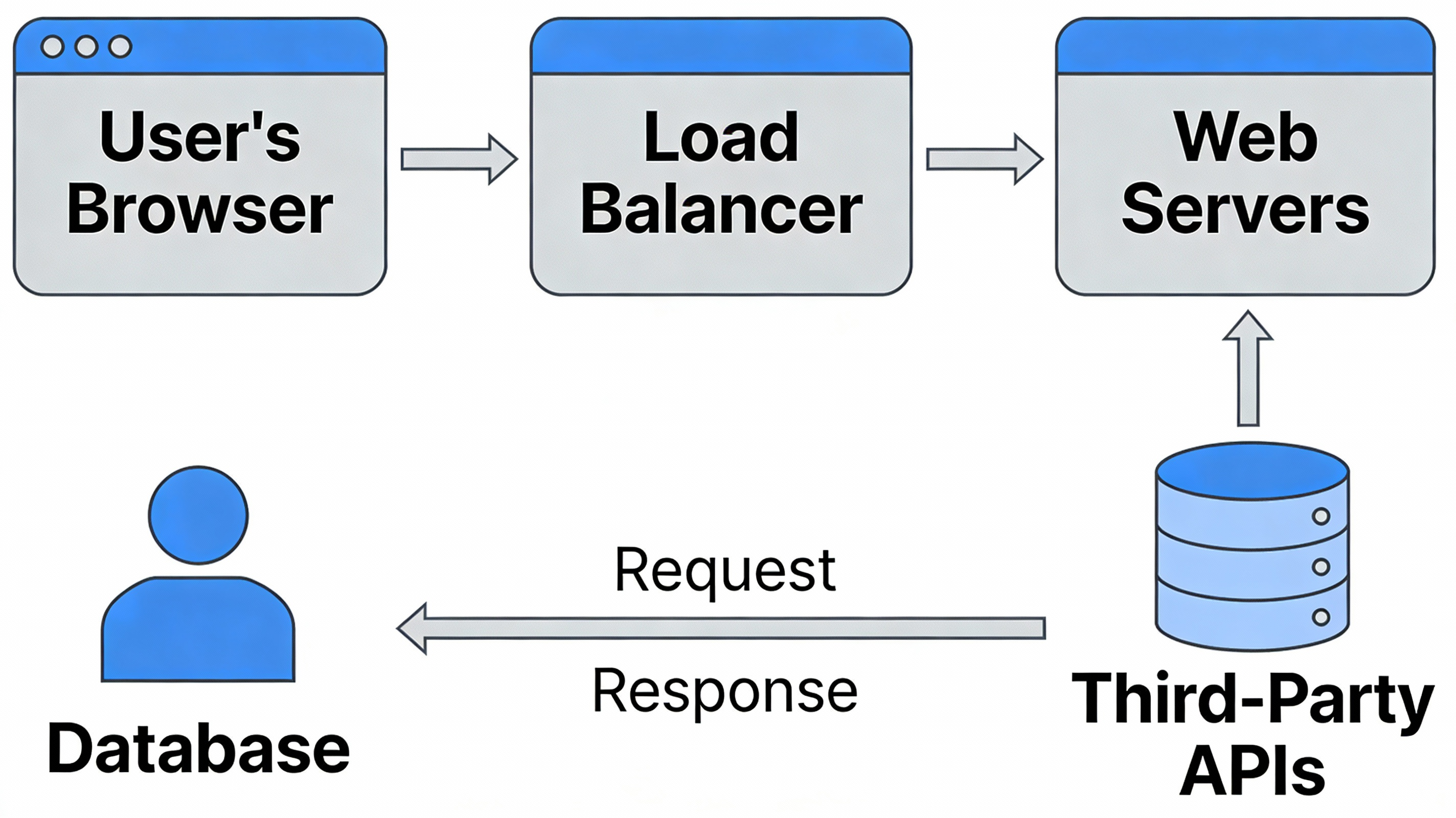
This prompt generates a high-level system architecture diagram for a modern web application, suitable for stakeholder presentations. It uses icons to represent components and shows data flow, with a clean, professional style understandable by non-technical audiences. - AIPinMaker
プロンプト
A high-level system architecture diagram for a modern web application, for a presentation to stakeholders. The diagram should use icons to represent different components like the user’s browser, a load balancer, web servers, a database, and third-party APIs. The connections between them should show the flow of data. The style is clean, professional, and easy to understand, even for a non-technical audience, showcasing the ability to render complex technical information clearly. –ar 16:9
このAI画像プロンプトテンプレートの使い方
 1
1プロンプトをコピー — テンプレートのプロンプトとネガティブプロンプトを取得。  2
2モデルを選ぶ — 最適な推奨AIモデルを選択。  3
3生成 — ワンクリックでスタジオを開いて作成。
関連テンプレート

3D Abstract Data Pipeline Visualization
Goal: Create a clean Korean prompt-collection webpage/card showcasing an example GPT Image 2 prompt for a modern ice cream shop interior. Canvas: Vertical 9:16 off-white page, warm cream background, generous margins, editorial web layout. Use crisp black typography and a realistic architectural render as the central visual. Layout: At the top left, show a small breadcrumb with exactly 3 items: "프롬프트", "이미지프롬프트", and "GPT IMAGE 2", separated by chevrons. Below it, place a large bold Korean headline: 모던한 아이스크림 매장 인테리어 (headline text). Under the headline, place one large rounded-corner image frame with a thin dark border, containing a realistic modern ice cream cafe interior. Below the image, add one short Korean description paragraph. At the bottom, add one large bordered prompt box with a header bar and a pale yellow text area. Main image subject: A photorealistic modern minimalist ice cream shop named Some ice (shop name). The interior has warm late-afternoon sunlight casting leaf shadows on the wall, cream plaster walls, gray concrete flooring, gray textured back wall, white square-tile counter, warm wood canopy ceiling, hidden cove lighting, a large gray shop logo above the counter, and a single female employee behind the counter wearing a cream shirt and beige apron. Include exactly 6 round cafe tables: 2 near the left foreground, 2 along the left middle wall, and 2 toward the right side. Include about 10 visible chairs, mostly bentwood chairs with chrome legs, plus one black accent chair on the right. Include exactly 4 small illustrated menu boards behind the counter, one desktop computer on the counter, cream storage boxes and beige shopping bags on shelves to the right, 3 framed ice-cream posters on the left wall, a narrow staircase or corridor receding in the back left, and no customers. Prompt box details: The box has a thick dark outline and slightly rounded corners. The header strip is off-white with the label "프롬프트" on the left. On the right side of the header, include exactly 3 controls: a black button labeled "무료로 이미지 생성" with a right arrow, a white outlined button labeled "번역 전" with a small translation icon, and a small square copy icon button. The large body area is pale yellow and filled with dense Korean paragraph text describing the image prompt. Highlight exactly 4 inline terms with rounded blue selection-style backgrounds: "Some ice", "어플리케이션", "Have Someice Day", and "3:2". Text content: The paragraph under the image should read: 브랜드 간판, 메뉴판, 좌석, 햇살이 어우러진 따뜻하고 미니멀한 아이스크림 카페 인테리어의 사실적인 건축 시각화 프롬프트입니다. (description text) The prompt body should be Korean prose beginning with a request for a warm late-afternoon sunlit modern ice cream shop interior and should mention the shop name, app-style signage, cream plaster walls, gray concrete floor, wood canopy ceiling, 4 menu boards, 6 round tables, 10 chairs, 3 framed posters, and a 3:2 horizontal composition. Visual style: Minimal Korean web UI, high-end prompt gallery aesthetic, black and charcoal text, cream paper background, realistic architectural photography in the image area, subtle shadows, clean alignment, no clutter. Constraints: Use only one main photo, one description paragraph, and one prompt card. Keep all Korean text legible. Do not add watermarks, logos outside the shop sign, extra people, or extra UI panels.73:Te2e,Goal: Create a clean Korean prompt-collection webpage/card showcasing an example GPT Image 2 prompt for a modern ice cream shop interior. Canvas: Vertical 9:16 off-white page, warm cream ba

Japanese Manufacturing Challenges Infographic
A clean corporate editorial infographic illustration for a Japanese business article about manufacturing industry challenges, set inside a realistic modern factory with metalworking machines and a cool gray-blue color palette. The composition is split into two thematic halves over a blurred industrial workshop background. At the top center, place a large bold Japanese headline in dark navy text: 製造業が直面する根深い課題: 「人手不足」と「技術伝承」 (headline text). In the left foreground, show 1 factory worker in a light gray uniform and cap standing with arms crossed, looking concerned; nearby add a circular white icon showing exactly 6 human silhouettes, with 3 filled dark figures and 3 dotted outline figures to symbolize labor shortage. In the right foreground, show exactly 2 factory workers beside a large lathe machine: 1 veteran worker in a navy work jacket and navy cap pointing and demonstrating machine operation, and 1 younger worker in a light gray uniform and cap observing closely. Near them, add a white thought bubble icon containing a navy head silhouette with 2 gear symbols and exactly 3 small Japanese word bubbles reading "経験", "勘", and "コツ". In the center background, include exactly 2 additional workers in light gray uniforms operating machinery, slightly out of focus, for a total of 5 workers visible in the factory scene. Overlay two rounded white information panels with dark navy title tabs. The left panel title is "人手不足" and contains exactly 3 bullet points with blue circular check icons: "若手人材の確保が困難", "現場の負担増大", and "将来の生産性低下への懸念". The right panel title is "技術伝承" and contains exactly 3 bullet points with blue circular check icons: "熟練技術が属人化", "暗黙知が言語化・標準化されていない", and "ベテランの退職による技術の断絶リスク". At the bottom center, place a dark navy rounded rectangular callout box with white Japanese text: 製造業の持続的な成長のために、これらの課題解決が急務 (callout text). Add exactly 2 large white arrows pointing inward toward this bottom callout, one from the left and one from the right. Style the whole image like a polished consulting-firm presentation visual or business magazine insert: photorealistic workers and machinery, subtle depth of field, high clarity, balanced layout, soft lighting, crisp typography, and a professional Japanese manufacturing-industry infographic aesthetic.3e:Ta26,A clean corporate editorial infographic illustration for a Japanese business article about manufacturing industry challenges, set inside a realistic modern factory with metalworking machines and a cool gray-blue color palette. The composition is split into two thema

Japanese LP Psychology 8-Step Infographic
{"type":"Japanese marketing infographic","topic":"high-converting landing page structure guided by user psychology","style":{"look":"clean flat business infographic","palette":{"primary":"blue","secondary":"green","neutral":"white and light gray","accent":"dark navy headline with one highlighted blue numeral"},"background":"plain white","lines":"thin gray connectors and borders","icons":"simple circular line icons in blue and green","aspect_ratio":"16:9 landscape"},"headline":{"text":"CVRの高いLPは{argument name=\"number of elements\" default=\"8\"}要素で心理を前に進める","position":"top center","emphasis":"the numeral is large and bright blue"},"layout":{"columns":3,"sections":[{"title":"ユーザー心理","position":"left column","count":8,"items":[{"index":1,"icon":"eye","label":"何のサービスか気になる","subtext":"まずは目に留まり、注意が向く"},{"index":2,"icon":"magnifying glass","label":"もっと知りたいと思う","subtext":"興味を持ち、内容を読み進める"},{"index":3,"icon":"thought cloud","label":"自分ごととしてイメージする","subtext":"利用シーンを想像し、自分に関係があると感じる"},{"index":4,"icon":"heart","label":"欲しい・解決したいと思う","subtext":"メリットを感じ、欲求が高まる"},{"index":5,"icon":"balance scale","label":"他と比べて良さそうだと思う","subtext":"比較して、優位性や違いを理解する"},{"index":6,"icon":"check mark badge","label":"信頼できると感じて納得する","subtext":"根拠や実績を確認し、安心して決められる"},{"index":7,"icon":"running person","label":"今すぐ行動しようと思う","subtext":"迷いがなくなり、行動に移る"},{"index":8,"icon":"smiling face","label":"使ってよかったと感じる","subtext":"成果を実感し、満足・信頼が深まる"}]},{"title":"LP全体構成(ワイヤーフレーム)","position":"center column","count":8,"items":[{"index":1,"label":"Attention(注意)","wireframe":"logo at top, main hero block with headline and CTA button","text":"キャッチコピーで課題や価値を一言で伝える"},{"index":2,"label":"Interest(興味)","wireframe":"image placeholder and text block","text":"サービス・商品の特徴や課題の解決方法を紹介"},{"index":3,"label":"Image(想像)","wireframe":"wide image placeholder","text":"利用シーン・導入後の未来をイメージできる構成"},{"index":4,"label":"Desire(欲求)","wireframe":"three small circular icons and text","text":"得られるベネフィット/価値を提示し『欲しい』と思わせる"},{"index":5,"label":"Comparison(比較)","wireframe":"comparison table grid","text":"他社・代替手段との違いや優位性を明確にする"},{"index":6,"label":"Consent(納得)","wireframe":"star rating, avatar, testimonial lines","text":"実績・お客様の声・データで信頼性を補強し、納得を促す"},{"index":7,"label":"Action(行動)","wireframe":"large CTA area with dark button","text":"今すぐ始める/無料で試すなど行動を後押しするCTA"},{"index":8,"label":"Satisfaction(満足)","wireframe":"circular arrow support icon and text","text":"導入後のサポート・保証・返金制度など安心材料で満足・リピートにつなげる"}],"extra_labels":["LOGO","CTAボタン","今すぐ申し込む"]},{"title":"役割","position":"right column","count":8,"items":[{"index":1,"icon":"megaphone","text":"注意を引き、スクロールを促す導入パート"},{"index":2,"icon":"open book","text":"興味を持たせ、読み進める動機をつくるパート"},{"index":3,"icon":"picture frame","text":"自分ごと化を促し、利用イメージを具体化するパート"},{"index":4,"icon":"heart","text":"ベネフィットを訴求し、『欲しい』を引き出すパート"},{"index":5,"icon":"balance scale","text":"比較によって、選ぶ理由を明確にするパート"},{"index":6,"icon":"shield","text":"信頼・安心を提供し、意思決定のハードルを下げるパート"},{"index":7,"icon":"cursor arrow","text":"行動を後押しし、コンバージョンを生むパート"},{"index":8,"icon":"smile face","text":"満足・信頼を高め、継続・紹介につなげるパート"}]}],"connectors":"dotted horizontal guide lines connect each of the 8 center stages to matching items in the left and right columns; small downward arrows connect stacked cards in the left column"},"footer":{"style":"rounded rectangular note bar with light background and thin blue outline","icon":"light bulb","text":"ユーザーの心理を段階的に前へ進めることで、自然な流れでCVRを最大化できます。"},"composition":"top headline, three evenly spaced vertical columns beneath it, eight aligned horizontal rows across the page, symmetrical educational slide design for a landing page optimization manual","quality":"sharp vector text, presentation-slide clarity, polished corporate training material"}3d:T1407,{"type":"Japanese marketing infographic","topic":"high-converting landing page structure guided by user psychology","style":{"look":"clean flat business infographic","palette":{"primary":"blue","secondary":"green","neutral":"white and light gray","accent":"dark navy headline with one highlighted blue numeral"},"background":"plain white","lines":"thin gray connectors and borders","icons":"simple circular line icons in blue and green","aspect_ratio":"16:9 landscape"},"headline":{"text":"CVRの高いLPは{argument name=\"number of elements\" default=\"8\"}要素で心理を前に進める","position":"top center","emphasis":"the numeral is large and bright blue"},"layout":{"columns":3,"sections":[{"title":"ユーザー心理","position":"left column","count":8,"items":[{"index":1,"icon":"eye","label":"何のサービスか気になる","subtext":"まずは目に留まり、注意が向く"},{"index":2,"icon":"magnifying glass","label":"もっと知りたいと思う","subtext":"興味を持ち、内容を読み進める"},{"index":3,"icon":"thought cloud","label":"自分ごととしてイメージする","subtext":"利用シーンを想像し、自分に関係があると感じる"},{"index":4,"icon":"heart","label":"欲しい・解決したいと思う","subtext":"メリットを感じ、欲求が高まる"},{"index":5,"icon":"balance scale","label":"他と比べて良さそうだと思う","subtext":"比較して、優位性や違いを理解する"},{"index":6,"icon":"check mark badge","label":"信頼できると感じて納得する","subtext":"根拠や実績を確認し、安心して決められる"},{"index":7,"icon":"running person","label":"今すぐ行動しようと思う","subtext":"迷いがなくなり、行動に移る"},{"index":8,"icon":"smiling face","label":"使ってよかったと感じる","subtext":"成果を実感し、

Google Fonts Japanese Tutorial Infographic
{"type":"Japanese infographic","topic":"How to use Google Fonts","style":"clean modern flat design, white background, soft pastel blue and mint corner blobs, rounded cards with subtle shadows, tech tutorial aesthetic, crisp vector typography and UI illustrations","canvas":{"aspect_ratio":"16:9"},"headline":{"main":"Google Fontsの使い方","sub":"基本の3ステップ"},"layout":{"sections":[{"title":"1. フォントを選ぶ","position":"left","count":1,"labels":["1. フォントを選ぶ"],"card_style":"rounded white panel with light blue border/shadow","icon":"blue numbered circle with 1","illustration":"browser window showing a font search interface, 3 visible font preview rows with large Aa あ samples, a search bar at top, small colored window buttons, light gray interface lines and blue accent dashes","body_text":"Google Fontsのサイトで、好きな書体を探します。"},{"title":"2. 埋め込みコードを取得","position":"center","count":1,"labels":["2. 埋め込みコードを取得"],"card_style":"rounded white panel with light blue border/shadow","icon":"blue numbered circle with 2","illustration":"dark code panel with two labeled code examples separated by a thin divider","code_blocks":{"count":2,"labels":["<link> (HTML)","@import (CSS)"],"content":["<link href=\"https://fonts.googleapis.com/css2?family=Poppins:wght@400;600&display=swap\" rel=\"stylesheet\">","@import url('https://fonts.googleapis.com/css2?family=Noto+Sans+JP:wght@400;700&display=swap');"]},"body_text":"表示された<link>やCSSをコピーします。"},{"title":"3. CSSで適用","position":"right","count":1,"labels":["3. CSSで適用"],"card_style":"rounded white panel with light blue border/shadow","icon":"blue numbered circle with 3","illustration":"white code card containing CSS with two selectors and font-family rules","code_blocks":{"count":2,"labels":[".title","body"],"content":[".title { font-family: 'Poppins', sans-serif; }","body { font-family: 'Noto Sans JP', sans-serif; }"]},"body_text":"font-familyを指定して、デザインに反映します。"},{"title":"ポイント","position":"bottom-left","count":3,"labels":["読みやすさで選ぶ","日本語対応を確認する","使いすぎず、2〜3種類に絞る"],"card_style":"rounded white panel with pale blue tint","icon":"blue star in a circle","body_format":"bullet list"},{"title":"よく使う組み合わせ","position":"bottom-center-right","count":2,"labels":["見出し: Poppins","本文: Noto Sans JP"],"card_style":"rounded white panel with pale lavender tint","icon":"purple linked-rings symbol","body_format":"two pill-shaped example boxes"}],"connectors":{"count":2,"style":"large blue right-pointing arrows between the 3 top cards"},"pagination":{"text":"2 / 2","position":"bottom-right","style":"blue rounded corner tab"}},"text_language":"Japanese","color_palette":{"primary_blue":"#2f80ff","navy":"#0f2b5b","google_colors":["#4285F4","#DB4437","#F4B400","#0F9D58"],"lavender":"#8b6cff","background":"#ffffff"}}3a:Tbd9,{"type":"Japanese infographic","topic":"How to use Google Fonts","style":"clean modern flat design, white background, soft pastel blue and mint corner blobs, rounded cards with subtle shadows, tech tutorial aesthetic, crisp vector typography and UI illustrations","canvas":{"aspect_ratio"

Software Shortcut Infographic
Create a infographic image of Software Shortcut Infographic. Style: photorealistic. Composition: balanced and well-framed. Lighting: natural with cinematic mood. Category: illustration. Reference: software-shortcut-infographic-14722.

Momotaro Explainer Slide in Hybrid Style
Create a creative image of Momotaro Explainer Slide In Hybrid Style. Style: photorealistic. Composition: balanced and well-framed. Lighting: natural with cinematic mood. Category: photography. Reference: momotaro-explainer-slide-in-hybrid-style-13983.
他のプロンプトを探す
カテゴリ別にAI画像・動画プロンプトをもっと見る。