テキストから画像
Retro Magazine Reader Submission Page — AI 画像プロンプト
A highly detailed prompt designed to recreate the nostalgic aesthetic of 90s and 00s gaming or anime magazine reader contribution pages, featuring a mix of different art styles and layout elements. - AIPinMaker
プロンプト
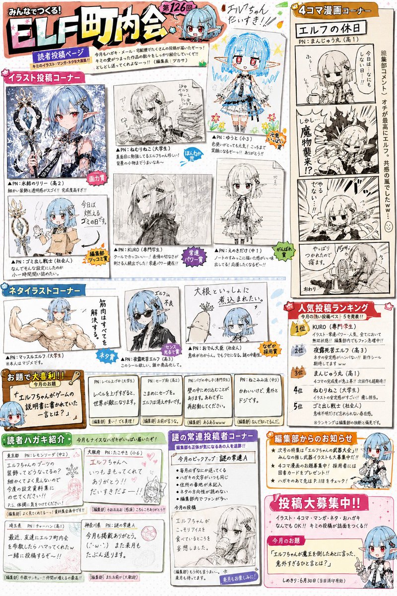
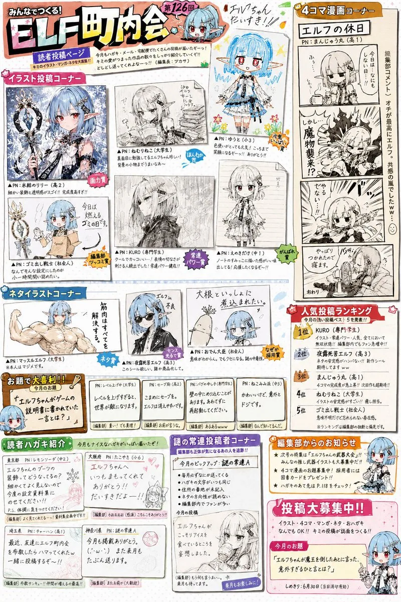
参照画像のキャラクターを主人公とする、実在しない大人気作品の公式ファン雑誌の読者投稿コーナーページを作成する。これは表紙ではない。これはポスターではない。これはイラスト集ではない。これは雑誌の中盤に存在する読者参加型投稿ページである。{argument name="年代" default="1990年代から2000年代"}のゲーム雑誌、アニメ雑誌、ホビー雑誌、児童向け雑誌の読者投稿コーナー文化を強く参考にすること。誌面内には複数のコーナーが存在する。・読者イラストコーナー・ネタイラストコーナー・4コマ漫画コーナー・大喜利コーナー・編集部コメント・読者ハガキ紹介・人気投稿ランキング・謎の常連投稿者コーナーなどを自由に構成してよい。誌面全体はカラフルで賑やか。手作業でレイアウトされたような雑誌編集感。デジタルデザインが洗練されすぎないこと。キャラクターは誌面の様々な場所に登場する。ただし公式イラストだけではなく、読者によるネタ投稿として描かれている。ギャグ表現歓迎。パロディ歓迎。日常ネタ歓迎。軽いキャラ崩壊歓迎。読者達はこの作品を長年愛している。キャラクターをいじることに慣れている。誌面には多数の吹き出し、コメント、編集部ツッコミが存在する。文字はすべて自然な日本語。AI特有の意味不明文字を避ける。本当に印刷された雑誌ページのような情報量。重要:この作品は架空だが、雑誌文化だけは異常なほどリアルにする。読者達は実在する作品について語っている温度感を持つ。「長年続く人気作品の読者投稿コーナー」として成立させること。単なるキャラクター紹介ページ禁止。単なるファンアート集禁止。雑誌編集部と読者が一緒に遊んでいる空気感を最優先する。投稿作品は作者ごとに明確な個性を持つこと。誌面内の作品は、・神絵師レベルの高画力作品・アマチュア上級者作品・高校生レベルの作品・小学生が一生懸命描いた作品・ギャグ漫画作品・4コマ漫画作品・落書き風ネタイラスト・鉛筆描き作品・モノクロ原稿作品などを自然に混在させること。作品ごとに・線の癖・デフォルメ度・画力・構図力・漫画表現・ペン入れの質・トーン処理が大きく異なること。すべて同じ絵柄で描かれてはならない。同一作者による作品集に見えてはならない。本当に多数の読者から投稿された作品を編集部が選んだように見せること。読者投稿作品は、完成イラストとして誌面上に直接描かれているのではなく、実際に編集部へ送られてきた投稿原稿をスキャンし、切り抜き、誌面上へレイアウトしたように見えること。作品ごとに・紙質・印刷品質・スキャン品質・線の濃さ・原稿サイズ・余白が異なっていてよい。投稿ハガキをそのまま掲載したような作品。コピー原稿を掲載したような作品。漫画原稿の一部を掲載したような作品。イラスト投稿を掲載したような作品。などが混在していてよい。編集部は画力だけで作品を選んでいない。面白さ、発想力、ネタ性、インパクト、読者人気、を重視して掲載作品を選んでいる。そのため誌面には、非常に上手い作品と、やや拙い作品が自然に混在している。編集部コメントも作品ごとに異なる。「画力賞」「ネタ賞」「編集長爆笑賞」「勢いだけで掲載賞」「なぜ採用したのか誰にも分からない賞」のような遊び心のある扱いが存在してもよい。特に重要:誌面を見た瞬間に、「昔のゲーム雑誌やアニメ雑誌の読者投稿ページだ」と感じること。そして細部を見るほど、投稿者ごとの個性、編集部の悪ノリ、常連投稿者文化、長年続く人気作品の歴史、が伝わってくること。雑誌編集部と読者が何年も一緒に遊び続けている空気感を最優先すること。3c:Teeb,Create a reader submission corner page for an official fan magazine of a non-existent, popular series, featuring the character from the reference image as the protagonist. This is not a cover. This is not a poster. This is not an art book. This is a reader-participation page found in the middle of a magazine. Strongly reference the reader submission corner culture of gaming, anime, hobby, and children's magazines from the {argument name="era" default="1990s to 2000s"}. Multiple sections exist within the page. You may freely compose sections such as: Reader Illustration Corner, Gag Illustration Corner, 4-panel Manga Corner, Caption Contest Corner, Editorial Comments, Reader Postcard Showcase, Popularity Ranking, and a Mysterious Regular Contributor Corner. The entire page is colorful and lively. It should have the feel of a magazine edited and laid out by hand. Digital design should not be too polished. Characters appear in various places on the page. However, they are depicted not just as official art, but as fan submissions. Gag expressions, parodies, slice-of-life jokes, and slight character breaks are welcome. The readers have loved this work for years and are used to joking with the characters. There are many speech bubbles, comments, and editorial quips. All text should be natural Japanese. Avoid AI-specific gibberish. Information density should be like a real printed magazine page. Important: Although the work is fictional, make the magazine culture extraordinarily realistic. Readers should have the vibe of talking about a real existing work. Establish it as a 'reader submission corner of a long-running popular series.' Prohibit simple character introduction pages or simple fan art collections. Prioritize the feeling of the editorial department and readers playing together. Each submission should have a clear individuality. Naturally mix works in the page such as: god-tier high-quality art, advanced amateur works, high school level works, works drawn earnestly by elementary schoolers, gag manga, 4-panel manga, doodle-style gag illustrations, pencil drawings, and monochrome manuscripts. For each work, the line habits, degree of deformation, artistic skill, composition, manga expression, inking quality, and screen tone processing should differ greatly. They must not all be drawn in the same style. It must not look like a collection of works by the same artist. Make it look like the editorial department truly selected works submitted by many readers. Reader submissions should not be drawn directly on the page as finished illustrations, but should look like submitted manuscripts sent to the editorial department that were scanned, cut out, and laid out on the page. Paper texture, print quality, scan quality, line density, manuscript size, and margins can vary by work. Include works that look like printed postcards, photocopied manuscripts, parts of manga manuscript参照画像
このAI画像プロンプトテンプレートの使い方
 1
1プロンプトをコピー — テンプレートのプロンプトとネガティブプロンプトを取得。  2
2モデルを選ぶ — 最適な推奨AIモデルを選択。  3
3生成 — ワンクリックでスタジオを開いて作成。
関連テンプレート

Cloudflare Catch-All Email Routing Infographic
Goal: Create a landscape hand-drawn notebook-style Chinese infographic explaining how to register multiple ChatGPT accounts by using Cloudflare Email Routing to create catch-all mailbox aliases. Canvas: Wide 16:9 whiteboard page, clean off-white background, surrounded by a thick black dashed rounded border. Use a casual marker-and-pen sketch style with slightly imperfect lines, doodle arrows, stars, question marks, pins, and small expressive icons. Title and intro: At the top center, write the bold headline 注册 ChatGPT 第 N 个账号:用 Cloudflare 造邮箱(手绘笔记) (headline text). Underline “Cloudflare” in blue. Beneath it on the left, write the pain point line: “痛点:同个邮箱只能注册一个账号,换邮箱麻烦。” Add a small curved arrow doodle and star near the title. Main layout: Use exactly 7 main content boxes/cards plus decorative doodles. Arrange them left-to-right as a process with bold black arrows connecting sections. The 7 cards are: 1 pain card, 1 solution card, 1 core-principle card, and 4 numbered step cards. Card 1, pain card: A red outlined sticky-note box on the upper left with a sad red face icon. Text: “想注册新号?没新邮箱!” Make it look like a folded-corner note. Card 2, solution card: A blue rounded rectangle in the upper middle with a blue cloud icon. Text: “解决方案:Cloudflare Email Routing(邮箱路由)”. Put a blue arrow pointing toward the core principle box. Card 3, core principle card: A large black-outlined rounded rectangle in the upper right. Header text: “核心原理:Catch-all(通配符 / 捕获所有)”. Include a funnel icon. Show exactly 4 example incoming aliases on the left: “chatgpt@”, “netflix@”, “test1@”, and “任意前缀@”. Draw arrows from all four into a large “@” symbol and “@你的域名.com”, then a thick black arrow to a mailbox icon labeled “真实邮箱(如 Gmail)”. Bottom line with green check icon: “全部自动转发,统一汇总!无需提前创建。” Step cards along the bottom: Use exactly 4 numbered boxes. Step 1 card, bottom left: Title “第一步:准备工作”. Include exactly 3 numbered requirements: “1. Cloudflare 账号(免费注册)”, “2. 你的域名(DNS 托管在 CF)”, “3. 真实邮箱(接收转发)”. Add a globe icon, a green check mark, and a yellow key icon. Below it add small text: “域名推荐:性价比高(如 top域名)”. Step 2 card, bottom center-left: Title “第二步:启用并验证目标邮箱”. Include a small computer icon labeled “CF 控制台”. Text flow: “添加域名 → 解析 → 激活”. Draw an arrow down to a mini DNS nameserver panel with two columns: left “阿里云(修改 NS)”, right “Cloudflare(等待生效,状态:活动)”. Beneath the card, draw a red circled nameserver list with exactly 2 entries: “gene.ns.cloudflare.com” and “peyton.ns.cloudflare.com”. Add a small clock icon and text “约30分钟”. Step 3 card, bottom center-right: Title “第三步:设置邮件路由”. Show a mini Cloudflare UI mockup with exactly 2 top tabs/boxes: “Email(电子邮件)” and “Email Routing(路由)”. Include a small “Get Started” button pointing to “绑定目标地址(Destination address)”. At the bottom add an envelope icon and text: “验证邮件 → 点击确认”. Under this card place a small blue status note titled “测试转发成功” with two arrow lines showing an alias forwarding to a Gmail address. Step 4 card, bottom right: Title “第四步:设置路由规则(核心步骤)”. Show a UI panel titled “Catch-all 规则设置”. Include a blue toggle switch labeled “Active(启用)”. Include a two-row table with headers and values: row 1 “Action(操作)” to “Send to(发送至)”; row 2 “Destination(目标)” to “你的真实邮箱”. Add a red star near the corner. Final result box: At the bottom right below Step 4, add a green rounded rectangle with a smiling face icon. Text: “效果:注册时随意编造前缀(例如 chatgpt@yourdomain.com)邮件全部统一汇总到真实邮箱,实现「邮箱自由」!全程免费!” Visual style: Handwritten Chinese typography, thick black marker outlines, simple vector doodles, blue/red/green/yellow accent colors, informal classroom note-taking feel. Keep all arrows bold and directional, with minor sketchy imperfections. Constraints: Keep the entire infographic in Chinese as specified, use no photorealism, no 3D rendering, no watermark, no extra sections beyond the 7 cards and final result box, and make the text legible.3b:T12a5,Goal: Create a landscape hand-drawn notebook-style Chinese infographic explaining how to register multiple ChatGPT accounts by using Cloudflare Email Routing to create catch-all mailbox aliases. Canvas: Wide 16:9 whiteboard page, clean off-white background, surrounded by a thick black dashed rounded border. Use a casual marker-and-pen sketch style with slightly imperfect lines, doodle arrows, stars, question marks, pins, and small expressive icons. Title and intro: At the top center, write the bold headline 注册 ChatGPT 第 N 个账号:用 Cloudflare 造邮箱(手绘笔记) (headline text). Underline “Cloudflare” in blue. Beneath it on the left, write the pain point line: “痛点:同个邮箱只能注册一个账号,换邮箱麻烦。” Add a small curved arrow doodle and star near the title. Main layout: Use exactly 7 main content boxes/cards plus deco

Visual Telephone Game Grid
Create a game image of Visual Telephone Game Grid. Style: photorealistic. Composition: balanced and well-framed. Lighting: natural with cinematic mood. Category: illustration. Reference: visual-telephone-game-grid-20512.

Humorous Caricature of a Professional
Create a creative image of Humorous Caricature Of A Professional. Style: photorealistic. Composition: balanced and well-framed. Lighting: natural with cinematic mood. Category: photography. Reference: humorous-caricature-of-a-professional-10707.

Japanese LP Psychology 8-Step Infographic
{"type":"Japanese marketing infographic","topic":"high-converting landing page structure guided by user psychology","style":{"look":"clean flat business infographic","palette":{"primary":"blue","secondary":"green","neutral":"white and light gray","accent":"dark navy headline with one highlighted blue numeral"},"background":"plain white","lines":"thin gray connectors and borders","icons":"simple circular line icons in blue and green","aspect_ratio":"16:9 landscape"},"headline":{"text":"CVRの高いLPは{argument name=\"number of elements\" default=\"8\"}要素で心理を前に進める","position":"top center","emphasis":"the numeral is large and bright blue"},"layout":{"columns":3,"sections":[{"title":"ユーザー心理","position":"left column","count":8,"items":[{"index":1,"icon":"eye","label":"何のサービスか気になる","subtext":"まずは目に留まり、注意が向く"},{"index":2,"icon":"magnifying glass","label":"もっと知りたいと思う","subtext":"興味を持ち、内容を読み進める"},{"index":3,"icon":"thought cloud","label":"自分ごととしてイメージする","subtext":"利用シーンを想像し、自分に関係があると感じる"},{"index":4,"icon":"heart","label":"欲しい・解決したいと思う","subtext":"メリットを感じ、欲求が高まる"},{"index":5,"icon":"balance scale","label":"他と比べて良さそうだと思う","subtext":"比較して、優位性や違いを理解する"},{"index":6,"icon":"check mark badge","label":"信頼できると感じて納得する","subtext":"根拠や実績を確認し、安心して決められる"},{"index":7,"icon":"running person","label":"今すぐ行動しようと思う","subtext":"迷いがなくなり、行動に移る"},{"index":8,"icon":"smiling face","label":"使ってよかったと感じる","subtext":"成果を実感し、満足・信頼が深まる"}]},{"title":"LP全体構成(ワイヤーフレーム)","position":"center column","count":8,"items":[{"index":1,"label":"Attention(注意)","wireframe":"logo at top, main hero block with headline and CTA button","text":"キャッチコピーで課題や価値を一言で伝える"},{"index":2,"label":"Interest(興味)","wireframe":"image placeholder and text block","text":"サービス・商品の特徴や課題の解決方法を紹介"},{"index":3,"label":"Image(想像)","wireframe":"wide image placeholder","text":"利用シーン・導入後の未来をイメージできる構成"},{"index":4,"label":"Desire(欲求)","wireframe":"three small circular icons and text","text":"得られるベネフィット/価値を提示し『欲しい』と思わせる"},{"index":5,"label":"Comparison(比較)","wireframe":"comparison table grid","text":"他社・代替手段との違いや優位性を明確にする"},{"index":6,"label":"Consent(納得)","wireframe":"star rating, avatar, testimonial lines","text":"実績・お客様の声・データで信頼性を補強し、納得を促す"},{"index":7,"label":"Action(行動)","wireframe":"large CTA area with dark button","text":"今すぐ始める/無料で試すなど行動を後押しするCTA"},{"index":8,"label":"Satisfaction(満足)","wireframe":"circular arrow support icon and text","text":"導入後のサポート・保証・返金制度など安心材料で満足・リピートにつなげる"}],"extra_labels":["LOGO","CTAボタン","今すぐ申し込む"]},{"title":"役割","position":"right column","count":8,"items":[{"index":1,"icon":"megaphone","text":"注意を引き、スクロールを促す導入パート"},{"index":2,"icon":"open book","text":"興味を持たせ、読み進める動機をつくるパート"},{"index":3,"icon":"picture frame","text":"自分ごと化を促し、利用イメージを具体化するパート"},{"index":4,"icon":"heart","text":"ベネフィットを訴求し、『欲しい』を引き出すパート"},{"index":5,"icon":"balance scale","text":"比較によって、選ぶ理由を明確にするパート"},{"index":6,"icon":"shield","text":"信頼・安心を提供し、意思決定のハードルを下げるパート"},{"index":7,"icon":"cursor arrow","text":"行動を後押しし、コンバージョンを生むパート"},{"index":8,"icon":"smile face","text":"満足・信頼を高め、継続・紹介につなげるパート"}]}],"connectors":"dotted horizontal guide lines connect each of the 8 center stages to matching items in the left and right columns; small downward arrows connect stacked cards in the left column"},"footer":{"style":"rounded rectangular note bar with light background and thin blue outline","icon":"light bulb","text":"ユーザーの心理を段階的に前へ進めることで、自然な流れでCVRを最大化できます。"},"composition":"top headline, three evenly spaced vertical columns beneath it, eight aligned horizontal rows across the page, symmetrical educational slide design for a landing page optimization manual","quality":"sharp vector text, presentation-slide clarity, polished corporate training material"}3d:T1407,{"type":"Japanese marketing infographic","topic":"high-converting landing page structure guided by user psychology","style":{"look":"clean flat business infographic","palette":{"primary":"blue","secondary":"green","neutral":"white and light gray","accent":"dark navy headline with one highlighted blue numeral"},"background":"plain white","lines":"thin gray connectors and borders","icons":"simple circular line icons in blue and green","aspect_ratio":"16:9 landscape"},"headline":{"text":"CVRの高いLPは{argument name=\"number of elements\" default=\"8\"}要素で心理を前に進める","position":"top center","emphasis":"the numeral is large and bright blue"},"layout":{"columns":3,"sections":[{"title":"ユーザー心理","position":"left column","count":8,"items":[{"index":1,"icon":"eye","label":"何のサービスか気になる","subtext":"まずは目に留まり、注意が向く"},{"index":2,"icon":"magnifying glass","label":"もっと知りたいと思う","subtext":"興味を持ち、内容を読み進める"},{"index":3,"icon":"thought cloud","label":"自分ごととしてイメージする","subtext":"利用シーンを想像し、自分に関係があると感じる"},{"index":4,"icon":"heart","label":"欲しい・解決したいと思う","subtext":"メリットを感じ、欲求が高まる"},{"index":5,"icon":"balance scale","label":"他と比べて良さそうだと思う","subtext":"比較して、優位性や違いを理解する"},{"index":6,"icon":"check mark badge","label":"信頼できると感じて納得する","subtext":"根拠や実績を確認し、安心して決められる"},{"index":7,"icon":"running person","label":"今すぐ行動しようと思う","subtext":"迷いがなくなり、行動に移る"},{"index":8,"icon":"smiling face","label":"使ってよかったと感じる","subtext":"成果を実感し、

Google Fonts Japanese Tutorial Infographic
{"type":"Japanese infographic","topic":"How to use Google Fonts","style":"clean modern flat design, white background, soft pastel blue and mint corner blobs, rounded cards with subtle shadows, tech tutorial aesthetic, crisp vector typography and UI illustrations","canvas":{"aspect_ratio":"16:9"},"headline":{"main":"Google Fontsの使い方","sub":"基本の3ステップ"},"layout":{"sections":[{"title":"1. フォントを選ぶ","position":"left","count":1,"labels":["1. フォントを選ぶ"],"card_style":"rounded white panel with light blue border/shadow","icon":"blue numbered circle with 1","illustration":"browser window showing a font search interface, 3 visible font preview rows with large Aa あ samples, a search bar at top, small colored window buttons, light gray interface lines and blue accent dashes","body_text":"Google Fontsのサイトで、好きな書体を探します。"},{"title":"2. 埋め込みコードを取得","position":"center","count":1,"labels":["2. 埋め込みコードを取得"],"card_style":"rounded white panel with light blue border/shadow","icon":"blue numbered circle with 2","illustration":"dark code panel with two labeled code examples separated by a thin divider","code_blocks":{"count":2,"labels":["<link> (HTML)","@import (CSS)"],"content":["<link href=\"https://fonts.googleapis.com/css2?family=Poppins:wght@400;600&display=swap\" rel=\"stylesheet\">","@import url('https://fonts.googleapis.com/css2?family=Noto+Sans+JP:wght@400;700&display=swap');"]},"body_text":"表示された<link>やCSSをコピーします。"},{"title":"3. CSSで適用","position":"right","count":1,"labels":["3. CSSで適用"],"card_style":"rounded white panel with light blue border/shadow","icon":"blue numbered circle with 3","illustration":"white code card containing CSS with two selectors and font-family rules","code_blocks":{"count":2,"labels":[".title","body"],"content":[".title { font-family: 'Poppins', sans-serif; }","body { font-family: 'Noto Sans JP', sans-serif; }"]},"body_text":"font-familyを指定して、デザインに反映します。"},{"title":"ポイント","position":"bottom-left","count":3,"labels":["読みやすさで選ぶ","日本語対応を確認する","使いすぎず、2〜3種類に絞る"],"card_style":"rounded white panel with pale blue tint","icon":"blue star in a circle","body_format":"bullet list"},{"title":"よく使う組み合わせ","position":"bottom-center-right","count":2,"labels":["見出し: Poppins","本文: Noto Sans JP"],"card_style":"rounded white panel with pale lavender tint","icon":"purple linked-rings symbol","body_format":"two pill-shaped example boxes"}],"connectors":{"count":2,"style":"large blue right-pointing arrows between the 3 top cards"},"pagination":{"text":"2 / 2","position":"bottom-right","style":"blue rounded corner tab"}},"text_language":"Japanese","color_palette":{"primary_blue":"#2f80ff","navy":"#0f2b5b","google_colors":["#4285F4","#DB4437","#F4B400","#0F9D58"],"lavender":"#8b6cff","background":"#ffffff"}}3a:Tbd9,{"type":"Japanese infographic","topic":"How to use Google Fonts","style":"clean modern flat design, white background, soft pastel blue and mint corner blobs, rounded cards with subtle shadows, tech tutorial aesthetic, crisp vector typography and UI illustrations","canvas":{"aspect_ratio"

Cute Totoro Puzzle Game UI
{"type":"cute vertical mobile puzzle game screen mockup","style":"soft Studio Ghibli-inspired kawaii 3D clay-toy illustration, rounded UI, pastel colors, gentle shadows, clean app screenshot composition","canvas":{"aspect":"landscape frame containing a centered portrait phone game panel","background":"pale mint green with large translucent circular shapes and a soft darker green floor band near the bottom"},"ui":{"outer_panel":"tall rounded rectangle card in very light mint with subtle drop shadow, centered","header":{"position":"top of card","components_count":4,"components":[{"text":"{argument name=\"game title\" default=\"コロコロトトロ\"}","position":"top left","style":"bold dark green Japanese sans serif"},{"text":"{argument name=\"score text\" default=\"スコア 7425\"}","position":"under title","style":"smaller dark green"},{"text":"{argument name=\"instruction text\" default=\"クリックで落とす\"}","position":"under score","style":"small dark green"},{"text":"{argument name=\"next label\" default=\"つぎ\"}","position":"top right","style":"small dark green with an acorn preview beneath it"}]},"playfield":{"position":"center","shape":"tall cream-colored rounded rectangle bordered by a thick muted forest-green outline","warning_line":{"text":"{argument name=\"game over warning\" default=\"ここを越えて詰まるとゲームオーバー\"}","position":"near top inside playfield","style":"thin red horizontal line with small red Japanese text above it"}}},"game_pieces":{"total_visible_count":25,"counts_by_type":[{"type":"gray Totoro pieces","count":2,"descriptions":["large gray Totoro floating near upper center","large gray Totoro resting mid-left"]},{"type":"blue Totoro pieces","count":2,"descriptions":["small blue Totoro near center","small blue Totoro near lower left"]},{"type":"white small Totoro ghost pieces","count":4,"descriptions":["upright white Totoro at left middle","upright white Totoro at right middle","sideways white Totoro at right center","tiny white Totoro near upper left under the warning line"]},{"type":"Catbus piece","count":1,"descriptions":["large smiling orange Catbus crouched at lower right"]},{"type":"black soot sprite pieces","count":5,"descriptions":["black soot sprite at left middle edge","black soot sprite near center-left","black soot sprite at right middle","black soot sprite near bottom center","black soot sprite at bottom right"]},{"type":"corn cob pieces","count":5,"descriptions":["corn cob at upper right","corn cob at right of center","corn cob near center-left above Catbus","corn cob at bottom left","corn cob near mid-right beside blue Totoro"]},{"type":"acorn pieces","count":6,"descriptions":["large acorn preview above playfield near next label","small acorn at upper left inside playfield","small acorn at left middle","small acorn at center-right","small acorn at lower left edge","small acorn at lower right beside Catbus"]}]},"composition":"The pieces are arranged like a Suika-style falling merge puzzle: round character tokens pile up in the lower two-thirds of the playfield, with open empty space at the top and a red game-over threshold line. Make everything soft, collectible, toy-like, cheerful, and polished, with no realistic harsh edges."}
他のプロンプトを探す
カテゴリ別にAI画像・動画プロンプトをもっと見る。