テキストから画像
Cream 3D China Divorce Data Chart — AI 画像プロンプト
A warm cream-style 3D infographic poster visualizing China divorce counts from 2020 to 2026 for social media or presentation use. - AIPinMaker
プロンプト
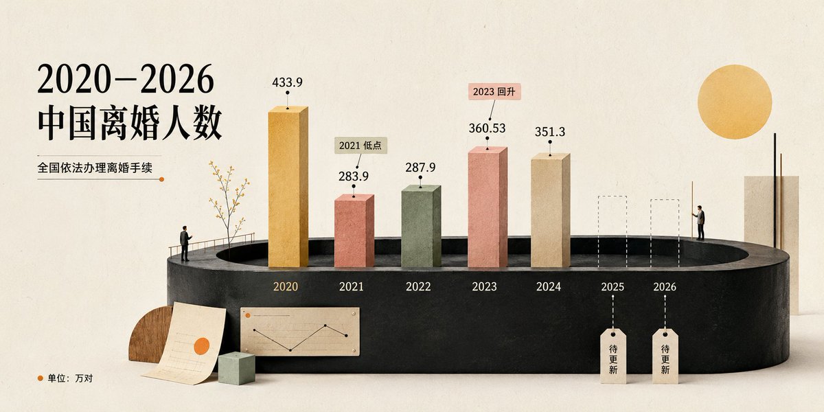
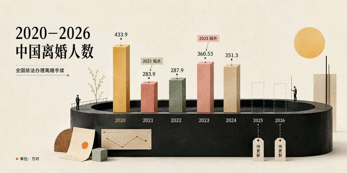
Goal: Create a cream-toned 3D editorial data visualization poster about {argument name="headline text" default="2020–2026 中国离婚人数"}, showing divorce counts in China with a refined miniature diorama style.

Canvas: Wide horizontal 2:1 composition, warm off-white paper background with subtle grain, soft shadows, minimalist premium infographic aesthetic. Use a muted cream, black, terracotta, sage, ochre, and beige palette.

Layout: Place the main title on the upper left in large elegant black serif Chinese typography. Under it, add the subtitle {argument name="subtitle text" default="全国依法办理离婚手续"} with a thin horizontal rule ending in a small orange dot. The central focus is a black oval/cylindrical stage platform spanning the lower middle of the image, viewed in slight perspective. On the platform, arrange exactly 7 year positions from left to right: 2020, 2021, 2022, 2023, 2024, 2025, 2026.

Data bars: Show exactly 5 solid rectangular 3D vertical bars for years 2020–2024 and exactly 2 dashed-outline placeholder bars for 2025 and 2026. Use these visible values and labels: 2020 ochre-gold tall bar labeled 433.9; 2021 terracotta bar labeled 283.9 with a small callout tag reading “2021 低点”; 2022 muted sage-green bar labeled 287.9; 2023 salmon-pink bar labeled 360.53 with a small callout tag reading “2023 回升”; 2024 beige bar labeled 351.3; 2025 dashed empty bar with a hanging tag reading “待更新”; 2026 dashed empty bar with a hanging tag reading “待更新”. Put each year label in white or pale text along the front face of the black platform beneath its position.

Supporting visual elements: Include exactly 2 miniature human figures: one standing near the left side of the stage railing looking toward the chart, and one standing on the right side near the 2026 area. Include a delicate small tree with thin branches near the 2020 bar. Add one large warm yellow sun circle in the upper right. Add a tall cream rectangular architectural block at the far right behind the platform. At the lower left foreground, add exactly 3 desk-like props: one semicircular wood block, one off-white paper sheet with faint chart lines and an orange dot, and one small pale green cube. On the front lower center of the platform, add one small beige inset chart card showing a simple black line chart with an orange dot.

Legend and text: In the bottom-left corner, add an orange dot followed by “单位:万对”. Keep all Chinese text crisp and readable. Use the data source/style as a polished social-media infographic, not a scientific chart.

Style constraints: Soft natural lighting, realistic paper and plaster textures, subtle 3D depth, clean negative space, no watermark, no extra years, no extra bars, no additional text beyond the specified labels. Use {argument name="background color" default="warm ivory"} as the overall background tone and {argument name="accent color" default="orange"} for dots and highlights.37:Tbb4,Goal: Create a cream-toned 3D editorial data visualization poster about {argum参照画像
このAI画像プロンプトテンプレートの使い方
 1
1プロンプトをコピー — テンプレートのプロンプトとネガティブプロンプトを取得。  2
2モデルを選ぶ — 最適な推奨AIモデルを選択。  3
3生成 — ワンクリックでスタジオを開いて作成。
関連テンプレート

Chinese AI Retirement Planning Infographic
{"type":"editorial Chinese infographic poster","topic":"AI and retirement planning boundaries","style":"clean academic magazine infographic, flat vector icons, soft textured off-white paper background, balanced Chinese editorial typography, minimal Japanese-inspired decorative motifs","canvas":{"orientation":"portrait","aspect_ratio":"3:4"},"palette":{"background":"warm ivory","primary_text":"black","secondary_text":"deep blue","accent_red":"rose pink","accent_green":"muted olive green","accent_yellow":"golden yellow","accent_blue":"navy blue","line_color":"soft gray-blue"},"headline":{"text":"{argument name=\"headline text\" default=\"AI 能帮你规划退休,但不能替你负责\"}","position":"top left","font":"bold Chinese serif or Song-style display","large":true},"subheadline":{"text":"MIT Sloan 对“AI + 退休规划”的边界判断","position":"below headline","color":"deep blue","font":"bold Chinese sans-serif"},"source_line":{"text":"来源:MIT Sloan / Andrew Lo","position":"below subheadline","color":"gray"},"layout":{"sections":[{"title":"高责任场景","position":"upper middle","count":2,"shape":"rounded rectangle with pink border and pale pink fill","icon_count":3,"labels":["AI = 辅助工具,不是最终决策者","适合帮助思考,不适合替你拍板"],"left_icon":"large pink warning triangle inside circle over wave pattern","item_icons":["person badge","exclamation mark"]},{"title":"强在帮你想清楚,弱在替你承担后果","position":"center","count":2,"shape":"large framed comparison panel","subsections":[{"title":"AI 更适合做:认知辅助","position":"left","count":4,"color":"green","labels":["解释复杂概念","比较不同方案","做情景推演","提醒行为偏差"],"icons":["book","balance scale","upward chart","exclamation in speech bubble"]},{"title":"AI 不能替代:责任判断","position":"right","count":4,"color":"pink-red","labels":["承担法律责任","精确税务与收益计算","处理复杂合规细节","托管敏感隐私风险"],"icons":["courthouse","calculator","clipboard","lock"]}],"center_icon":"blue circle with white balance scale"},{"title":"正确用法:把 AI 当分析伙伴,不当神谕","position":"lower middle","count":3,"shape":"rounded rectangle with yellow border and pale cream fill","labels":["先用 AI 做认知准备:理解概念、列变量、梳理方案","再让 AI 挑战你的假设:问它哪里可能错、缺了什么信息","关键决策交给自己,并由专业人士复核"],"left_illustration":"yellow rising sun over stylized landscape with bamboo leaves","step_markers":"three yellow numbered circles: 1, 2, 3"},{"title":"注:本文强调的是“辅助决策边界”,不是投资建议","position":"bottom","count":1,"shape":"rounded rectangle with blue-gray border","labels":["Source: MIT Sloan, Want to use AI to plan your retirement? Here’s how to proceed"],"left_icon":"blue fountain pen nib in circle","right_decoration":"gray-blue wave pattern"}],"decorations":{"count":5,"items":["top right cherry blossom branch with pink flowers and falling petals","top left pagoda silhouette","top left distant mountain silhouette","small cloud-line motifs near upper corners of comparison section","subtle wave patterns inside circular icons and lower right footer"]}},"composition":"ample margins, all text in Chinese except the English source line at bottom, strong hierarchy from headline to colored content boxes, symmetrical comparison layout in the middle, polished social-media-ready infographic","rendering":"sharp vector infographic, crisp text, subtle paper grain, no photorealism"}3e:Te44,{"type":"editorial Chinese infographic poster","topic":"AI and retirement planning boundaries","style":"clean academic magazine infographic, flat vector icons, soft textured off-white paper background, balanced Chinese editorial typography, minimal Japanese-inspired decorative motifs","canvas":{"orientation":"portrait","aspect_ratio":"3:4"},"palette":{"background":"warm ivory","primary_text":"black","secondary_text":"deep blue","accent_red":"rose pink","accent_green":"muted olive green",

Fashion Style Guide Infographic Poster
Create a social-media image of Fashion Style Guide Infographic Poster. Style: photorealistic. Composition: balanced and well-framed. Lighting: natural with cinematic mood. Category: poster. Reference: fashion-style-guide-infographic-poster-22552.

Pixar Style Storyboard Poster
Create a social-media image of Pixar Style Storyboard Poster. Style: photorealistic. Composition: balanced and well-framed. Lighting: natural with cinematic mood. Category: poster. Reference: pixar-style-storyboard-poster-25798.

Desk Setup Audit Infographic
Using REFERENCE_0, turn the attached desk photo and its written brief into a clean editorial-style infographic poster. Create a side-by-side comparison with exactly 2 labeled photo panels: “Current Setup” on the left using the original scene, and “Optimized Setup” on the right showing a plausible improved version of the same room and desk from a matching angle. Add a large serif headline at the top reading Desk Setup Audit (headline text). Around the left panel, add exactly 5 issue callout cards connected by leader lines: 1) MONITOR HEIGHT — 👍 acceptable — “Screens close, but split focal plane” — tag “Neck fatigue”; 2) CHAIR POSITION — ❌ actively hurting — “Low lounge chair, weak support” — tag “Back pain + slouching”; 3) LIGHTING — ⚠️ costing energy — “Mixed lamps + side glare” — tag “Eye strain”; 4) CABLE MANAGEMENT — ❌ actively hurting — “Loose cables on desk + floor” — tag “Visual drag / trip risk”; 5) CLUTTER — ⚠️ costing energy — “Tools, boxes, papers in view” — tag “Focus loss”. Add a small red “TOP FIX” badge pointing to the chair position issue. Around the right panel, add exactly 5 improved callout cards: 1) MONITOR HEIGHT — ✅ working — “Primary screen centered at eye level”; 2) CHAIR POSITION — ✅ working — “Chair tucked in, feet flat, elbows ~90°”; 3) LIGHTING — ✅ working — “Soft front light, glare reduced”; 4) CABLE MANAGEMENT — ✅ working — “Cables routed under desk”; 5) CLUTTER — ✅ working — “Clear work zone, gear zoned”. In the optimized panel, visibly show the improvements: one main monitor centered, laptop centered below it, ergonomic office chair, cleaner desktop, cable routing hidden under the desk, softer balanced lighting, and a small drawer cabinet on the right while keeping the same room recognizable. Add a bottom legend with exactly 5 items: “LEGEND”, “Top Fix”, “working”, “acceptable”, “costing energy”, “actively hurting”. Along the bottom, add exactly 4 boxed sections: 1) “FREE FIXES” with 3 numbered items — “Top Fix: Raise sitting posture / ditch low slouch”, “Center primary monitor”, “Clear desk + floor spillover”; 2) “UNDER $50” with 3 numbered items — “Velcro ties + under-desk cable tray”, “Lumbar pillow or footrest”, “Simple desk organizer”; 3) “WORTH THE INVESTMENT” with 3 numbered items — “Ergonomic task chair”, “Monitor arms for perfect alignment”, “Closed storage / drawers”; 4) “FOCUS FORECAST” showing 2 gauges labeled “Current: 2.5 hrs/day” and “After Top 3 Fixes: 5.5 hrs/day”, plus a green pill reading “+3.0 hrs”. Use a refined magazine infographic aesthetic, muted green and cream palette, rounded boxes, minimal text, crisp icons, thin connector lines, and polished layout suitable for sharing on social media.36:Tb90,Using REFERENCE_0, turn the attached desk photo and its written brief into a clean editorial-style infographic poster. Create a side-by-side comparison with exactly 2 labeled photo panels: “Current Setup” on the left using the origina

3D Animated Storyboard Poster Grid
Create a clean, colorful storyboard poster in a 3x4 grid layout with 12 panels on a single page. Title at the top: "[MAIN TITLE] (title)" Each panel must include: a scene number in a small circle, a short scene title, a colorful illustrated image, a 1–2 line description under the image. Main characters must remain visually consistent across all 12 panels: Character 1: [describe main character in detail] (character one) Character 2: [describe second character in detail] (character two) Theme/story: [overall story theme] (theme) Scene breakdown: [Scene title] – [what happens] [Scene title] – [what happens] [Scene title] – [what happens] [Scene title] – [what happens] [Scene title] – [what happens] [Scene title] – [what happens] [Scene title] – [what happens] [Scene title] – [what happens] [Scene title] – [what happens] [Scene title] – [what happens] [Scene title] – [what happens] [Scene title] – [what happens] Design style: cute 3D animated storybook style, warm emotional lighting, bright colors, soft shadows, child-friendly, clean panel borders, readable typography, neat poster composition, high detail. Important: Keep all 12 panels inside one single image. Make the layout clean and balanced. Keep the characters consistent in face, outfit, and colors. Make the text readable and properly placed. No cropped panels. No extra characters unless mentioned.3a:T5e5,Create a clean, co

Japanese AI Case Study Slide
Goal: Create a polished Japanese corporate presentation slide for Galirage (company name) showing support achievements and case studies for AI implementation and AIX consulting. Canvas: 16:9 widescreen slide, white to very pale blue gradient background with subtle translucent curved wave shapes. Clean SaaS-consulting aesthetic, generous spacing, blue and teal accent colors, rounded cards, soft shadows, crisp vector icons. Header and title area: At top left, place a vertical blue accent bar followed by the small black headline 「支援実績【事例紹介】」. Below it, add a blue subheading 「多様な業界の大手企業を支援」 and a large bold main title in bright blue: AI導入・AIX支援で\n豊富な実績 (main title). To the upper center-right, place a short Japanese paragraph in black: 「製造・金融・保険・製薬・IT・通信など、多岐にわたる業界の大手企業を幅広くご支援してきました。特に『上場企業を中心とした大手企業向けのAI導入・AIX支援』において、豊富な実績を有しています。」 Logo and industry panel: At the top right, show a small abstract blue-and-red circular logo mark and the wordmark Galirage (company name). Beneath it, create a rounded rectangular outlined panel with a small blue pill label 「対応業界」 centered on its top border. Inside the panel, show exactly 6 evenly spaced blue line icons with Japanese labels, separated by thin vertical dividers: 1) factory icon labeled 「製造」, 2) bank building icon labeled 「金融」, 3) hands/heart insurance icon labeled 「保険」, 4) capsule icon labeled 「製薬」, 5) monitor with code icon labeled 「IT」, 6) radio tower icon labeled 「通信」. Main layout: Bottom two-thirds of the slide contains exactly 6 rounded white case-study cards in a 3-column by 2-row grid. Each card has a soft shadow, a diagonal numbered ribbon in the upper-left corner, a pale circular icon area on the left, a bold Japanese client-title heading on the right, three small rounded tag pills below the heading, and a short Japanese description paragraph. Use alternating blue and teal accents. Case cards, exact count and content: 1. Card number 1, title 「国内メガバンクグループ」, icon: blue bank building in a pale circle, tags: 「社内AI」 「AI駆動開発」 「研修」, description: 「グループ社員向けの社内AIシステム開発をご支援。AI駆動開発の社内標準化では、社内ツールの開発からエンジニア研修まで、一気通貫で対応しました。」 2. Card number 2, title 「大手化学メーカー」, icon: chemistry flask with bubbles, tags: 「PoC支援」 「データ分析AI」 「業務データ正規化」, description: 「研究開発部門の業務データ正規化および分析AIのPoC支援を担当。課題整理、仮説立案からシステム構築、成果物検証まで、一気通貫で対応しました。」 3. Card number 3, title 「大手製薬メーカー」, icon: medicine bottle and pill, tags: 「RAG」 「AIエージェント」 「業務効率化」, description: 「社内の業務効率化・高度化を目的としたRAG・AIエージェントのシステム開発をご支援。要件定義から本格的なシステム開発まで、一貫して担当しました。」 4. Card number 4, title 「大手保険持株会社」, icon: shield with check mark, tags: 「AIツール選定」 「セキュリティ準拠」 「ナレッジ提供」, description: 「社内セキュリティポリシーに準拠したAIツールの選定を支援。生成AI最新動向のインサイト付き定期配信とナレッジ提供を、継続的に実施しました。」 5. Card number 5, title 「大手重工メーカー」, icon: robotic arm, tags: 「ナレッジ継承」 「AIシステム構築」 「業務知識の体系化」, description: 「熟練社員が持つ暗黙知を次世代へ継承するためのAIシステム構築をご支援。現場の業務知識をデジタル化・体系化する仕組みを、設計から実装まで担当しました。」 6. Card number 6, title 「大手通信グループのIT会社」, icon: headset, tags: 「業務効率化」 「リスキリング研修」 「人材育成」, description: 「コールセンターシステムの業務効率化を支援。別案件として、社内AI人材育成に向けたリスキリング研修の設計・実施にも、幅広く対応しました。」 Typography and details: Use modern Japanese sans-serif typography, with large heavy blue title text, black section titles, small gray body copy, and blue/teal tag outlines. Add small footer copyright at bottom left: © Galirage Inc. (footer text). Keep the slide information-dense but readable, with no photos, no people, no extra cards, no extra icons, and no watermark.38:T13a2,Goal: Create a polished Japanese corporate presentation slide for Galirage (company name) showing support achievements and case studies for AI implementation and AIX consulting. Canvas: 16:9 widescreen slide, white to very pale blue gradient background with subtle translucent curved wave shapes. Clean SaaS-consulting aesthetic, generous spacing, blue and teal accent colors, rounded cards, soft shadows, crisp vector icons. Header and title area: At top left, place a vertical blue accent bar followed by the small black headline 「支援実績【事例紹介】」. Below it, add a blue subheading 「多様な業界の大手企業を支援」 and a large bold main title in bright blue: AI導入・AIX支援で\n豊富な実績 (main title). To the upper center-right, place a short Japanese paragraph in black: 「製造・金融・保険・製薬・IT・通信など、多岐にわたる業界の大手企業を幅広くご支援してきました。特に『上場企業を中心とした大手企業向けのAI導入・AIX支援』において、豊富な実績を有しています。」 Logo and industry panel: At the top right, show a small abstract blue-and-red circular logo mark and the wordmark Galirage (company name). Beneath it, create a rounded rectangular outlined panel with a small blue pill label 「対応業界」 centered on its top border. Inside the panel, show exactly 6 evenly spaced blue line icons with Japanese labels, separated by thin vertical dividers: 1) factory icon labeled 「製造」, 2) bank building icon labeled 「金融」, 3) hands/heart insurance icon labeled 「保険」, 4) capsule icon labeled 「製薬」, 5) monitor with code icon labeled 「IT」, 6) radio tower icon labeled 「通信」.
他のプロンプトを探す
カテゴリ別にAI画像・動画プロンプトをもっと見る。